
A theme that approximates the style of The Economist.
Usage
theme_economist(
  base_size = 10,
  base_family = "sans",
  horizontal = TRUE,
  dkpanel = FALSE
)

theme_economist_white(
  base_size = 11,
  base_family = "sans",
  gray_bg = TRUE,
  horizontal = TRUE
)
Arguments
- base_size
base font size, given in pts.
- base_family
base font family
- horizontal
If
TRUE(the default), draw horizontal grid lines.- dkpanel
If
TRUE, use a darker background for the panel region. The default isFALSE.- gray_bg
If
TRUE(the default), use a gray background; otherwise, use a white background.
Value
An object of class ggplot2::theme().
Details
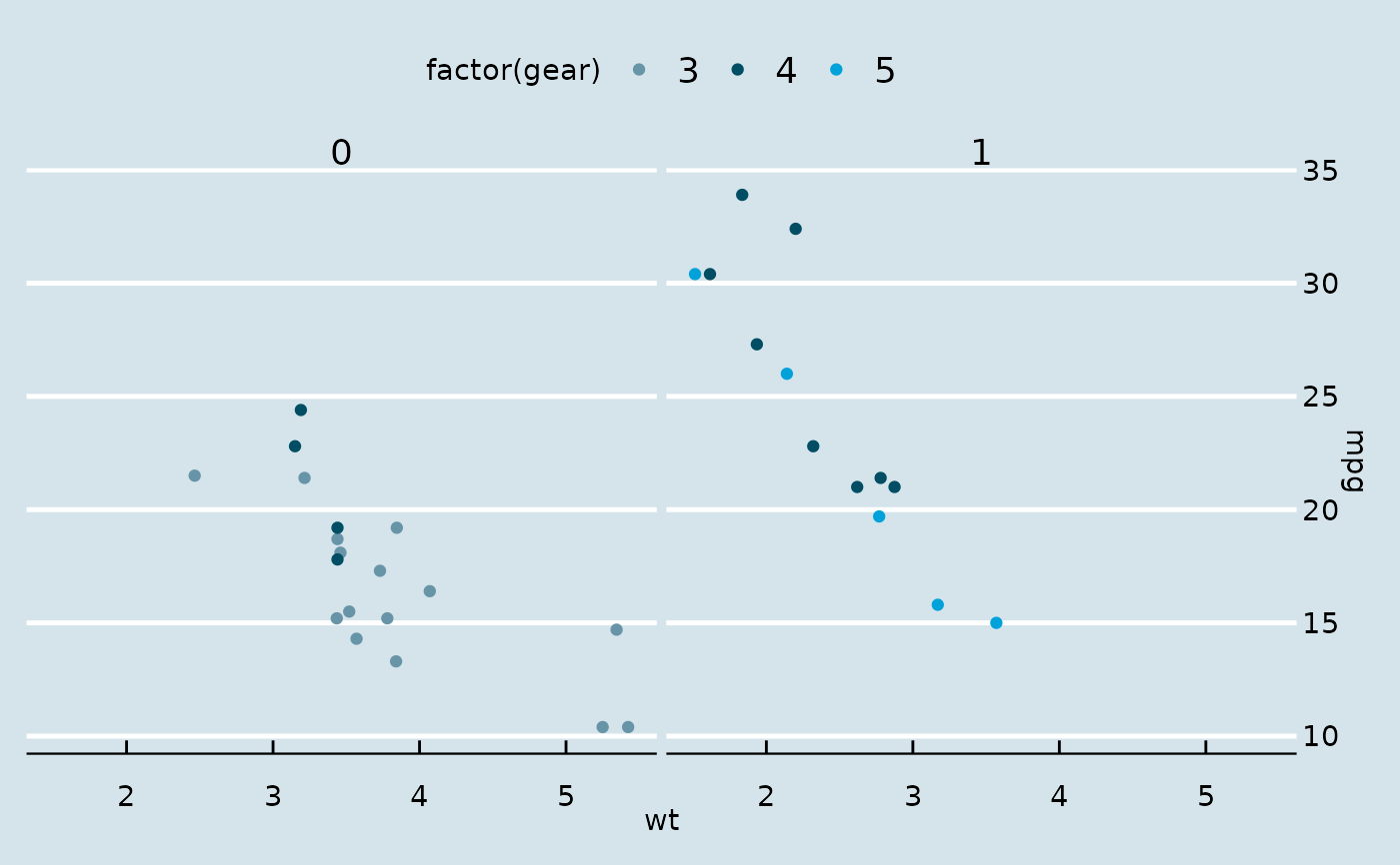
theme_economist() implements the standard bluish-gray
background theme in the print The Economist and
economist.com.
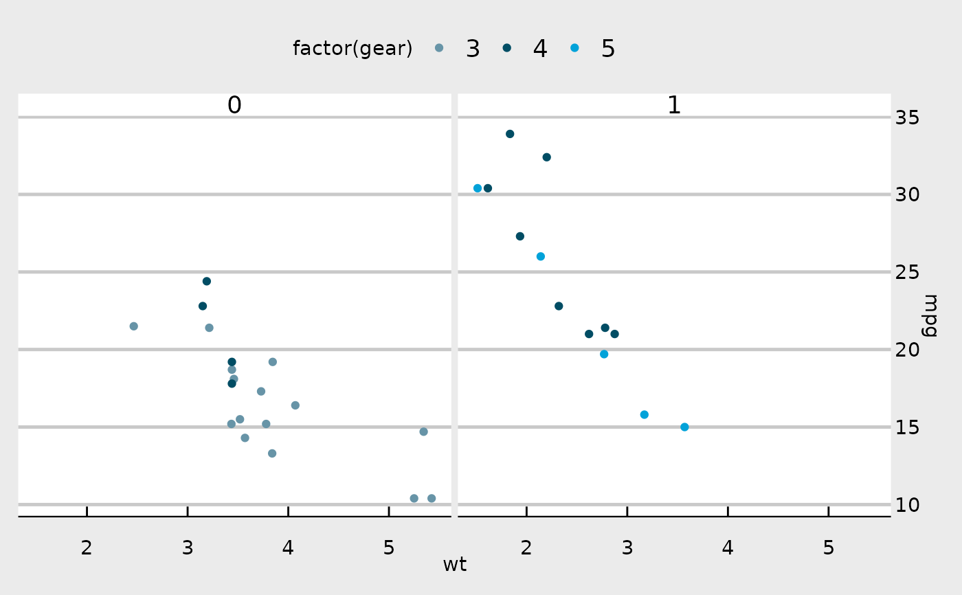
theme_economist_white() implements a variant with a white
panel and light gray (or white) background often used by The Economist
blog Graphic Detail.
Use scale_color_economist() with this theme.
The y axis should be displayed on the right hand side.
The Economist uses "ITC Officina Sans" as its font for graphs. If you have access to this font, you can use it with the extrafont package. "Verdana" is a good substitute.
Examples
library("ggplot2")
p <- ggplot(mtcars) +
geom_point(aes(x = wt, y = mpg, colour = factor(gear))) +
facet_wrap(~am) +
# Economist puts x-axis labels on the right-hand side
scale_y_continuous(position = "right")
## Standard
p + theme_economist() +
scale_colour_economist()
 # Change axis lines to vertical
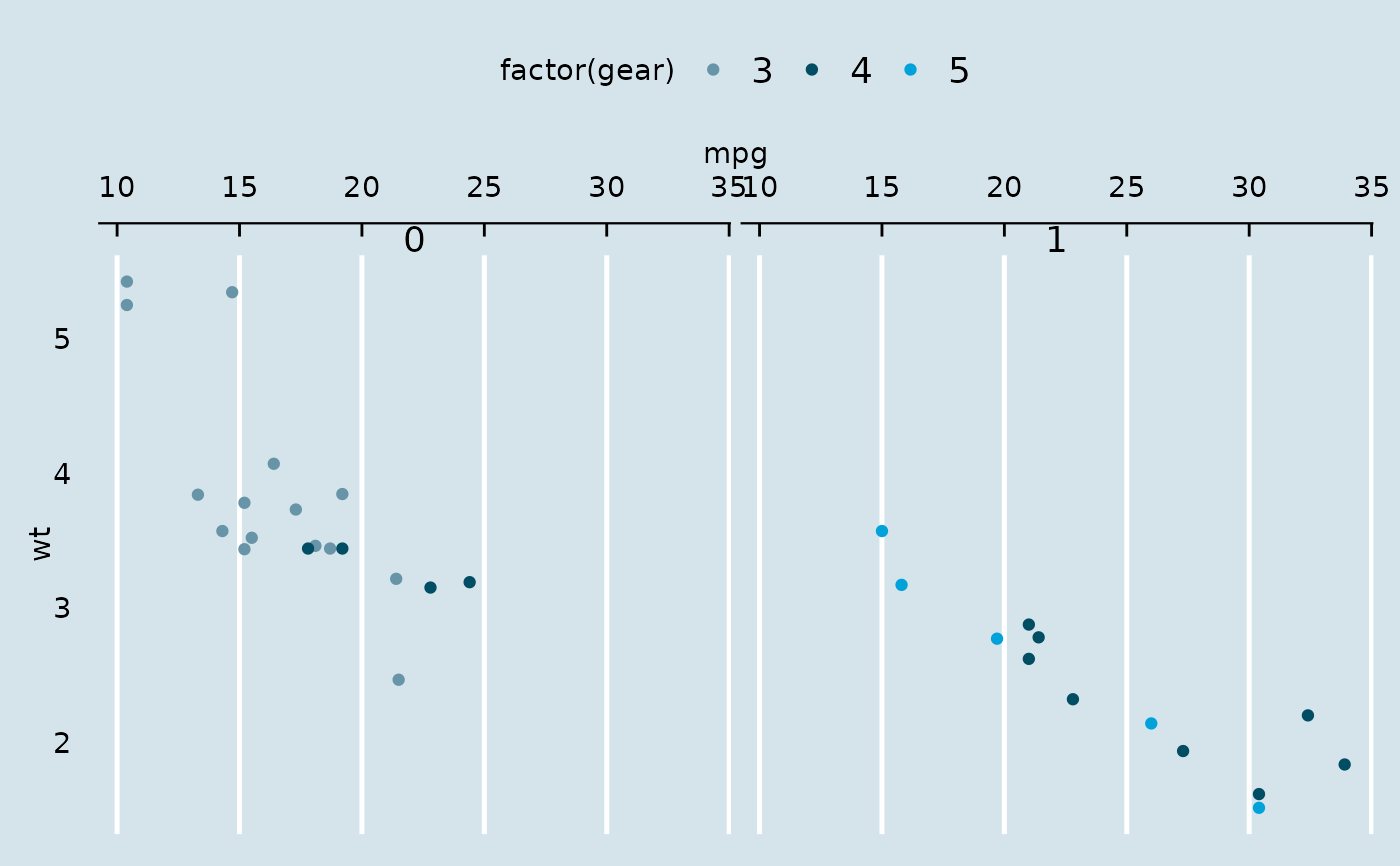
p + theme_economist(horizontal = FALSE) +
scale_colour_economist() +
coord_flip()
# Change axis lines to vertical
p + theme_economist(horizontal = FALSE) +
scale_colour_economist() +
coord_flip()
 ## White panel/light gray background
p + theme_economist_white() +
scale_colour_economist()
## White panel/light gray background
p + theme_economist_white() +
scale_colour_economist()
 ## All white variant
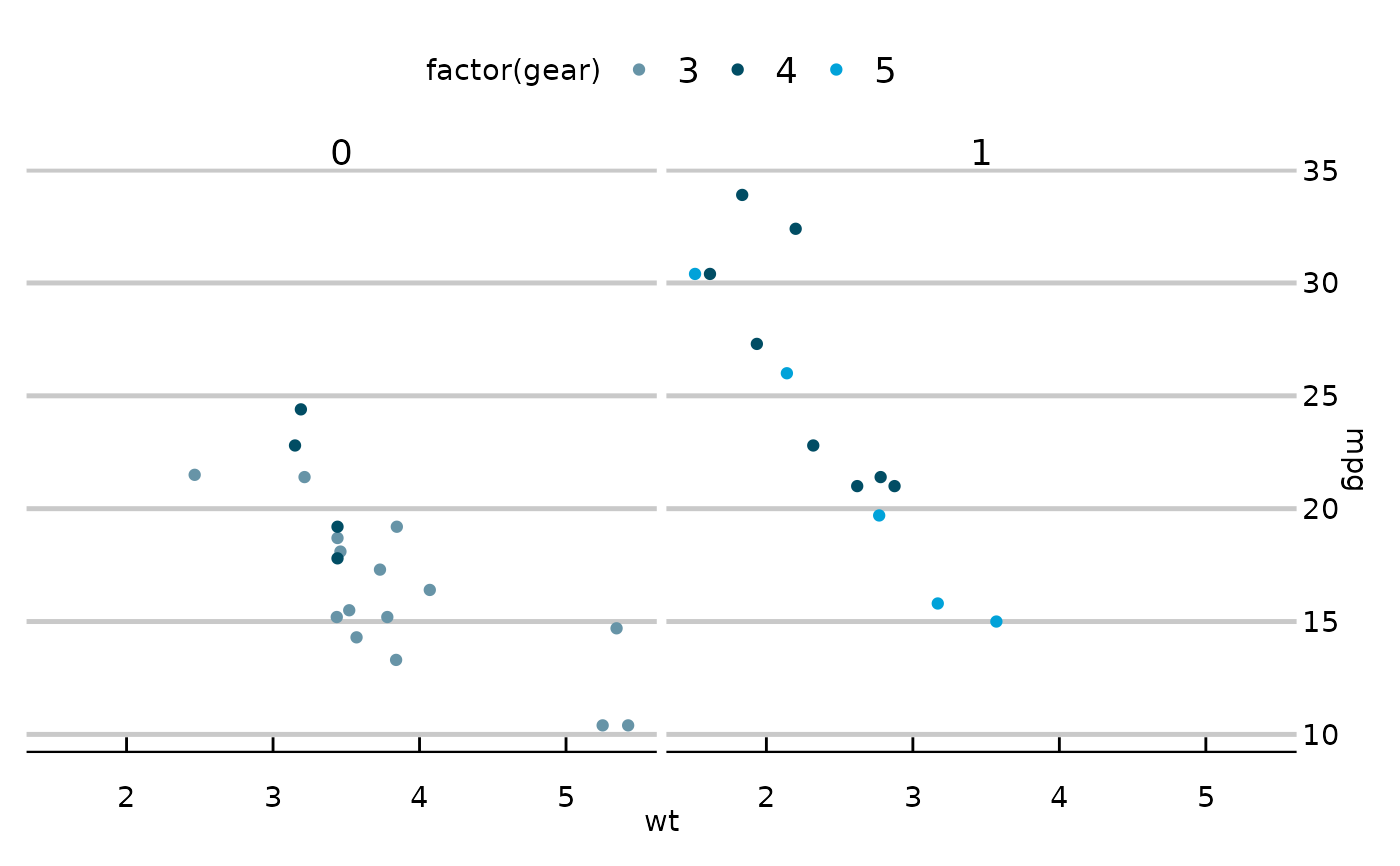
p + theme_economist_white(gray_bg = FALSE) +
scale_colour_economist()
## All white variant
p + theme_economist_white(gray_bg = FALSE) +
scale_colour_economist()
 if (FALSE) { # \dontrun{
## The Economist uses ITC Officina Sans
library("extrafont")
p + theme_economist(base_family="ITC Officina Sans") +
scale_colour_economist()
## Verdana is a widely available substitute
p + theme_economist(base_family="Verdana") +
scale_colour_economist()
} # }
if (FALSE) { # \dontrun{
## The Economist uses ITC Officina Sans
library("extrafont")
p + theme_economist(base_family="ITC Officina Sans") +
scale_colour_economist()
## Verdana is a widely available substitute
p + theme_economist(base_family="Verdana") +
scale_colour_economist()
} # }