Theme based on the rules and examples from Stephen Few's Show Me the Numbers and "Practical Rules for Using Color in Charts".
References
Few, S. (2012) Show Me the Numbers: Designing Tables and Graphs to Enlighten. 2nd edition. Analytics Press.
Stephen Few, "Practical Rules for Using Color in Charts", https://www.perceptualedge.com/articles/visual_business_intelligence/rules_for_using_color.pdf.
Examples
library("ggplot2")

p <- ggplot(mtcars) +
  geom_point(aes(x = wt, y = mpg, colour = factor(gear))) +
  facet_wrap(~am)
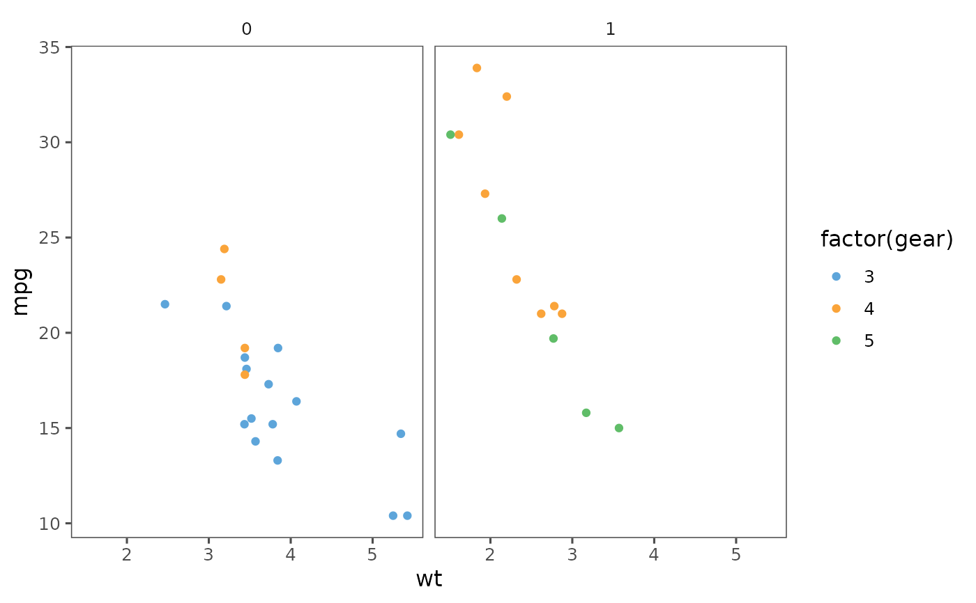
p + theme_few() + scale_colour_few()

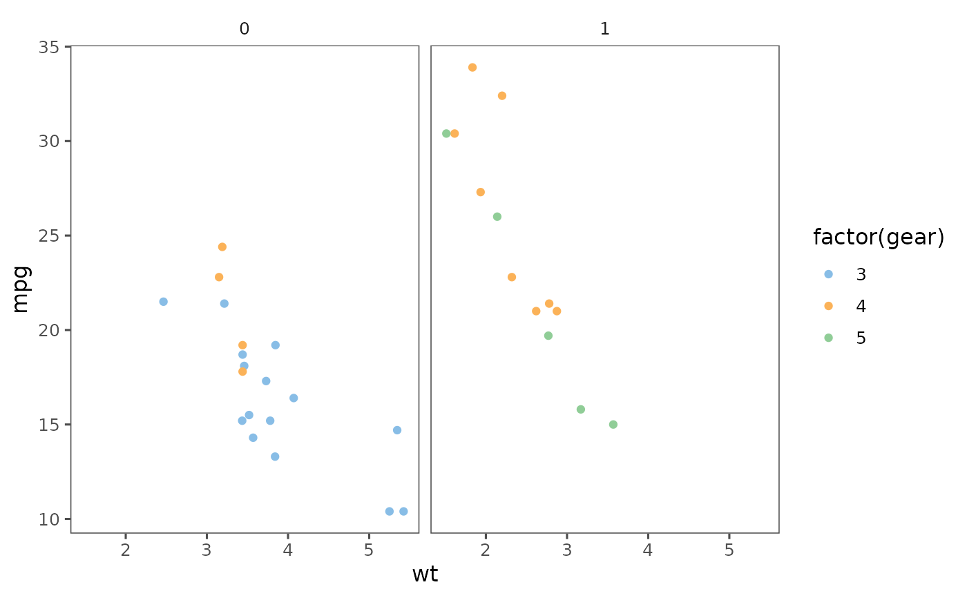
p + theme_few() + scale_colour_few("Light")

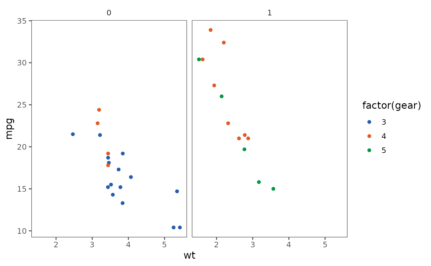
p + theme_few() + scale_colour_few("Dark")


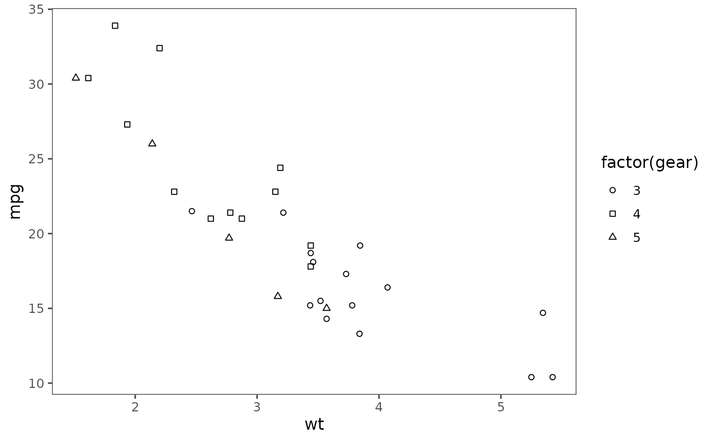
ggplot(mtcars) +
  geom_point(aes(x = wt, y = mpg, shape = factor(gear))) +
  theme_few() +
  scale_shape_few()
