If you find any typos, errors, or places where the text may be improved, please let me know. The best ways to provide feedback are by GitHub or hypothes.is annotations.
Opening an issue or submitting a pull request on GitHub
Adding an annotation using hypothes.is.
To add an annotation, select some text and then click the
on the pop-up menu.
To see the annotations of others, click the
in the upper right-hand corner of the page.
3 Data visualisation
3.1 Introduction
3.2 First steps
Exercise 3.2.1
Run ggplot(data = mpg) what do you see?

This code creates an empty plot.
The ggplot() function creates the background of the plot,
but since no layers were specified with geom function, nothing is drawn.
Exercise 3.2.2
How many rows are in mpg?
How many columns?
There are 234 rows and 11 columns in the mpg data frame.
The glimpse() function also displays the number of rows and columns in a data frame.
glimpse(mpg)
#> Rows: 234
#> Columns: 11
#> $ manufacturer <chr> "audi", "audi", "audi", "audi", "audi", "audi", "audi", …
#> $ model        <chr> "a4", "a4", "a4", "a4", "a4", "a4", "a4", "a4 quattro", …
#> $ displ        <dbl> 1.8, 1.8, 2.0, 2.0, 2.8, 2.8, 3.1, 1.8, 1.8, 2.0, 2.0, 2…
#> $ year         <int> 1999, 1999, 2008, 2008, 1999, 1999, 2008, 1999, 1999, 20…
#> $ cyl          <int> 4, 4, 4, 4, 6, 6, 6, 4, 4, 4, 4, 6, 6, 6, 6, 6, 6, 8, 8,…
#> $ trans        <chr> "auto(l5)", "manual(m5)", "manual(m6)", "auto(av)", "aut…
#> $ drv          <chr> "f", "f", "f", "f", "f", "f", "f", "4", "4", "4", "4", "…
#> $ cty          <int> 18, 21, 20, 21, 16, 18, 18, 18, 16, 20, 19, 15, 17, 17, …
#> $ hwy          <int> 29, 29, 31, 30, 26, 26, 27, 26, 25, 28, 27, 25, 25, 25, …
#> $ fl           <chr> "p", "p", "p", "p", "p", "p", "p", "p", "p", "p", "p", "…
#> $ class        <chr> "compact", "compact", "compact", "compact", "compact", "…
Exercise 3.2.3
What does the drv variable describe?
Read the help for ?mpg to find out.
The drv variable is a categorical variable which categorizes cars into front-wheels, rear-wheels, or four-wheel drive.1
| Value | Description |
|---|---|
"f" |
front-wheel drive |
"r" |
rear-wheel drive |
"4" |
four-wheel drive |
Exercise 3.2.4
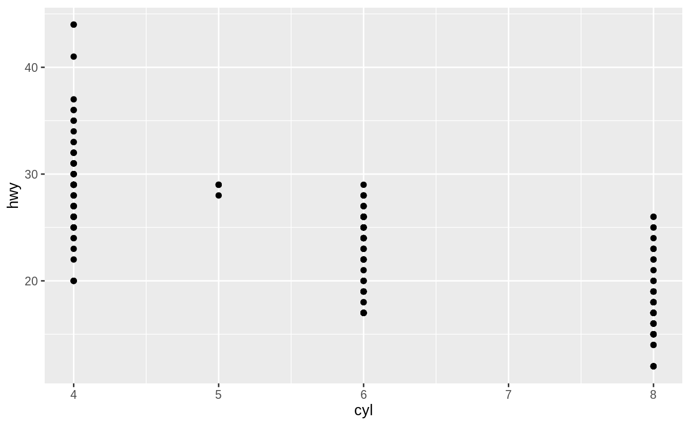
Make a scatter plot of hwy vs. cyl.
Exercise 3.2.5
What happens if you make a scatter plot of class vs drv?
Why is the plot not useful?
The resulting scatterplot has only a few points.
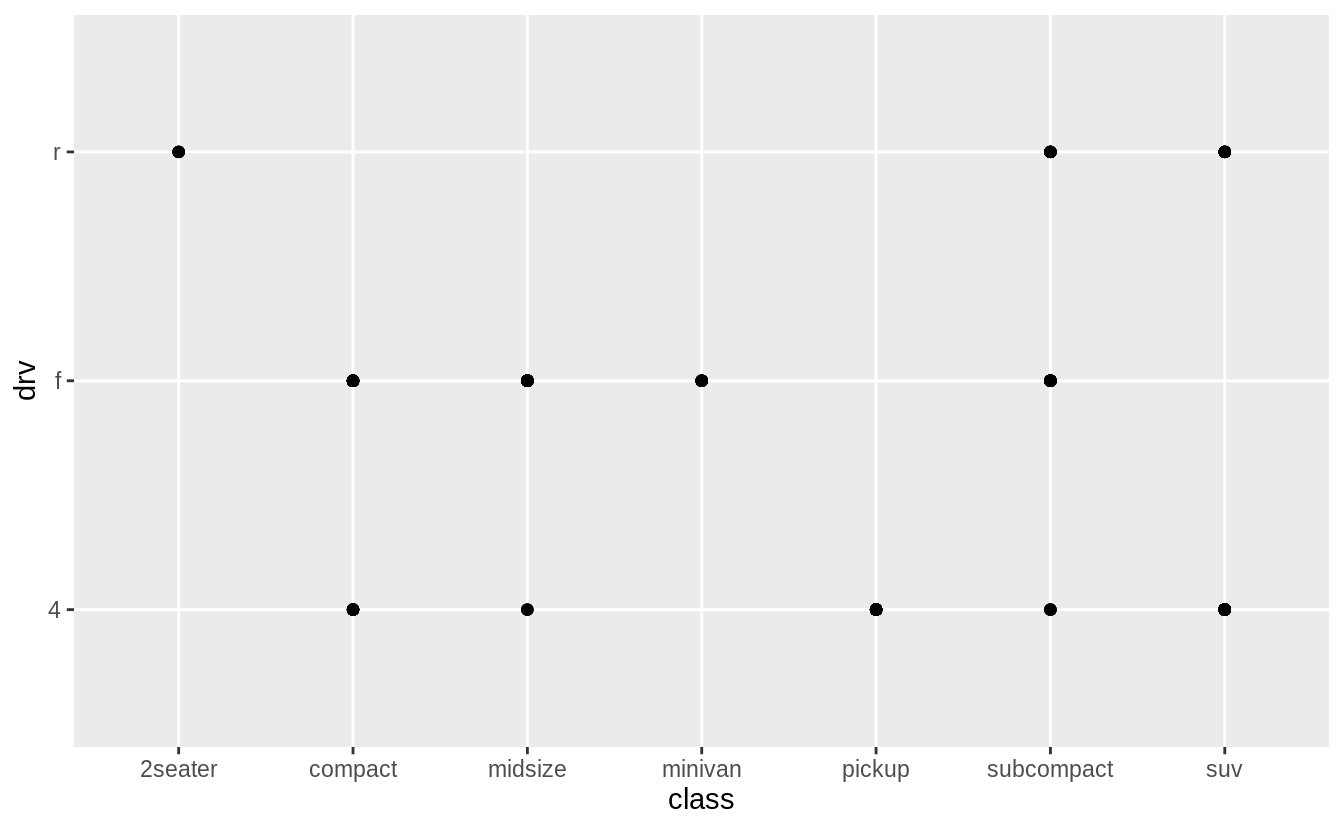
A scatter plot is not a useful display of these variables since both drv and class are categorical variables.
Since categorical variables typically take a small number of values,
there are a limited number of unique combinations of (x, y) values that can be displayed.
In this data, drv takes 3 values and class takes 7 values,
meaning that there are only 21 values that could be plotted on a scatterplot of drv vs. class.
In this data, there 12 values of (drv, class) are observed.
count(mpg, drv, class)
#> # A tibble: 12 x 3
#>   drv   class          n
#>   <chr> <chr>      <int>
#> 1 4     compact       12
#> 2 4     midsize        3
#> 3 4     pickup        33
#> 4 4     subcompact     4
#> 5 4     suv           51
#> 6 f     compact       35
#> # … with 6 more rows
A simple scatter plot does not show how many observations there are for each (x, y) value.
As such, scatterplots work best for plotting a continuous x and a continuous y variable, and when all (x, y) values are unique.
Warning: The following code uses functions introduced in a later section.
Come back to this after reading
section 7.5.2, which introduces methods for plotting two categorical variables.
The first is geom_count() which is similar to a scatterplot but uses the size of the points to show the number of observations at an (x, y) point.
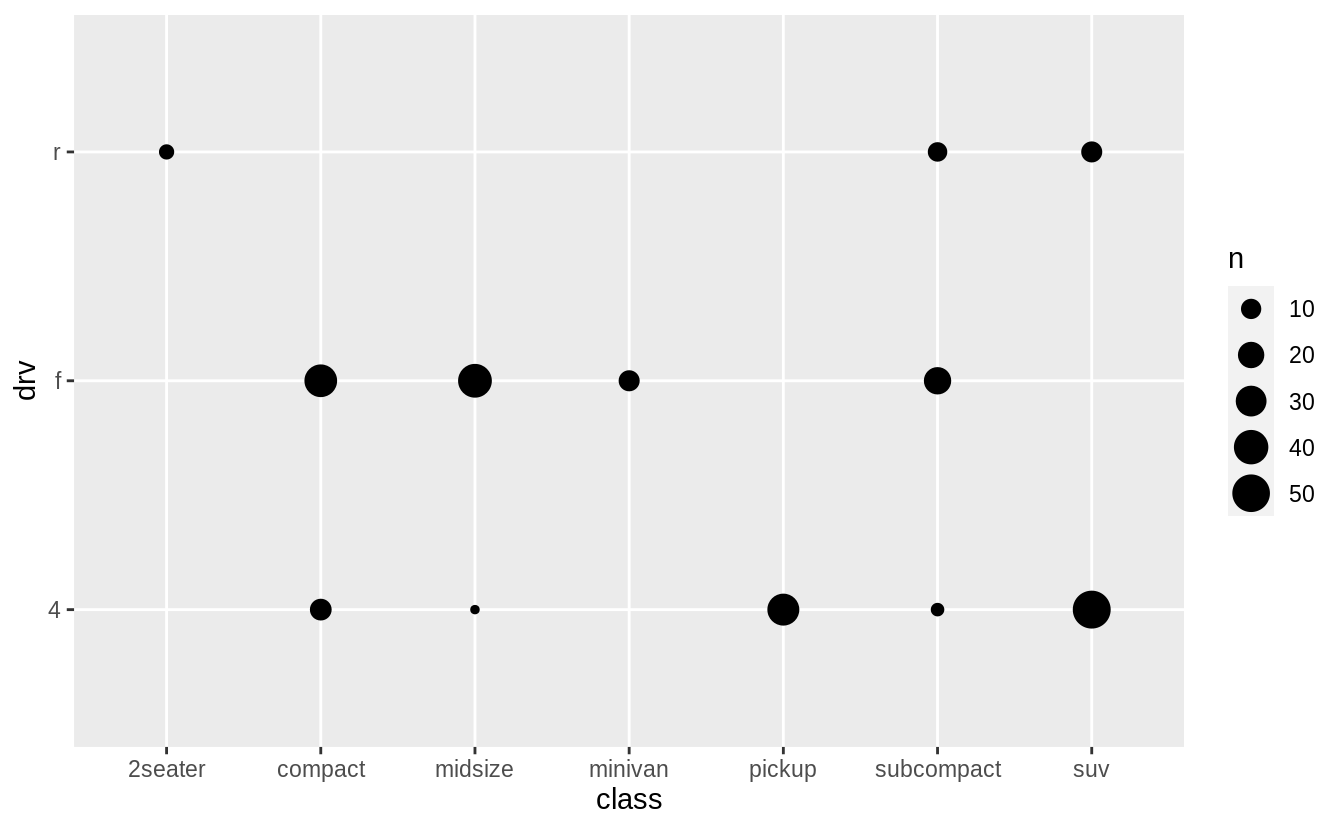
The second is geom_tile() which uses a color scale to show the number of observations with each (x, y) value.
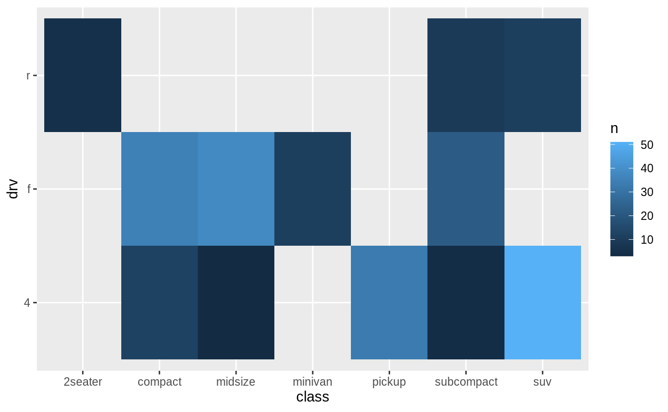
In the previous plot, there are many missing tiles.
These missing tiles represent unobserved combinations of class and drv values.
These missing values are not unknown, but represent values of (class, drv) where n = 0.
The complete() function in the tidyr package adds new rows to a data frame for missing combinations of columns.
The following code adds rows for missing combinations of class and drv and uses the fill argument to set n = 0 for those new rows.
mpg %>%
  count(class, drv) %>%
  complete(class, drv, fill = list(n = 0)) %>%
  ggplot(aes(x = class, y = drv)) +
    geom_tile(mapping = aes(fill = n))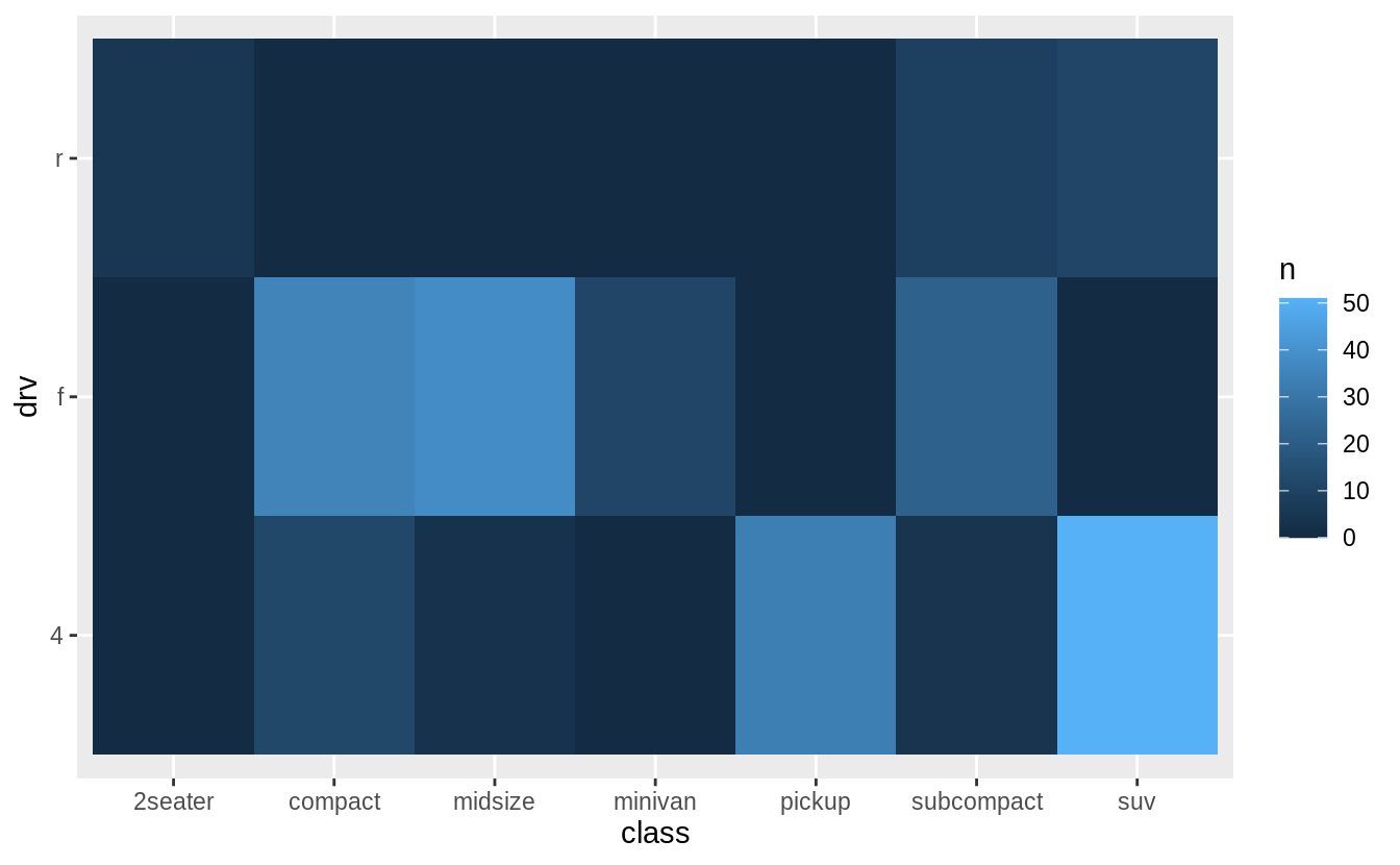
3.3 Aesthetic mappings
Exercise 3.3.1
What’s gone wrong with this code? Why are the points not blue?
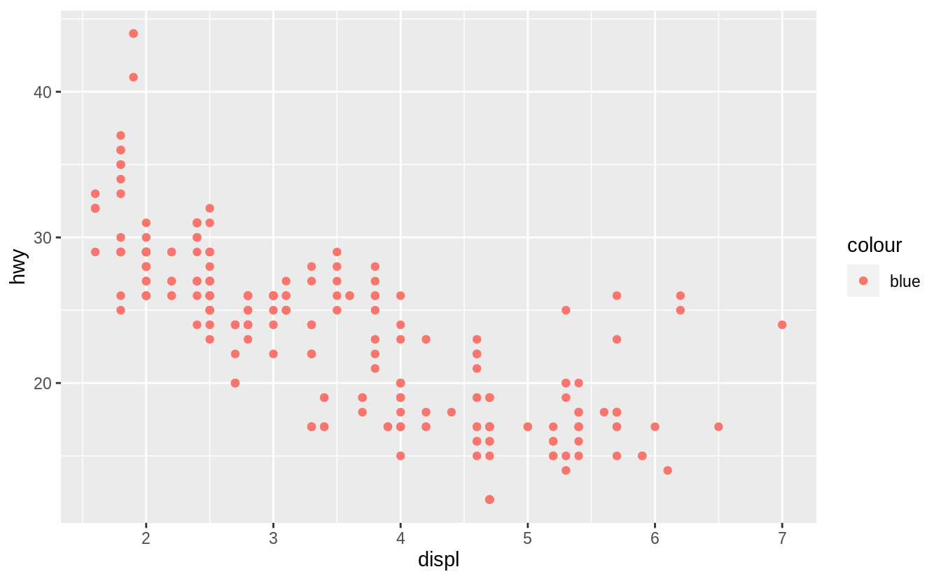
The argumentcolour = "blue" is included within the mapping argument, and as such, it is treated as an aesthetic, which is a mapping between a variable and a value.
In the expression, colour = "blue", "blue" is interpreted as a categorical variable which only takes a single value "blue".
If this is confusing, consider how colour = 1:234 and colour = 1 are interpreted by aes().
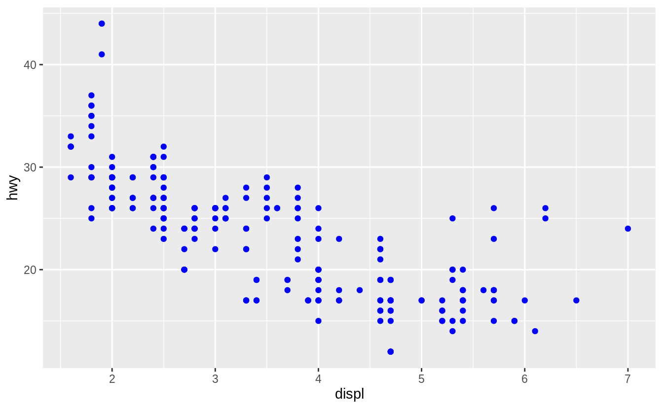
The following code does produces the expected result.
Exercise 3.3.2
Which variables in mpg are categorical?
Which variables are continuous?
(Hint: type ?mpg to read the documentation for the dataset).
How can you see this information when you run mpg?
The following list contains the categorical variables in mpg:
manufacturermodeltransdrvflclass
The following list contains the continuous variables in mpg:
displyearcylctyhwy
In the printed data frame, angled brackets at the top of each column provide type of each variable.
mpg
#> # A tibble: 234 x 11
#>   manufacturer model displ  year   cyl trans      drv     cty   hwy fl    class
#>   <chr>        <chr> <dbl> <int> <int> <chr>      <chr> <int> <int> <chr> <chr>
#> 1 audi         a4      1.8  1999     4 auto(l5)   f        18    29 p     compa…
#> 2 audi         a4      1.8  1999     4 manual(m5) f        21    29 p     compa…
#> 3 audi         a4      2    2008     4 manual(m6) f        20    31 p     compa…
#> 4 audi         a4      2    2008     4 auto(av)   f        21    30 p     compa…
#> 5 audi         a4      2.8  1999     6 auto(l5)   f        16    26 p     compa…
#> 6 audi         a4      2.8  1999     6 manual(m5) f        18    26 p     compa…
#> # … with 228 more rows
Those with <chr> above their columns are categorical, while those with <dbl> or <int> are continuous.
The exact meaning of these types will be discussed in “Chapter 15: Vectors”.
glimpse() is another function that concisely displays the type of each column in the data frame:
glimpse(mpg)
#> Rows: 234
#> Columns: 11
#> $ manufacturer <chr> "audi", "audi", "audi", "audi", "audi", "audi", "audi", …
#> $ model        <chr> "a4", "a4", "a4", "a4", "a4", "a4", "a4", "a4 quattro", …
#> $ displ        <dbl> 1.8, 1.8, 2.0, 2.0, 2.8, 2.8, 3.1, 1.8, 1.8, 2.0, 2.0, 2…
#> $ year         <int> 1999, 1999, 2008, 2008, 1999, 1999, 2008, 1999, 1999, 20…
#> $ cyl          <int> 4, 4, 4, 4, 6, 6, 6, 4, 4, 4, 4, 6, 6, 6, 6, 6, 6, 8, 8,…
#> $ trans        <chr> "auto(l5)", "manual(m5)", "manual(m6)", "auto(av)", "aut…
#> $ drv          <chr> "f", "f", "f", "f", "f", "f", "f", "4", "4", "4", "4", "…
#> $ cty          <int> 18, 21, 20, 21, 16, 18, 18, 18, 16, 20, 19, 15, 17, 17, …
#> $ hwy          <int> 29, 29, 31, 30, 26, 26, 27, 26, 25, 28, 27, 25, 25, 25, …
#> $ fl           <chr> "p", "p", "p", "p", "p", "p", "p", "p", "p", "p", "p", "…
#> $ class        <chr> "compact", "compact", "compact", "compact", "compact", "…
For those lists, I considered any variable that was non-numeric was considered categorical and any variable that was numeric was considered continuous.
This largely corresponds to the heuristics ggplot() uses for will interpreting variables as discrete or continuous.
However, this definition of continuous vs. categorical misses several important cases.
Of the numeric variables, year and cyl (cylinders) clearly take on discrete values.
The variables cty and hwy are stored as integers (int) so they only take on a discrete values.
Even though displ has
In some sense, due to measurement and computational constraints all numeric variables are discrete ().
But unlike the categorical variables, it is possible to add and subtract these numeric variables in a meaningful way.
The typology of levels of measurement is one such typology of data types.
In this case the R data types largely encode the semantics of the variables; e.g. integer variables are stored as integers, categorical variables with no order are stored as character vectors and so on.
However, that is not always the case.
Instead, the data could have stored the categorical class variable as an integer with values 1–7, where the documentation would note that 1 = “compact”, 2 = “midsize”, and so on.2
Even though this integer vector could be added, multiplied, subtracted, and divided, those operations would be meaningless.
Fundamentally, categorizing variables as “discrete”, “continuous”, “ordinal”, “nominal”, “categorical”, etc. is about specifying what operations can be performed on the variables. Discrete variables support counting and calculating the mode. Variables with an ordering support sorting and calculating quantiles. Variables that have an interval scale support addition and subtraction and operations such as taking the mean that rely on these primitives. In this way, the types of data or variables types is an information class system, something that is beyond the scope of R4DS but discussed in Advanced R.
Exercise 3.3.3
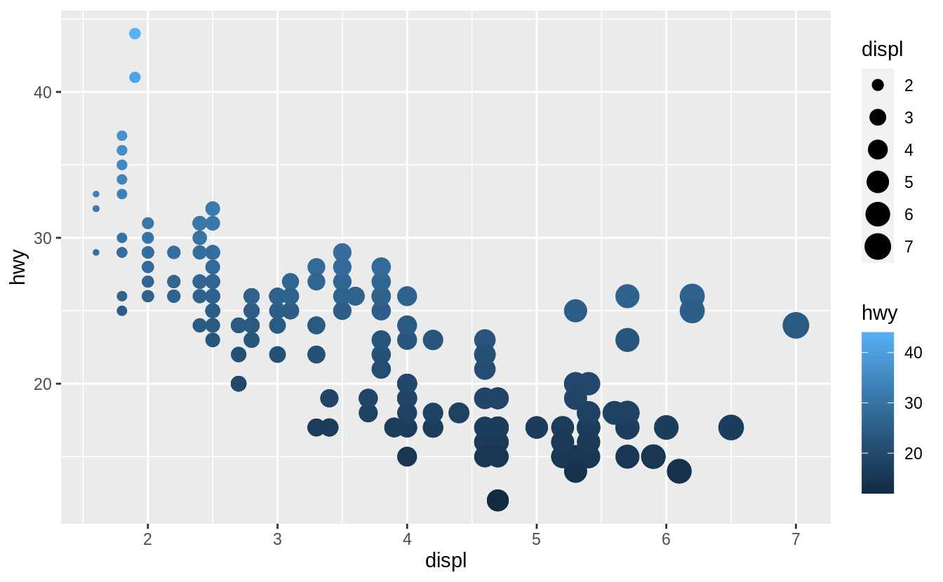
Map a continuous variable to color, size, and shape. How do these aesthetics behave differently for categorical vs. continuous variables?
The variable cty, city highway miles per gallon, is a continuous variable.
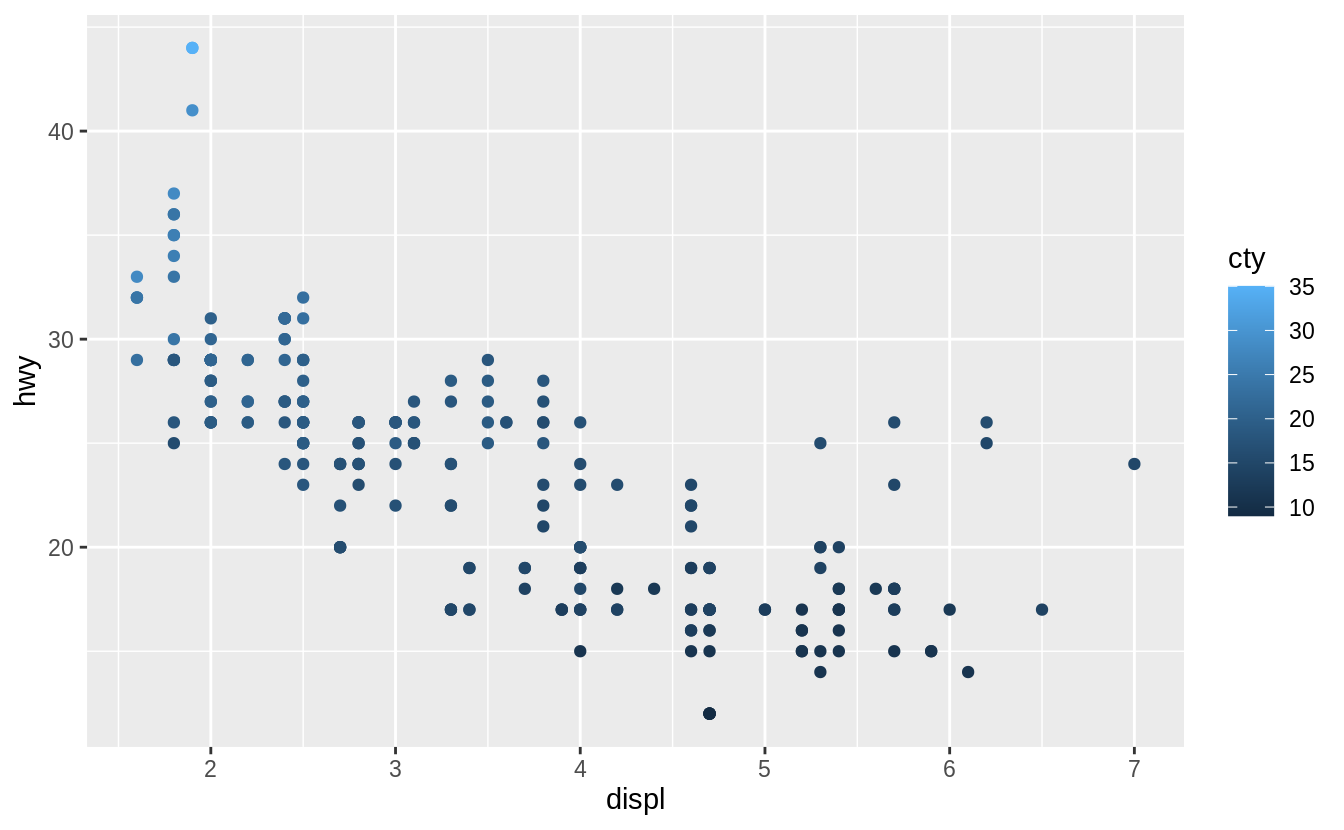
Instead of using discrete colors, the continuous variable uses a scale that varies from a light to dark blue color.
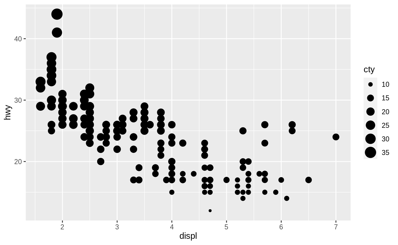
When mapped to size, the sizes of the points vary continuously as a function of their size.
ggplot(mpg, aes(x = displ, y = hwy, shape = cty)) +
  geom_point()
#> Error: A continuous variable can not be mapped to shape
When a continuous value is mapped to shape, it gives an error. Though we could split a continuous variable into discrete categories and use a shape aesthetic, this would conceptually not make sense. A numeric variable has an order, but shapes do not. It is clear that smaller points correspond to smaller values, or once the color scale is given, which colors correspond to larger or smaller values. But it is not clear whether a square is greater or less than a circle.
Exercise 3.3.4
What happens if you map the same variable to multiple aesthetics?
In the above plot, hwy is mapped to both location on the y-axis and color, and displ is mapped to both location on the x-axis and size.
The code works and produces a plot, even if it is a bad one.
Mapping a single variable to multiple aesthetics is redundant.
Because it is redundant information, in most cases avoid mapping a single variable to multiple aesthetics.
Exercise 3.3.5
What does the stroke aesthetic do?
What shapes does it work with?
(Hint: use ?geom_point)
Stroke changes the size of the border for shapes (21-25). These are filled shapes in which the color and size of the border can differ from that of the filled interior of the shape.
For example
ggplot(mtcars, aes(wt, mpg)) +
  geom_point(shape = 21, colour = "black", fill = "white", size = 5, stroke = 5)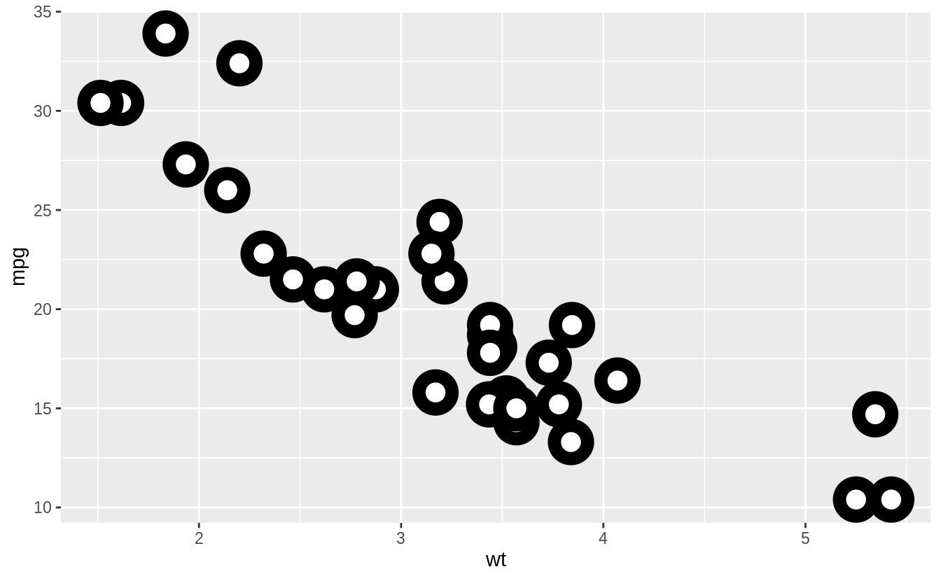
Exercise 3.3.6
What happens if you map an aesthetic to something other than a variable name, like aes(colour = displ < 5)?
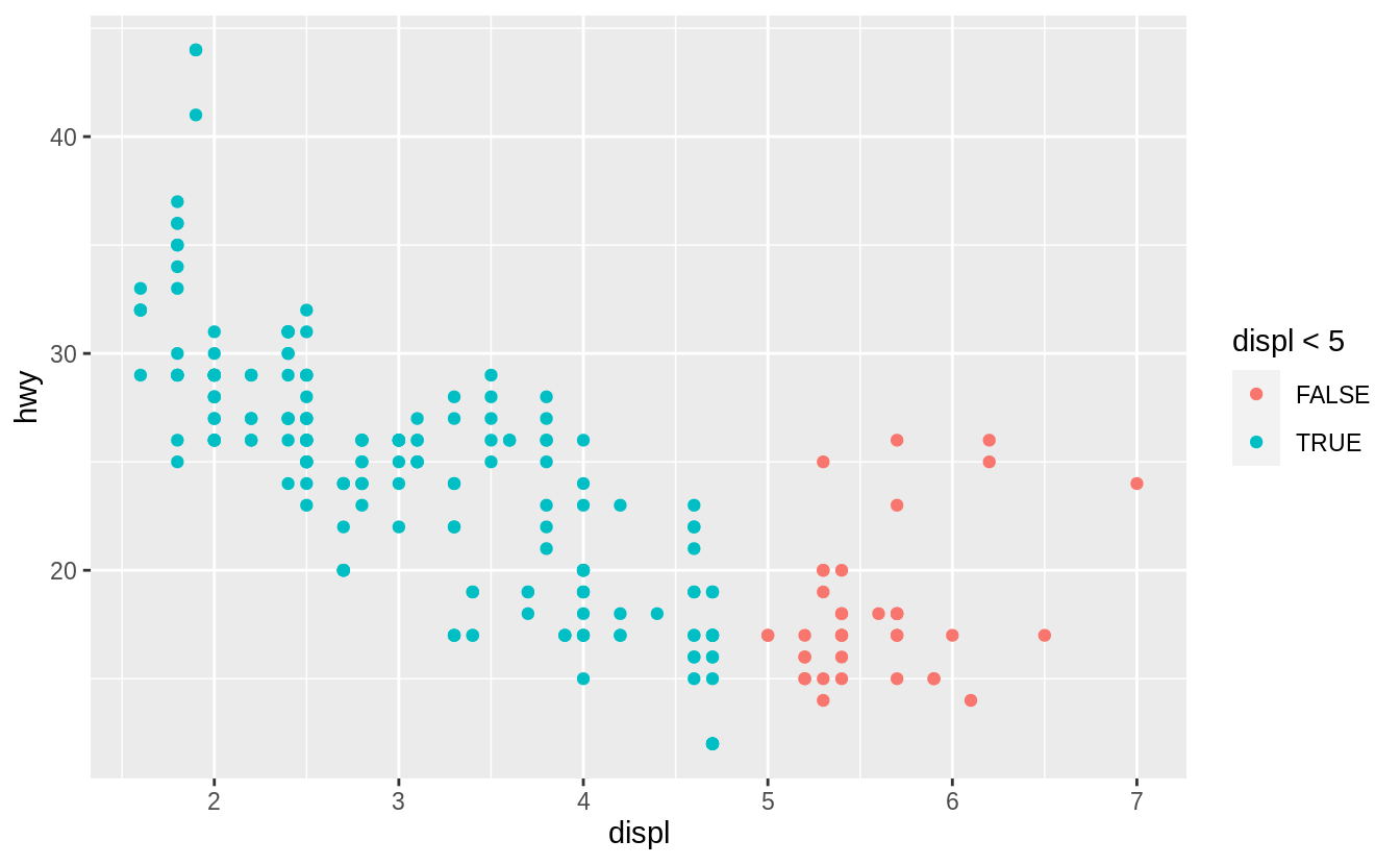
Aesthetics can also be mapped to expressions like displ < 5.
The ggplot() function behaves as if a temporary variable was added to the data with values equal to the result of the expression.
In this case, the result of displ < 5 is a logical variable which takes values of TRUE or FALSE.
This also explains why, in Exercise 3.3.1, the expression colour = "blue" created a categorical variable with only one category: “blue”.
3.4 Common problems
3.5 Facets
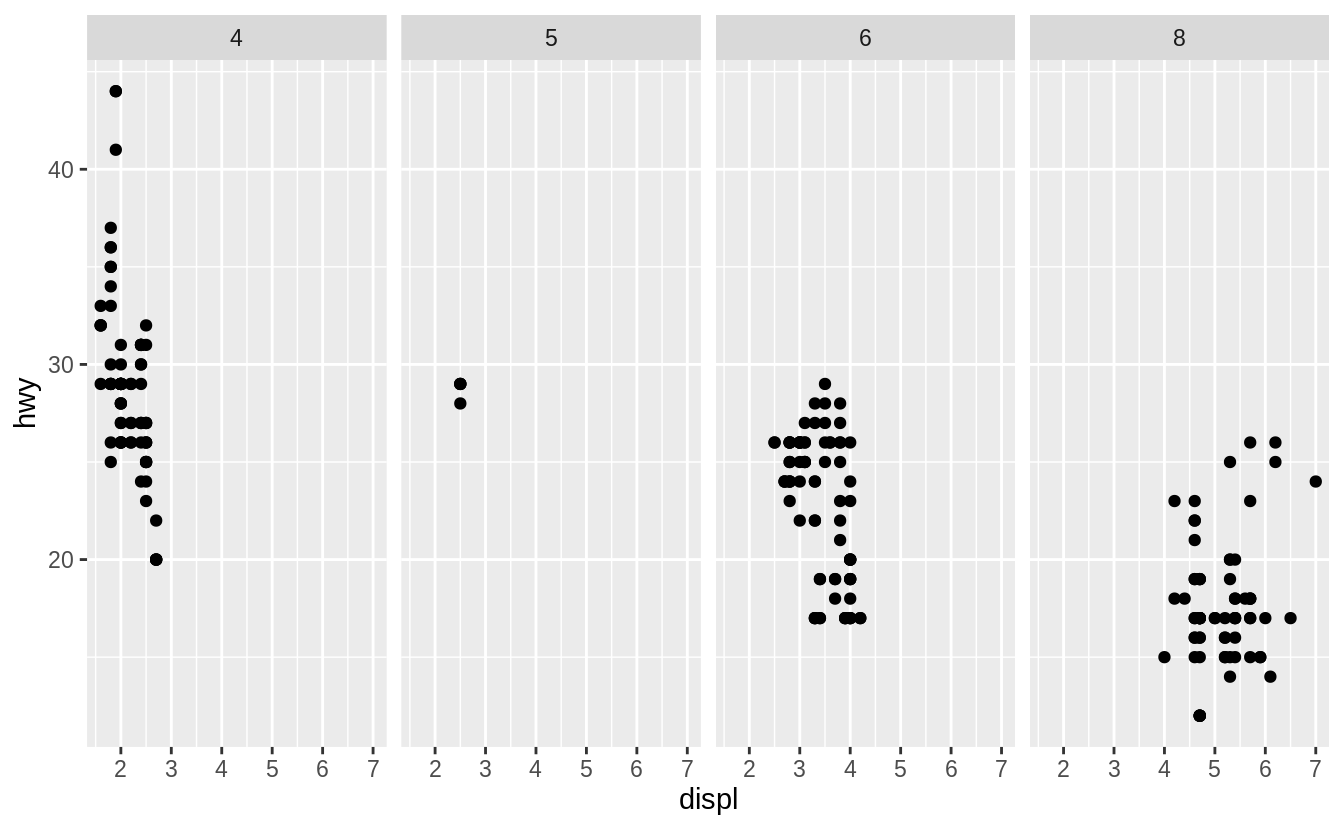
Exercise 3.5.1
What happens if you facet on a continuous variable?
Let’s see.
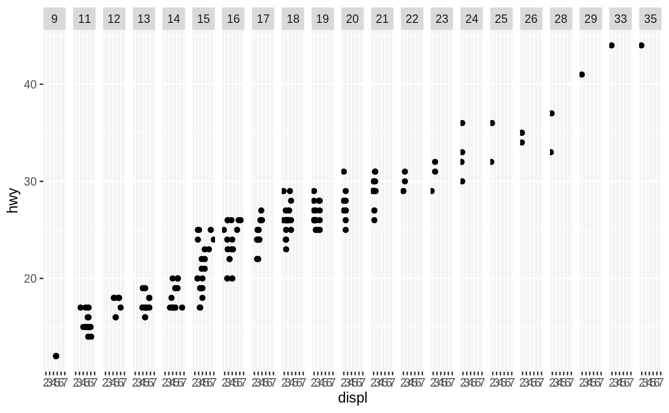
The continuous variable is converted to a categorical variable, and the plot contains a facet for each distinct value.
Exercise 3.5.2
What do the empty cells in plot with facet_grid(drv ~ cyl) mean?
How do they relate to this plot?
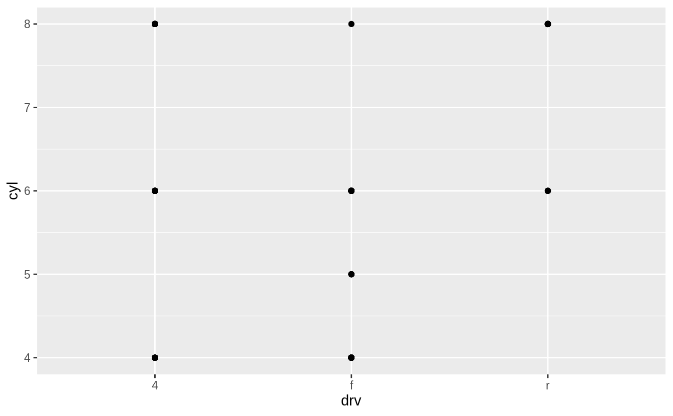
The empty cells (facets) in this plot are combinations of drv and cyl that have no observations.
These are the same locations in the scatter plot of drv and cyl that have no points.

Exercise 3.5.3
What plots does the following code make?
What does . do?
The symbol . ignores that dimension when faceting.
For example, drv ~ . facet by values of drv on the y-axis.
While, . ~ cyl will facet by values of cyl on the x-axis.
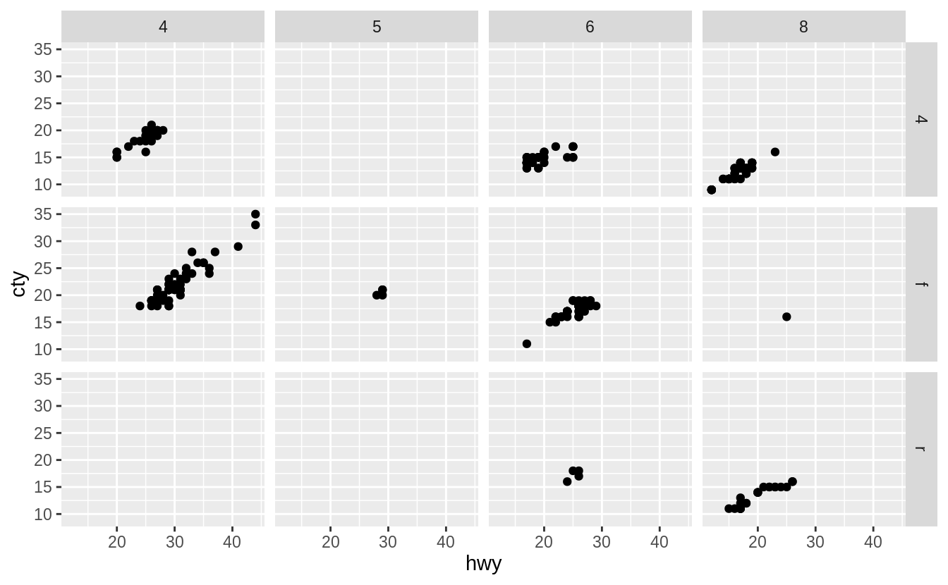
Exercise 3.5.4
Take the first faceted plot in this section:
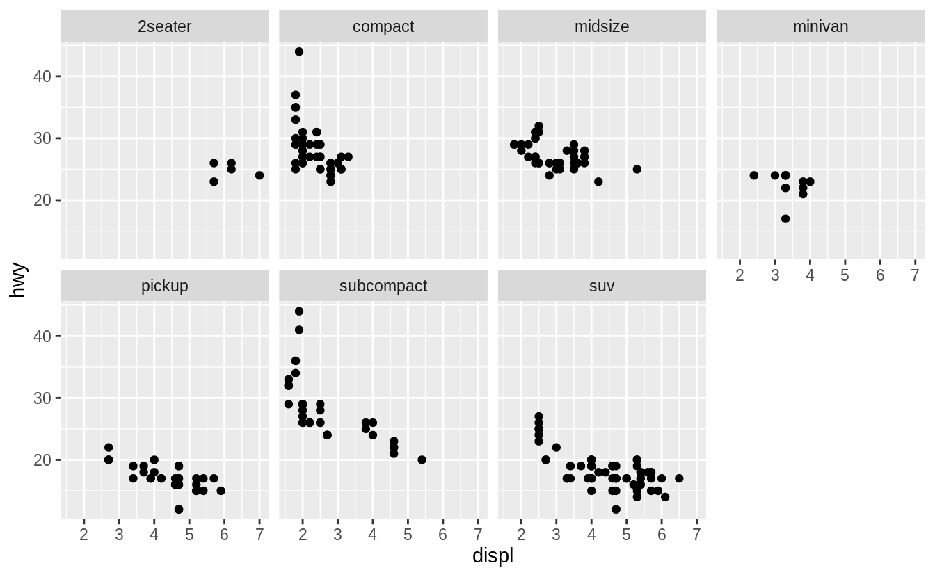
What are the advantages to using faceting instead of the colour aesthetic? What are the disadvantages? How might the balance change if you had a larger dataset?
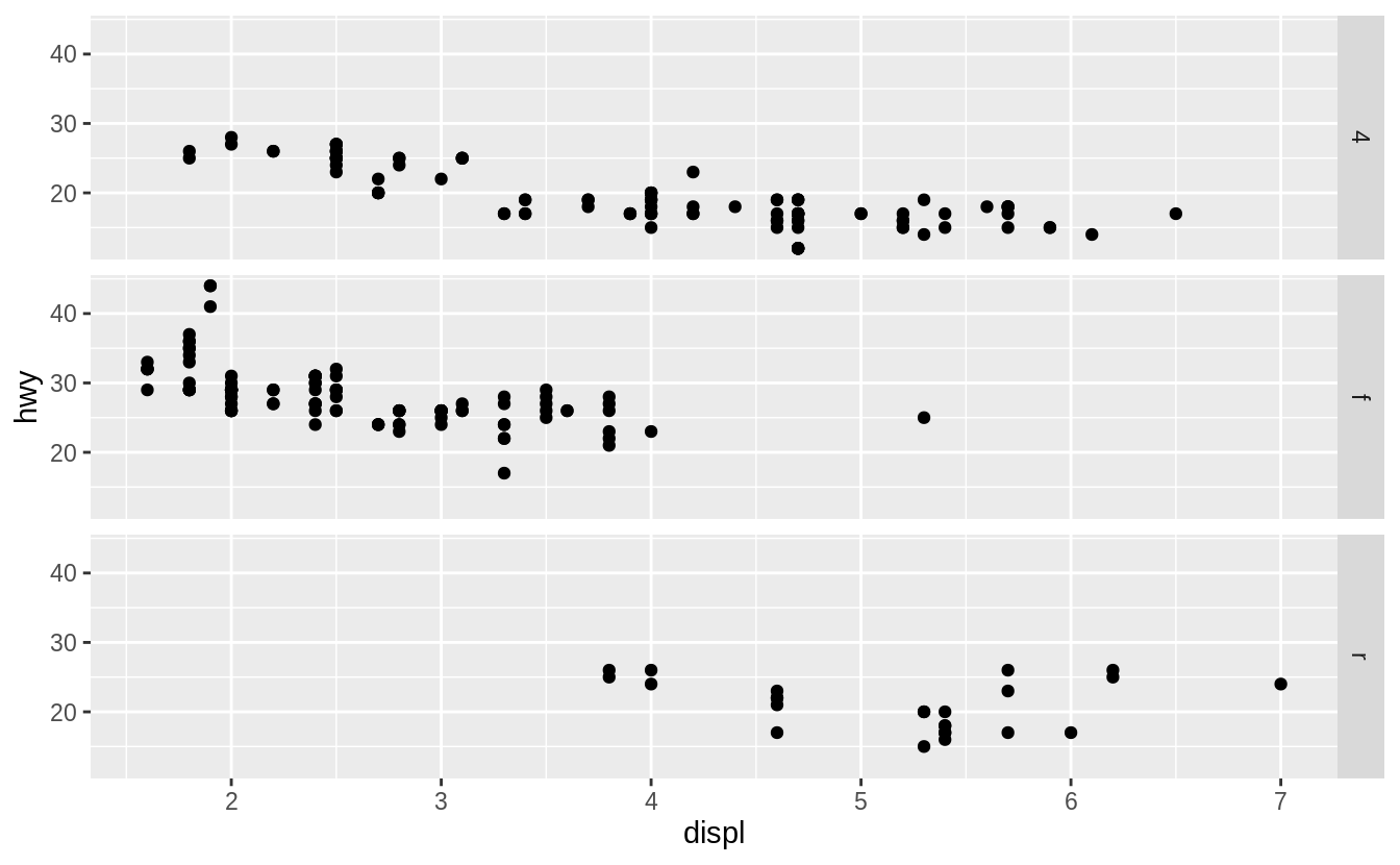
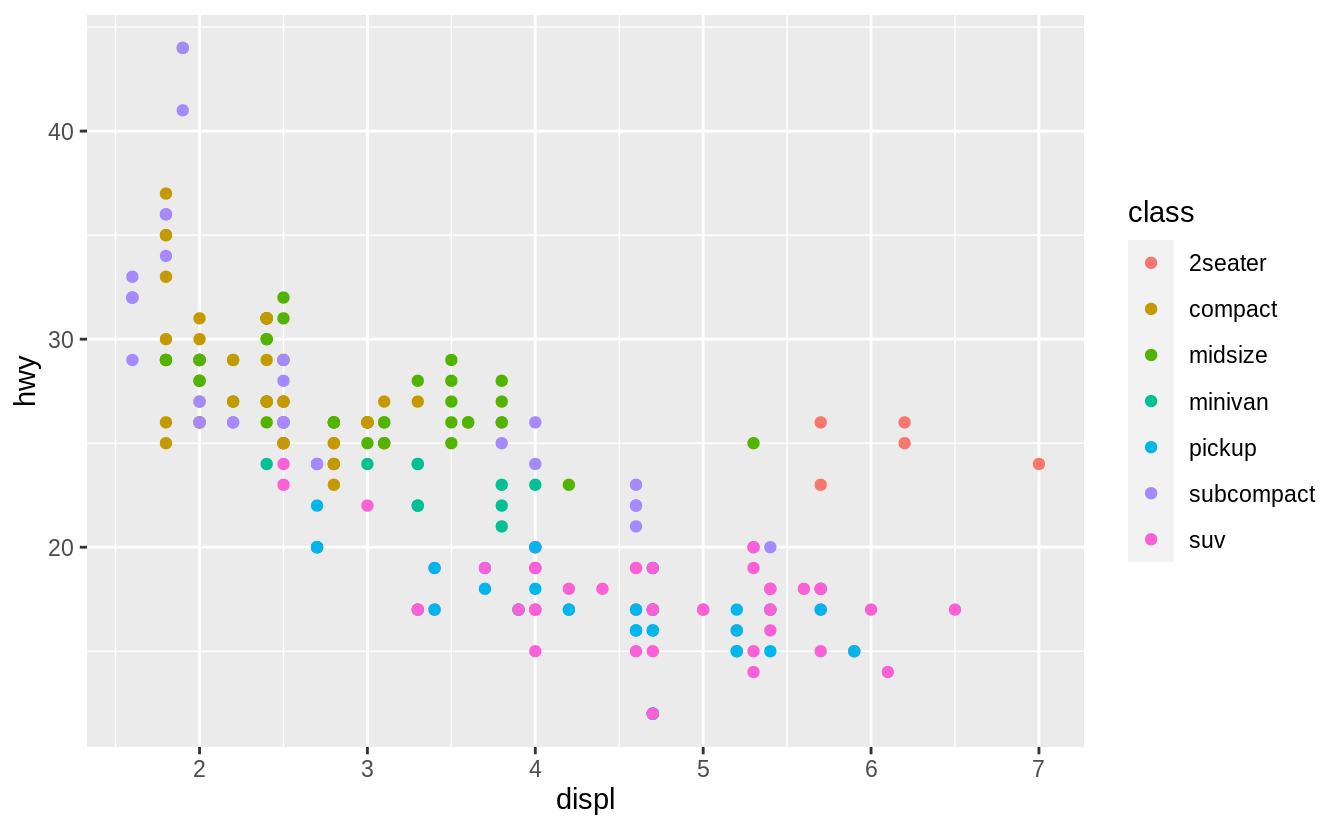
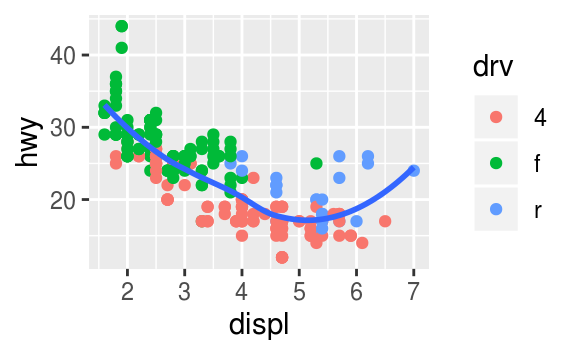
In the following plot the class variable is mapped to color.
Advantages of encoding class with facets instead of color include the ability to encode more distinct categories.
For me, it is difficult to distinguish between the colors of "midsize" and "minivan".
Given human visual perception, the max number of colors to use when encoding unordered categorical (qualitative) data is nine, and in practice, often much less than that. Displaying observations from different categories on different scales makes it difficult to directly compare values of observations across categories. However, it can make it easier to compare the shape of the relationship between the x and y variables across categories.
Disadvantages of encoding the class variable with facets instead of the color aesthetic include the difficulty of comparing the values of observations between categories since the observations for each category are on different plots.
Using the same x- and y-scales for all facets makes it easier to compare values of observations across categories, but it is still more difficult than if they had been displayed on the same plot.
Since encoding class within color also places all points on the same plot,
it visualizes the unconditional relationship between the x and y variables;
with facets, the unconditional relationship is no longer visualized since the
points are spread across multiple plots.
The benefit of encoding a variable with facetting over encoding it with color increase in both the number of points and the number of categories.
With a large number of points, there is often overlap.
It is difficult to handle overlapping points with different colors color.
Jittering will still work with color.
But jittering will only work well if there are few points and the classes do not overlap much, otherwise, the colors of areas will no longer be distinct, and it will be hard to pick out the patterns of different categories visually.
Transparency (alpha) does not work well with colors since the mixing of overlapping transparent colors will no longer represent the colors of the categories.
Binning methods already use color to encode the density of points in the bin, so color cannot be used to encode categories.
As the number of categories increases, the difference between colors decreases, to the point that the color of categories will no longer be visually distinct.
Exercise 3.5.5
Read ?facet_wrap.
What does nrow do? What does ncol do?
What other options control the layout of the individual panels?
Why doesn’t facet_grid() have nrow and ncol variables?
The arguments nrow (ncol) determines the number of rows (columns) to use when laying out the facets.
It is necessary since facet_wrap() only facets on one variable.
The nrow and ncol arguments are unnecessary for facet_grid() since the number of unique values of the variables specified in the function determines the number of rows and columns.
Exercise 3.5.6
When using facet_grid() you should usually put the variable with more unique levels in the columns.
Why?
There will be more space for columns if the plot is laid out horizontally (landscape).
3.6 Geometric objects
Exercise 3.6.1
What geom would you use to draw a line chart? A boxplot? A histogram? An area chart?
- line chart:
geom_line() - boxplot:
geom_boxplot() - histogram:
geom_histogram() - area chart:
geom_area()
Exercise 3.6.2
Run this code in your head and predict what the output will look like. Then, run the code in R and check your predictions.
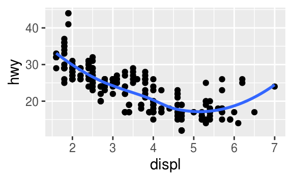
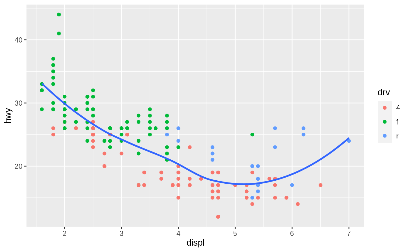
ggplot(data = mpg, mapping = aes(x = displ, y = hwy, colour = drv)) +
  geom_point() +
  geom_smooth(se = FALSE)
#> `geom_smooth()` using method = 'loess' and formula 'y ~ x'
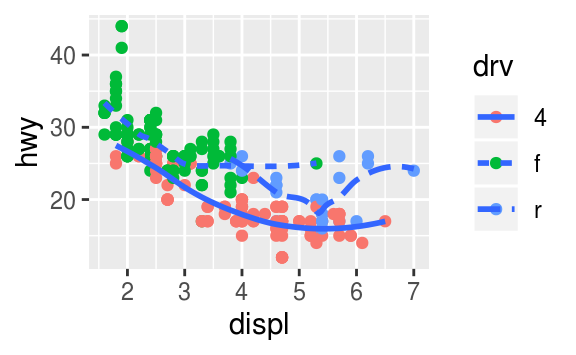
This code produces a scatter plot with displ on the x-axis, hwy on the y-axis, and the points colored by drv.
There will be a smooth line, without standard errors, fit through each drv group.
ggplot(data = mpg, mapping = aes(x = displ, y = hwy, colour = drv)) +
  geom_point() +
  geom_smooth(se = FALSE)
#> `geom_smooth()` using method = 'loess' and formula 'y ~ x'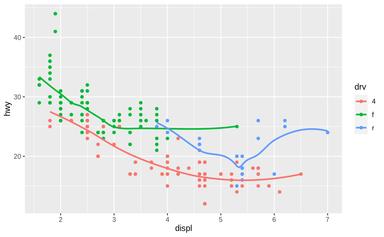
Exercise 3.6.3
What does show.legend = FALSE do?
What happens if you remove it?
Why do you think I used it earlier in the chapter?
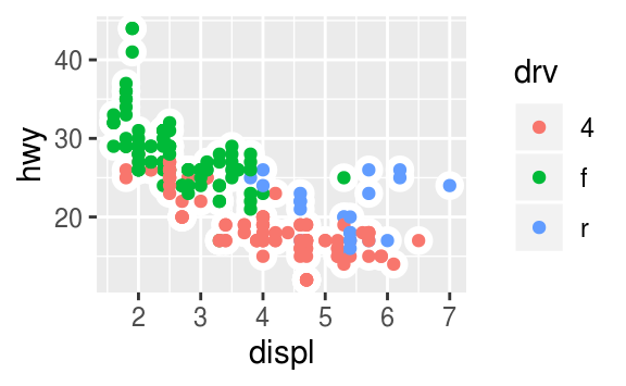
The theme option show.legend = FALSE hides the legend box.
Consider this example earlier in the chapter.
ggplot(data = mpg) +
  geom_smooth(
    mapping = aes(x = displ, y = hwy, colour = drv),
    show.legend = FALSE
  )
#> `geom_smooth()` using method = 'loess' and formula 'y ~ x'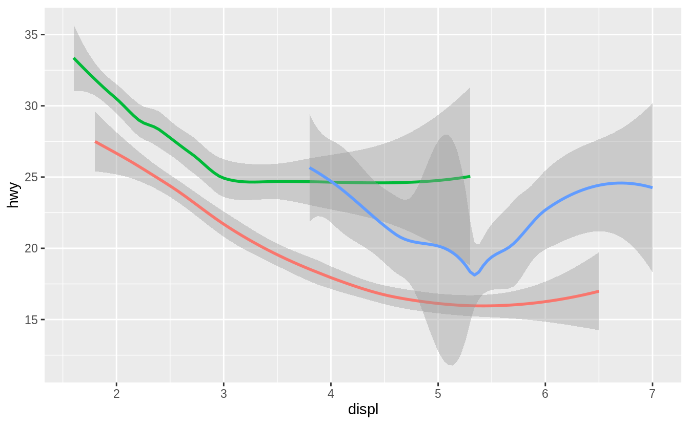
In that plot, there is no legend.
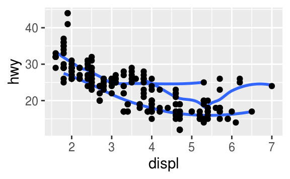
Removing the show.legend argument or setting show.legend = TRUE will result in the plot having a legend displaying the mapping between colors and drv.
ggplot(data = mpg) +
  geom_smooth(mapping = aes(x = displ, y = hwy, colour = drv))
#> `geom_smooth()` using method = 'loess' and formula 'y ~ x'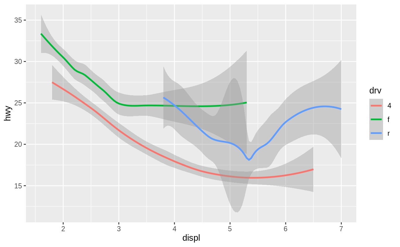
In the chapter, the legend is suppressed because with three plots,
adding a legend to only the last plot would make the sizes of plots different.
Different sized plots would make it more difficult to see how arguments change the appearance of the plots.
The purpose of those plots is to show the difference between no groups, using a group aesthetic, and using a color aesthetic, which creates implicit groups.
In that example, the legend isn’t necessary since looking up the values associated with each color isn’t necessary to make that point.
Exercise 3.6.4
What does the se argument to geom_smooth() do?
It adds standard error bands to the lines.
ggplot(data = mpg, mapping = aes(x = displ, y = hwy, colour = drv)) +
  geom_point() +
  geom_smooth(se = TRUE)
#> `geom_smooth()` using method = 'loess' and formula 'y ~ x'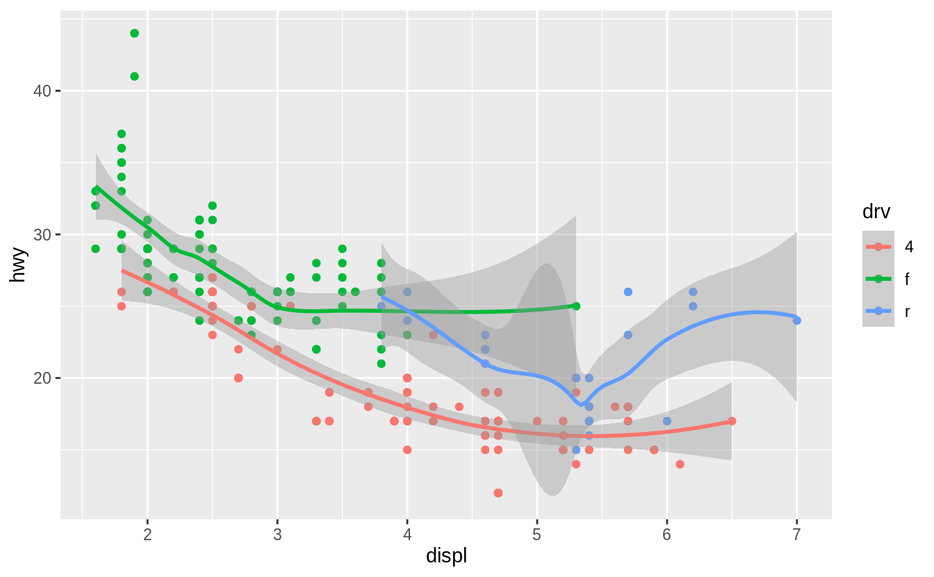
By default se = TRUE:
ggplot(data = mpg, mapping = aes(x = displ, y = hwy, colour = drv)) +
  geom_point() +
  geom_smooth()
#> `geom_smooth()` using method = 'loess' and formula 'y ~ x'
Exercise 3.6.5
Will these two graphs look different? Why/why not?
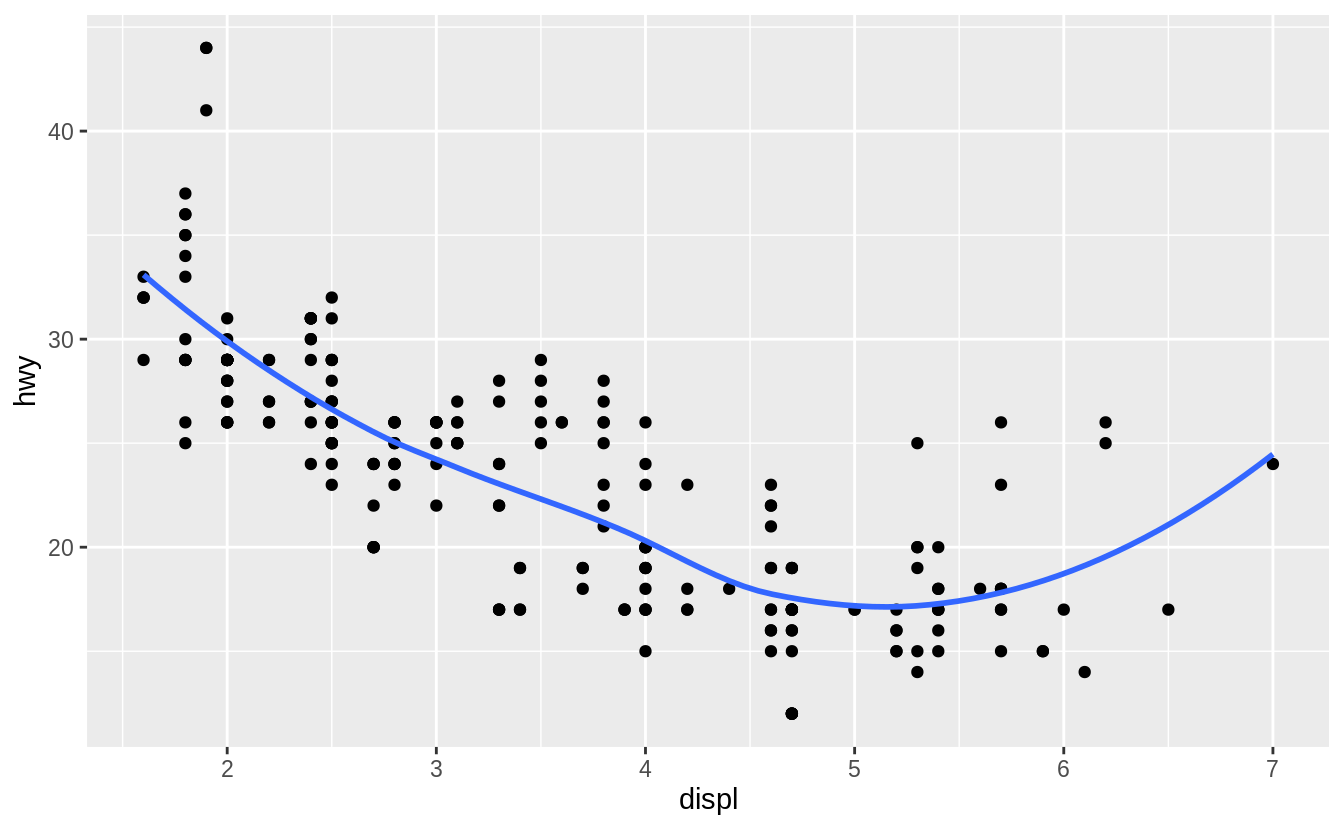
No. Because both geom_point() and geom_smooth() will use the same data and mappings.
They will inherit those options from the ggplot() object, so the mappings don’t need to specified again.
ggplot(data = mpg, mapping = aes(x = displ, y = hwy)) +
  geom_point() +
  geom_smooth()
#> `geom_smooth()` using method = 'loess' and formula 'y ~ x'
ggplot() +
  geom_point(data = mpg, mapping = aes(x = displ, y = hwy)) +
  geom_smooth(data = mpg, mapping = aes(x = displ, y = hwy))
#> `geom_smooth()` using method = 'loess' and formula 'y ~ x'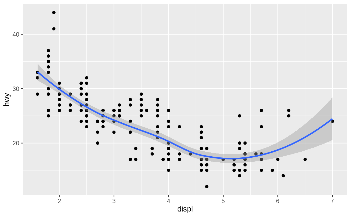
Exercise 3.6.6
Recreate the R code necessary to generate the following graphs.
The following code will generate those plots.
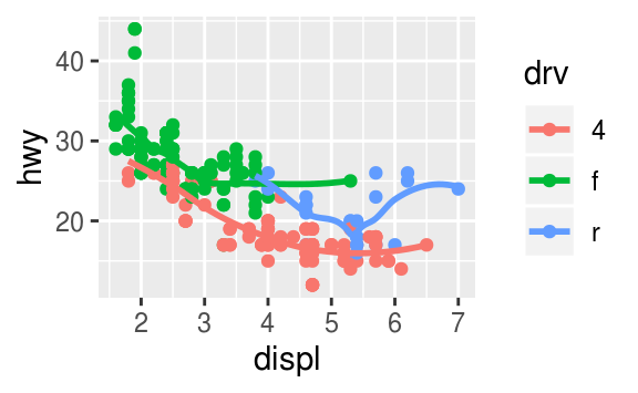
ggplot(mpg, aes(x = displ, y = hwy)) +
  geom_smooth(mapping = aes(group = drv), se = FALSE) +
  geom_point()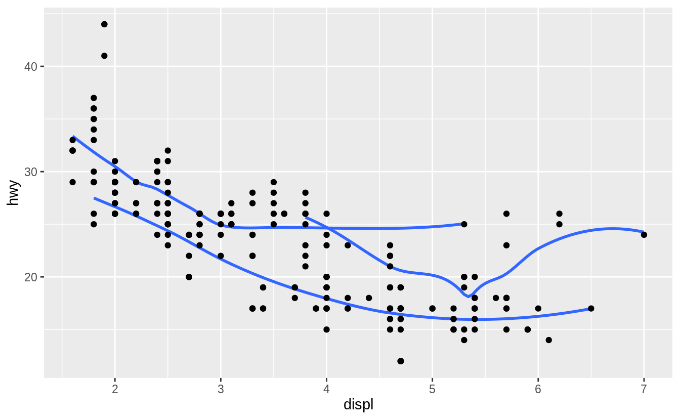

ggplot(mpg, aes(x = displ, y = hwy)) +
  geom_point(aes(colour = drv)) +
  geom_smooth(aes(linetype = drv), se = FALSE)
#> `geom_smooth()` using method = 'loess' and formula 'y ~ x'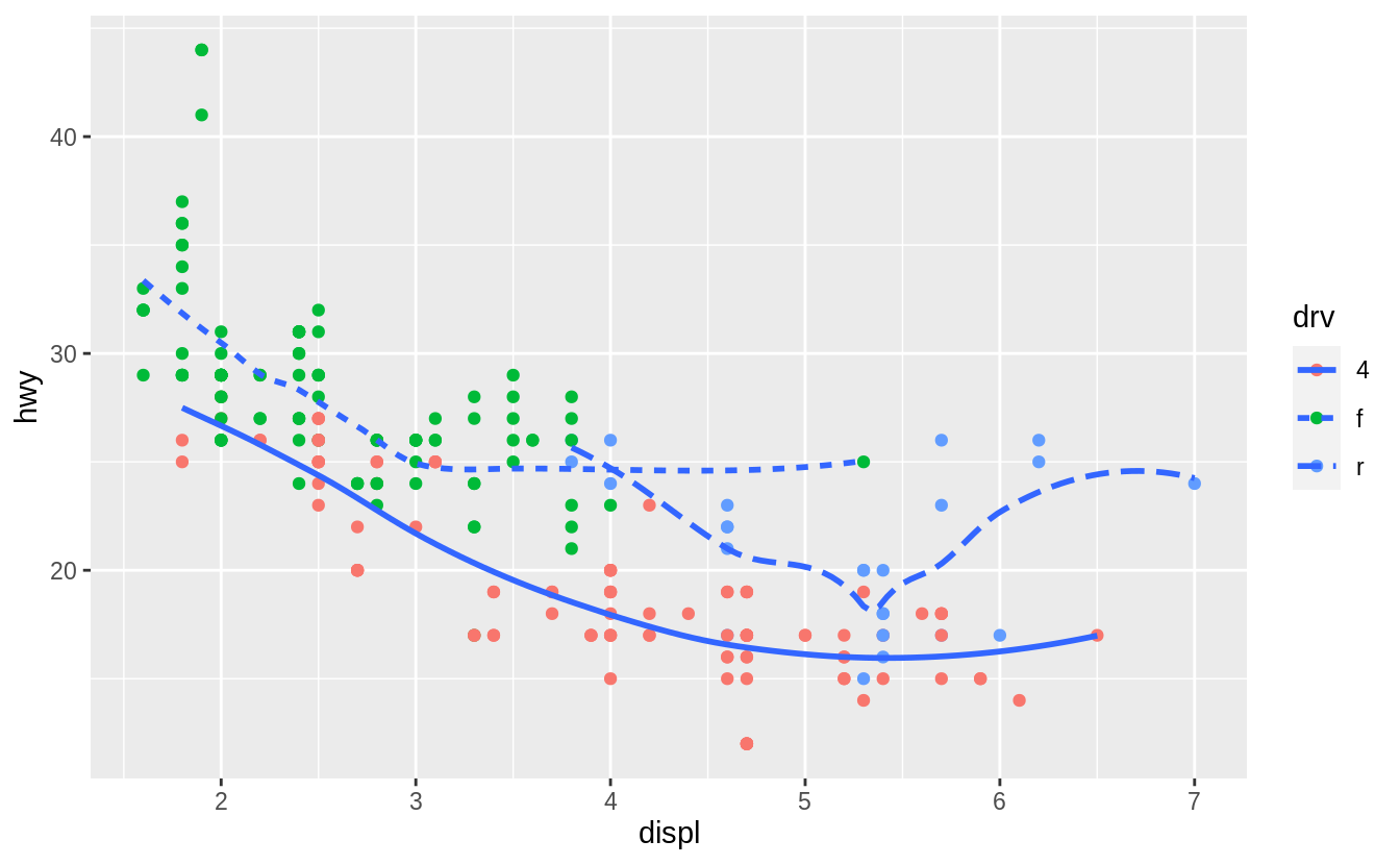
ggplot(mpg, aes(x = displ, y = hwy)) +
  geom_point(size = 4, color = "white") +
  geom_point(aes(colour = drv))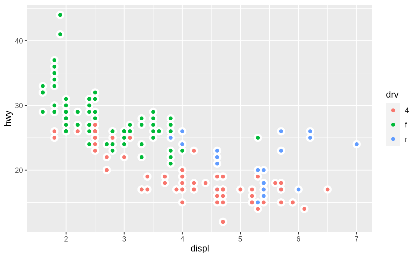
3.7 Statistical transformations
Exercise 3.7.1
What is the default geom associated with stat_summary()?
How could you rewrite the previous plot to use that geom function instead of the stat function?
The “previous plot” referred to in the question is the following.
ggplot(data = diamonds) +
stat_summary(
mapping = aes(x = cut, y = depth),
fun.min = min,
fun.max = max,
fun = median
)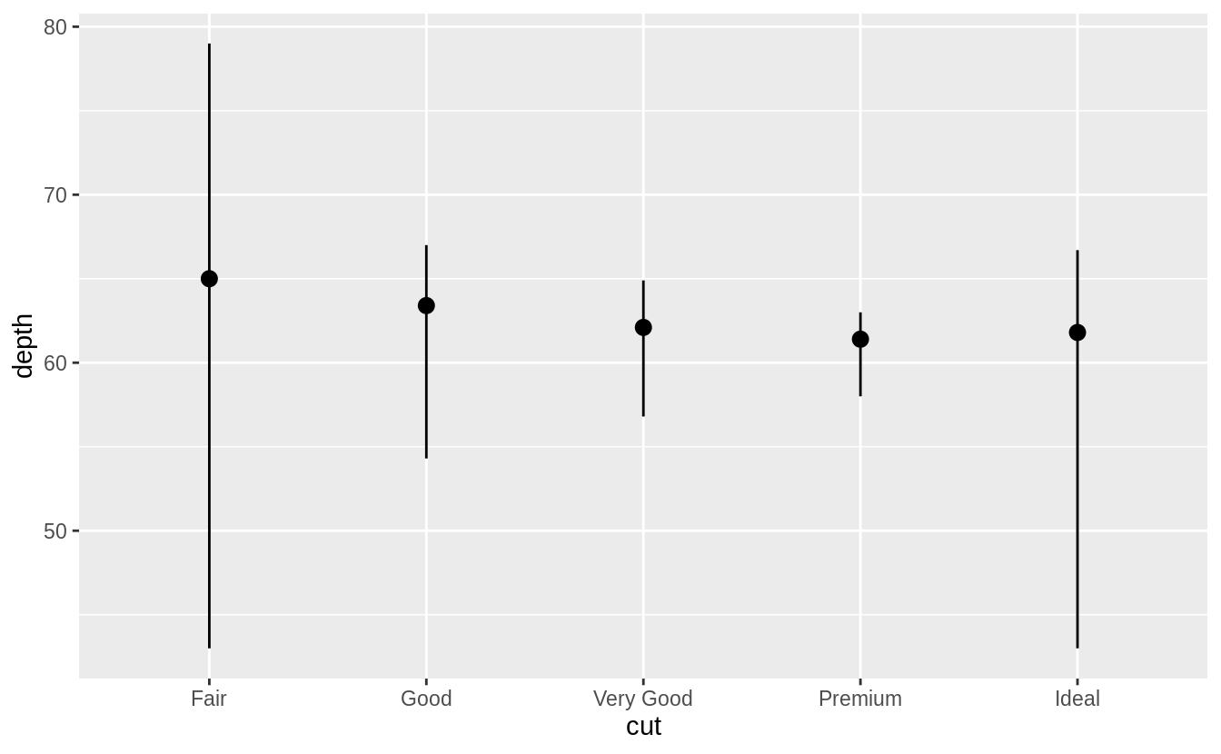 The arguments
 fun.ymin, fun.ymax, and fun.y have been deprecated and replaced with fun.min, fun.max, and fun in ggplot2 v 3.3.0.
The default geom for stat_summary() is geom_pointrange().
The default stat for geom_pointrange() is identity() but we can add the argument stat = "summary" to use stat_summary() instead of stat_identity().
ggplot(data = diamonds) +
  geom_pointrange(
    mapping = aes(x = cut, y = depth),
    stat = "summary"
  )
#> No summary function supplied, defaulting to `mean_se()`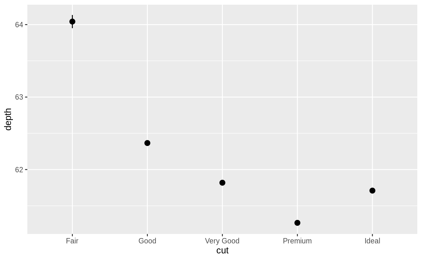
The resulting message says that stat_summary() uses the mean and sd to calculate the middle point and endpoints of the line.
However, in the original plot the min and max values were used for the endpoints.
To recreate the original plot we need to specify values for fun.min, fun.max, and fun.
ggplot(data = diamonds) +
  geom_pointrange(
    mapping = aes(x = cut, y = depth),
    stat = "summary",
    fun.min = min,
    fun.max = max,
    fun = median
  )
Exercise 3.7.2
What does geom_col() do? How is it different to geom_bar()?
The geom_col() function has different default stat than geom_bar().
The default stat of geom_col() is stat_identity(), which leaves the data as is.
The geom_col() function expects that the data contains x values and y values which represent the bar height.
The default stat of geom_bar() is stat_count().
The geom_bar() function only expects an x variable.
The stat, stat_count(), preprocesses input data by counting the number of observations for each value of x.
The y aesthetic uses the values of these counts.
Exercise 3.7.3
Most geoms and stats come in pairs that are almost always used in concert. Read through the documentation and make a list of all the pairs. What do they have in common?
The following tables lists the pairs of geoms and stats that are almost always used in concert.
| geom | stat |
|---|---|
geom_bar() |
stat_count() |
geom_bin2d() |
stat_bin_2d() |
geom_boxplot() |
stat_boxplot() |
geom_contour_filled() |
stat_contour_filled() |
geom_contour() |
stat_contour() |
geom_count() |
stat_sum() |
geom_density_2d() |
stat_density_2d() |
geom_density() |
stat_density() |
geom_dotplot() |
stat_bindot() |
geom_function() |
stat_function() |
geom_sf() |
stat_sf() |
geom_sf() |
stat_sf() |
geom_smooth() |
stat_smooth() |
geom_violin() |
stat_ydensity() |
geom_hex() |
stat_bin_hex() |
geom_qq_line() |
stat_qq_line() |
geom_qq() |
stat_qq() |
geom_quantile() |
stat_quantile() |
These pairs of geoms and stats tend to have their names in common, such stat_smooth() and geom_smooth() and be documented on the same help page.
The pairs of geoms and stats that are used in concert often have each other as the default stat (for a geom) or geom (for a stat).
The following tables contain the geoms and stats in ggplot2 and their defaults as of version 3.3.0.
Many geoms have stat_identity() as the default stat.
| geom | default stat | shared docs |
|---|---|---|
geom_abline() |
stat_identity() |
|
geom_area() |
stat_identity() |
|
geom_bar() |
stat_count() |
x |
geom_bin2d() |
stat_bin_2d() |
x |
geom_blank() |
None | |
geom_boxplot() |
stat_boxplot() |
x |
geom_col() |
stat_identity() |
|
geom_count() |
stat_sum() |
x |
geom_countour_filled() |
stat_countour_filled() |
x |
geom_countour() |
stat_countour() |
x |
geom_crossbar() |
stat_identity() |
|
geom_curve() |
stat_identity() |
|
geom_density_2d_filled() |
stat_density_2d_filled() |
x |
geom_density_2d() |
stat_density_2d() |
x |
geom_density() |
stat_density() |
x |
geom_dotplot() |
stat_bindot() |
x |
geom_errorbar() |
stat_identity() |
|
geom_errorbarh() |
stat_identity() |
|
geom_freqpoly() |
stat_bin() |
x |
geom_function() |
stat_function() |
x |
geom_hex() |
stat_bin_hex() |
x |
geom_histogram() |
stat_bin() |
x |
geom_hline() |
stat_identity() |
|
geom_jitter() |
stat_identity() |
|
geom_label() |
stat_identity() |
|
geom_line() |
stat_identity() |
|
geom_linerange() |
stat_identity() |
|
geom_map() |
stat_identity() |
|
geom_path() |
stat_identity() |
|
geom_point() |
stat_identity() |
|
geom_pointrange() |
stat_identity() |
|
geom_polygon() |
stat_identity() |
|
geom_qq_line() |
stat_qq_line() |
x |
geom_qq() |
stat_qq() |
x |
geom_quantile() |
stat_quantile() |
x |
geom_raster() |
stat_identity() |
|
geom_rect() |
stat_identity() |
|
geom_ribbon() |
stat_identity() |
|
geom_rug() |
stat_identity() |
|
geom_segment() |
stat_identity() |
|
geom_sf_label() |
stat_sf_coordinates() |
x |
geom_sf_text() |
stat_sf_coordinates() |
x |
geom_sf() |
stat_sf() |
x |
geom_smooth() |
stat_smooth() |
x |
geom_spoke() |
stat_identity() |
|
geom_step() |
stat_identity() |
|
geom_text() |
stat_identity() |
|
geom_tile() |
stat_identity() |
|
geom_violin() |
stat_ydensity() |
x |
geom_vline() |
stat_identity() |
| stat | default geom | shared docs |
|---|---|---|
stat_bin_2d() |
geom_tile() |
|
stat_bin_hex() |
geom_hex() |
x |
stat_bin() |
geom_bar() |
x |
stat_boxplot() |
geom_boxplot() |
x |
stat_count() |
geom_bar() |
x |
stat_countour_filled() |
geom_contour_filled() |
x |
stat_countour() |
geom_contour() |
x |
stat_density_2d_filled() |
geom_density_2d() |
x |
stat_density_2d() |
geom_density_2d() |
x |
stat_density() |
geom_area() |
|
stat_ecdf() |
geom_step() |
|
stat_ellipse() |
geom_path() |
|
stat_function() |
geom_function() |
x |
stat_function() |
geom_path() |
|
stat_identity() |
geom_point() |
|
stat_qq_line() |
geom_path() |
|
stat_qq() |
geom_point() |
|
stat_quantile() |
geom_quantile() |
x |
stat_sf_coordinates() |
geom_point() |
|
stat_sf() |
geom_rect() |
|
stat_smooth() |
geom_smooth() |
x |
stat_sum() |
geom_point() |
|
stat_summary_2d() |
geom_tile() |
|
stat_summary_bin() |
geom_pointrange() |
|
stat_summary_hex() |
geom_hex() |
|
stat_summary() |
geom_pointrange() |
|
stat_unique() |
geom_point() |
|
stat_ydensity() |
geom_violin() |
x |
Exercise 3.7.4
What variables does stat_smooth() compute?
What parameters control its behavior?
The function stat_smooth() calculates the following variables:
-
y: predicted value -
ymin: lower value of the confidence interval -
ymax: upper value of the confidence interval -
se: standard error
The “Computed Variables” section of the stat_smooth() documentation contains these variables.
The parameters that control the behavior of stat_smooth() include:
method: This is the method used to compute the smoothing line. IfNULL, a default method is used based on the sample size:stats::loess()when there are less than 1,000 observations in a group, andmgcv::gam()withformula = y ~ s(x, bs = "CS)otherwise. Alternatively, the user can provide a character vector with a function name, e.g."lm","loess", or a function, e.g.MASS::rlm.formula: When providing a custommethodargument, the formula to use. The default isy ~ x. For example, to use the line implied bylm(y ~ x + I(x ^ 2) + I(x ^ 3)), usemethod = "lm"ormethod = lmandformula = y ~ x + I(x ^ 2) + I(x ^ 3).method.arg(): Arguments other than than the formula, which is already specified in theformulaargument, to pass to the function inmethod`.se: IfTRUE, display standard error bands, ifFALSEonly display the line.na.rm: IfFALSE, missing values are removed with a warning, ifTRUEthe are silently removed. The default isFALSEin order to make debugging easier. If missing values are known to be in the data, then can be ignored, but if missing values are not anticipated this warning can help catch errors.
TODO: Plots with examples illustrating the uses of these arguments.
Exercise 3.7.5
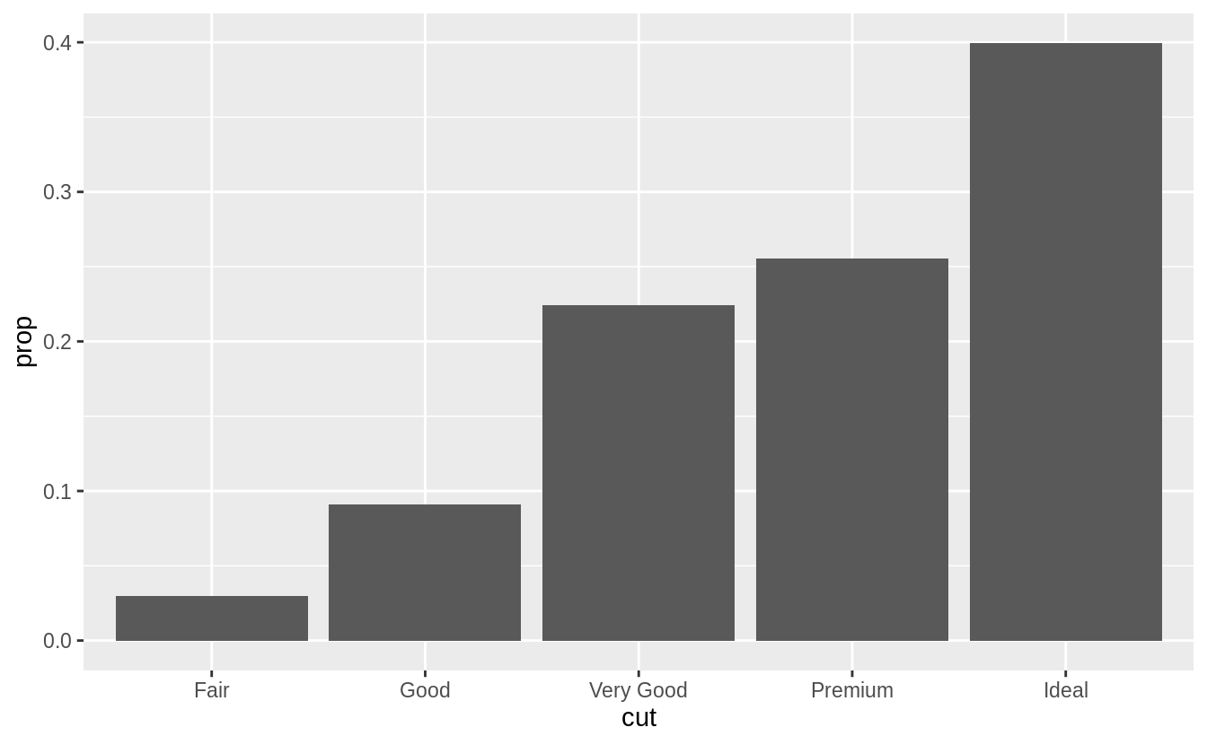
In our proportion bar chart, we need to set group = 1 Why?
In other words, what is the problem with these two graphs?
If group = 1 is not included, then all the bars in the plot will have the same height, a height of 1.
The function geom_bar() assumes that the groups are equal to the x values since the stat computes the counts within the group.

The problem with these two plots is that the proportions are calculated within the groups.
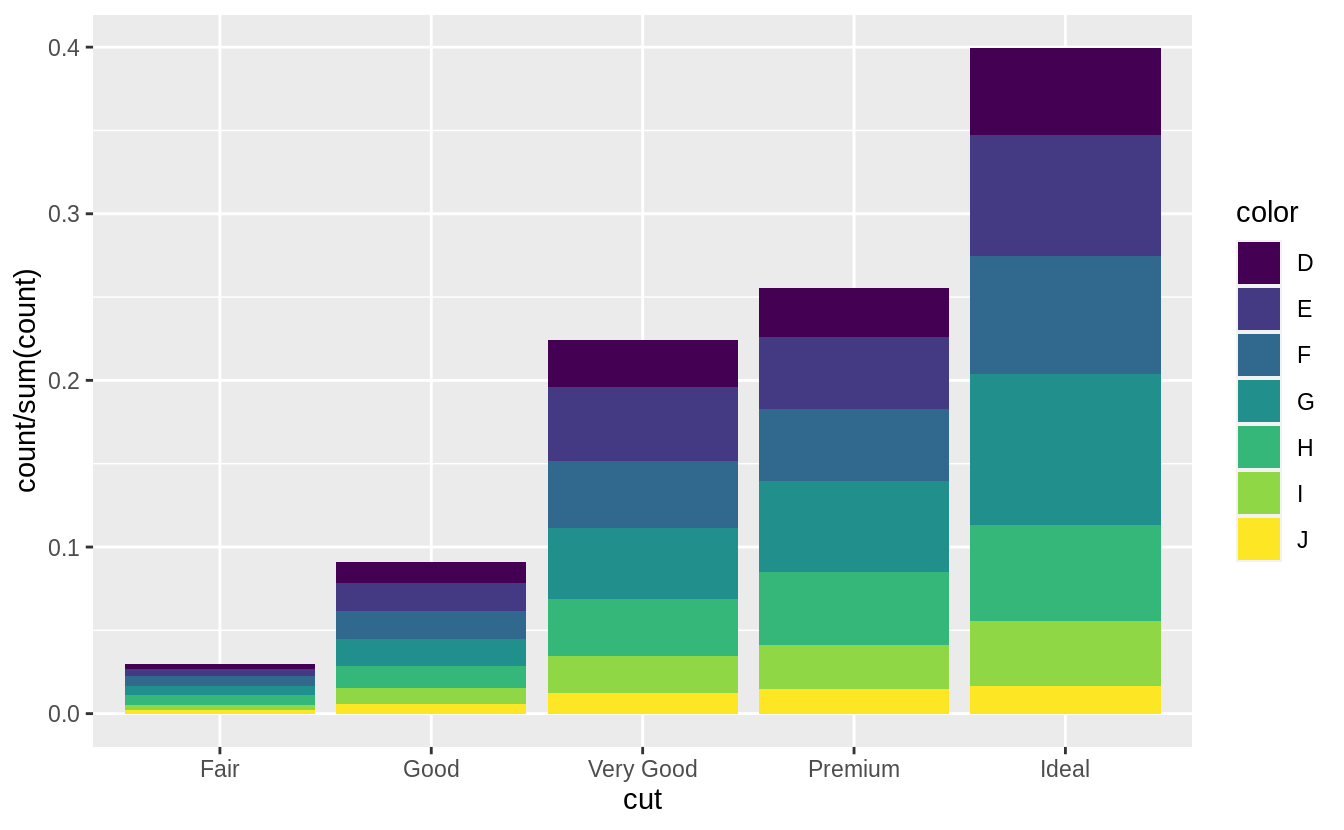
ggplot(data = diamonds) +
  geom_bar(mapping = aes(x = cut, y = ..prop..))
ggplot(data = diamonds) +
geom_bar(mapping = aes(x = cut, fill = color, y = ..prop..))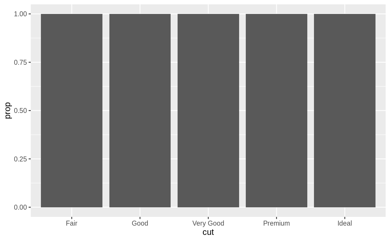
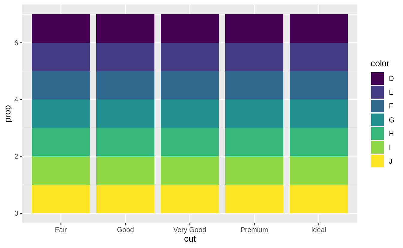
The following code will produce the intended stacked bar charts for the case with no fill aesthetic.
With the fill aesthetic, the heights of the bars need to be normalized.
3.8 Position adjustments
Exercise 3.8.1
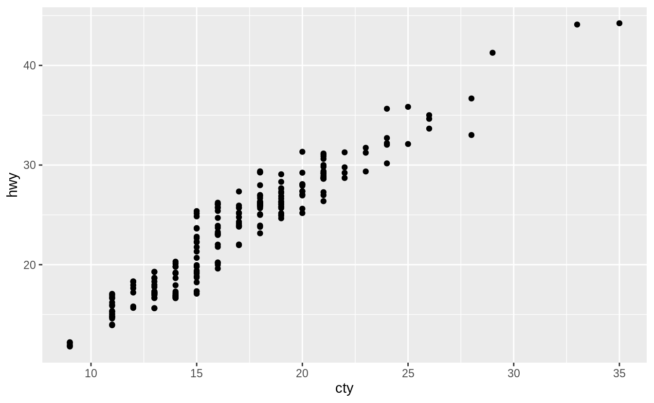
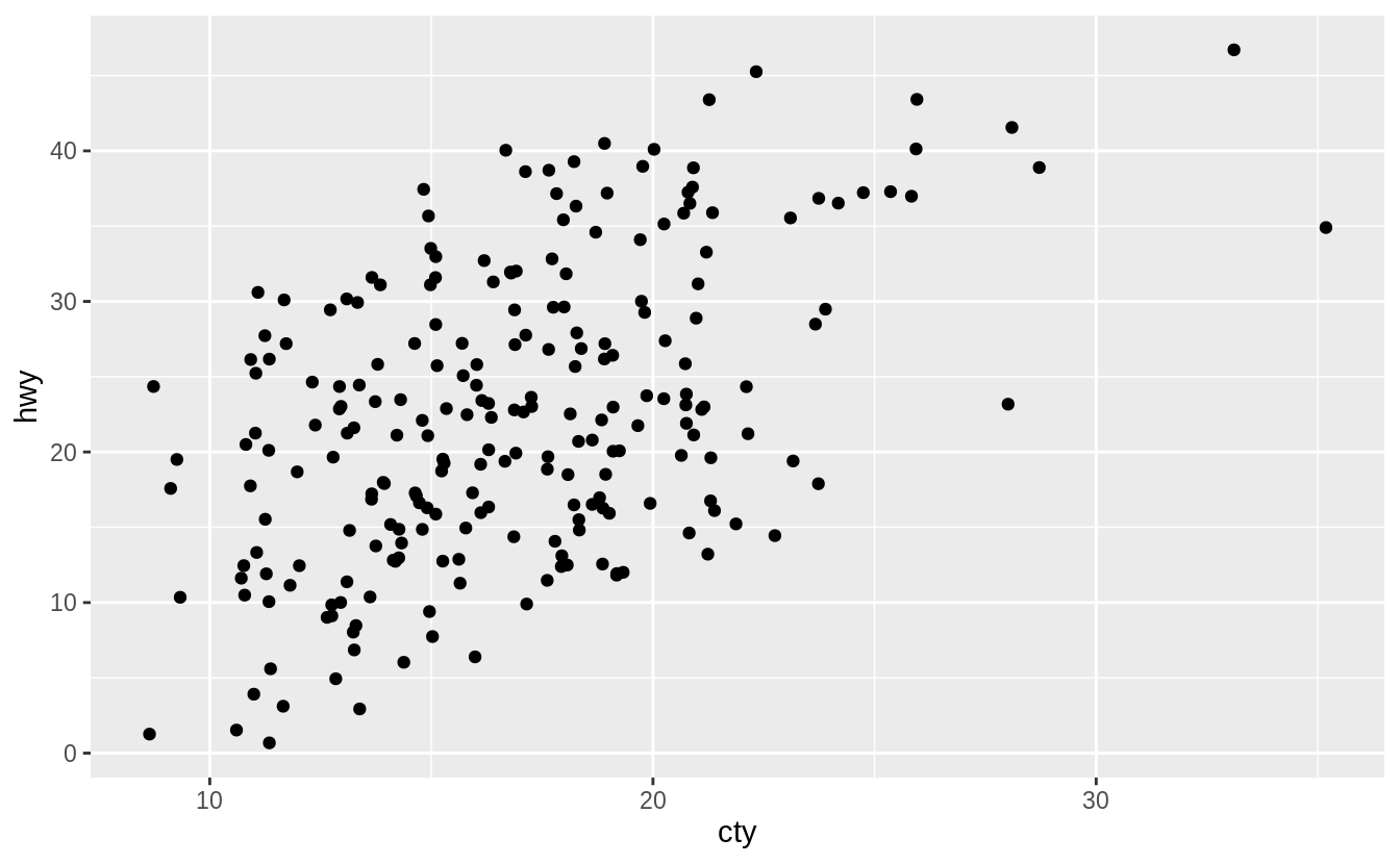
What is the problem with this plot? How could you improve it?

There is overplotting because there are multiple observations for each combination of cty and hwy values.
I would improve the plot by using a jitter position adjustment to decrease overplotting.

The relationship between cty and hwy is clear even without jittering the points
but jittering shows the locations where there are more observations.
Exercise 3.8.2
What parameters to geom_jitter() control the amount of jittering?
From the geom_jitter() documentation, there are two arguments to jitter:
-
widthcontrols the amount of horizontal displacement, and -
heightcontrols the amount of vertical displacement.
The defaults values of width and height will introduce noise in both directions.
Here is what the plot looks like with the default values of height and width.

However, we can change these parameters.
Here are few a examples to understand how these parameters affect the amount of jittering.
Whenwidth = 0 there is no horizontal jitter.
When width = 20, there is too much horizontal jitter.
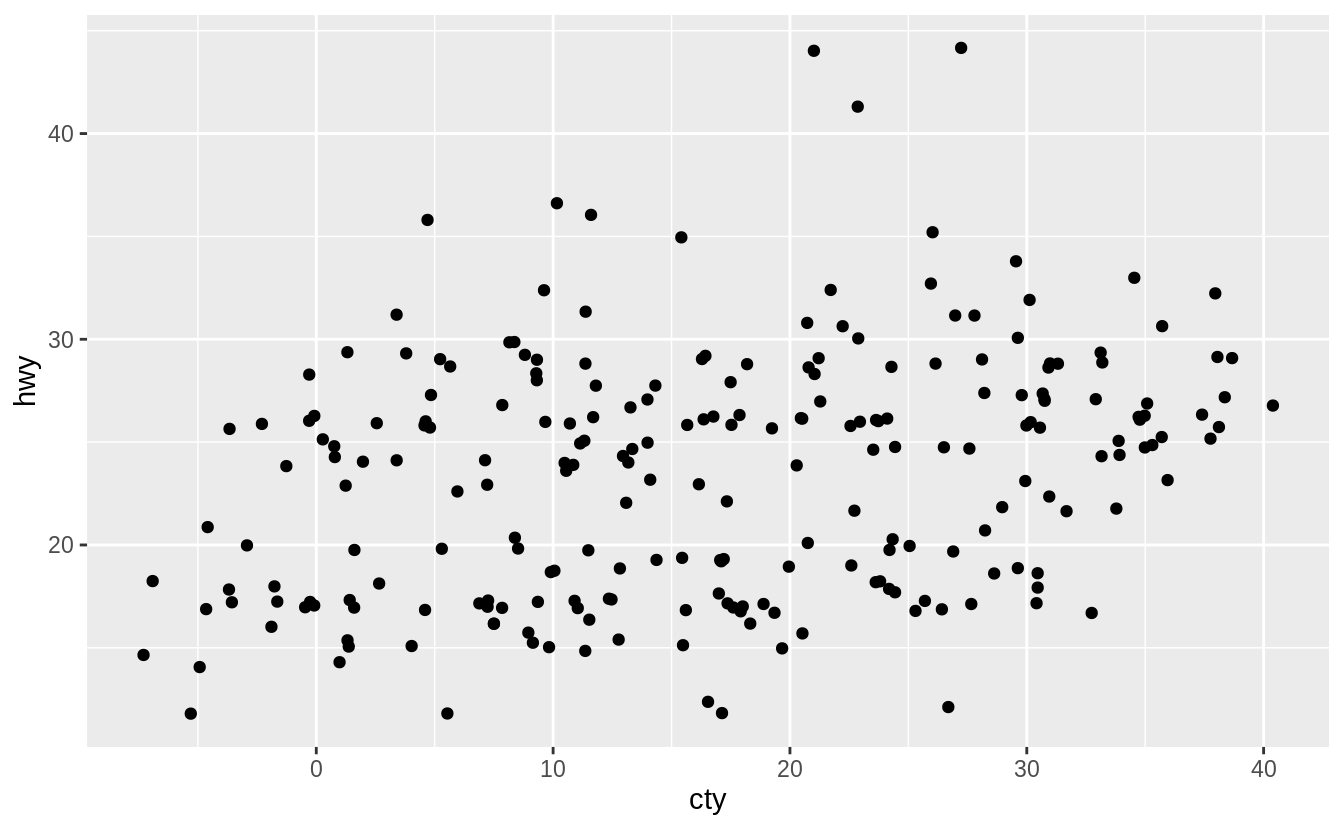
When height = 0, there is no vertical jitter.
When height = 15, there is too much vertical jitter.
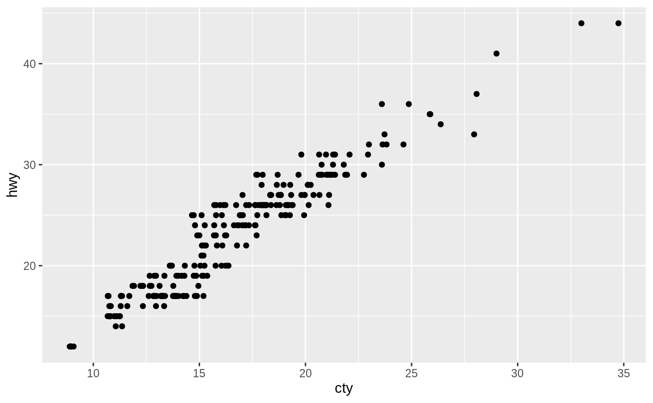
When width = 0 and height = 0, there is neither horizontal or vertical jitter,
and the plot produced is identical to the one produced with geom_point().
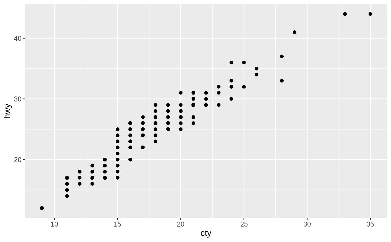
Note that the height and width arguments are in the units of the data.
Thus height = 1 (width = 1) corresponds to different relative amounts of jittering depending on the scale of the y (x) variable.
The default values of height and width are defined to be 80% of the resolution() of the data, which is the smallest non-zero distance between adjacent values of a variable.
When x and y are discrete variables,
their resolutions are both equal to 1, and height = 0.4 and width = 0.4 since the jitter moves points in both positive and negative directions.
The default values of height and width in geom_jitter() are non-zero, so unless both height and width are explicitly set set 0, there will be some jitter.

Exercise 3.8.3
Compare and contrast geom_jitter() with geom_count().
The geom geom_jitter() adds random variation to the locations points of the graph.
In other words, it “jitters” the locations of points slightly.
This method reduces overplotting since two points with the same location are unlikely to have the same random variation.

However, the reduction in overlapping comes at the cost of slightly changing the x and y values of the points.
The geom geom_count() sizes the points relative to the number of observations.
Combinations of (x, y) values with more observations will be larger than those with fewer observations.
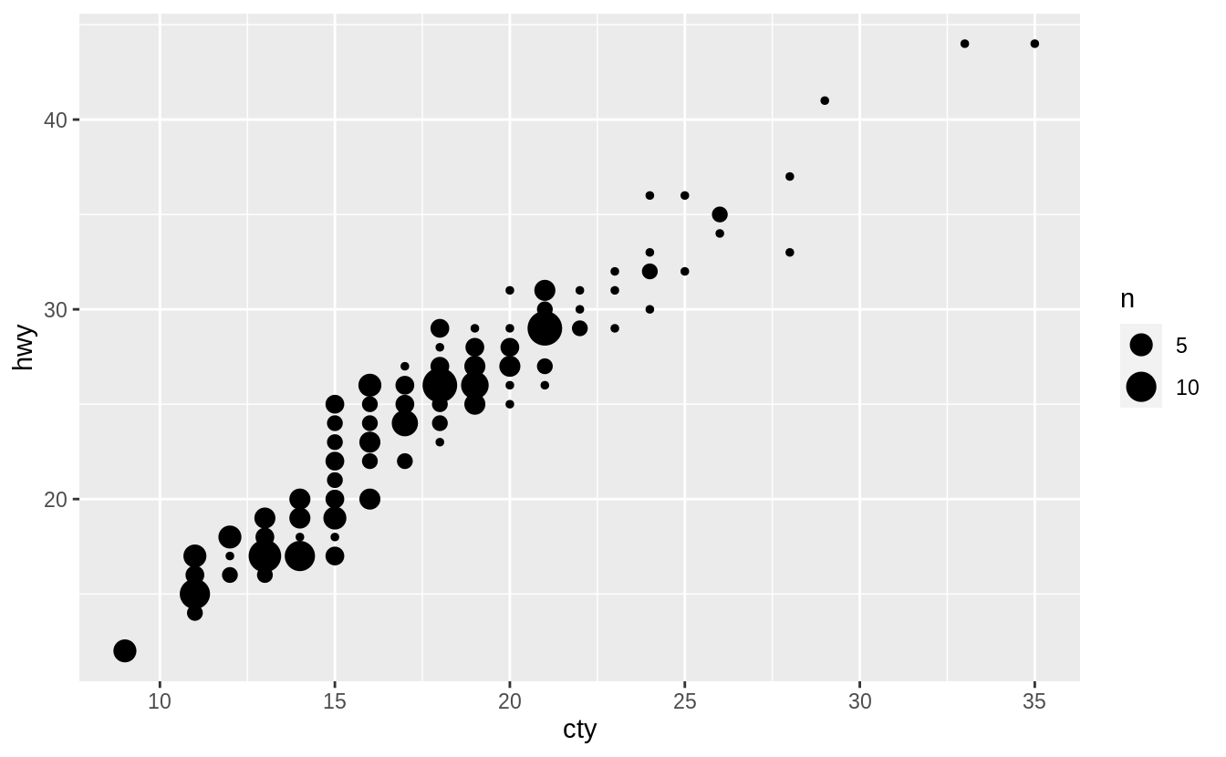
The geom_count() geom does not change x and y coordinates of the points.
However, if the points are close together and counts are large, the size of some
points can itself create overplotting.
For example, in the following example, a third variable mapped to color is added to the plot. In this case, geom_count() is less readable than geom_jitter() when adding a third variable as a color aesthetic.
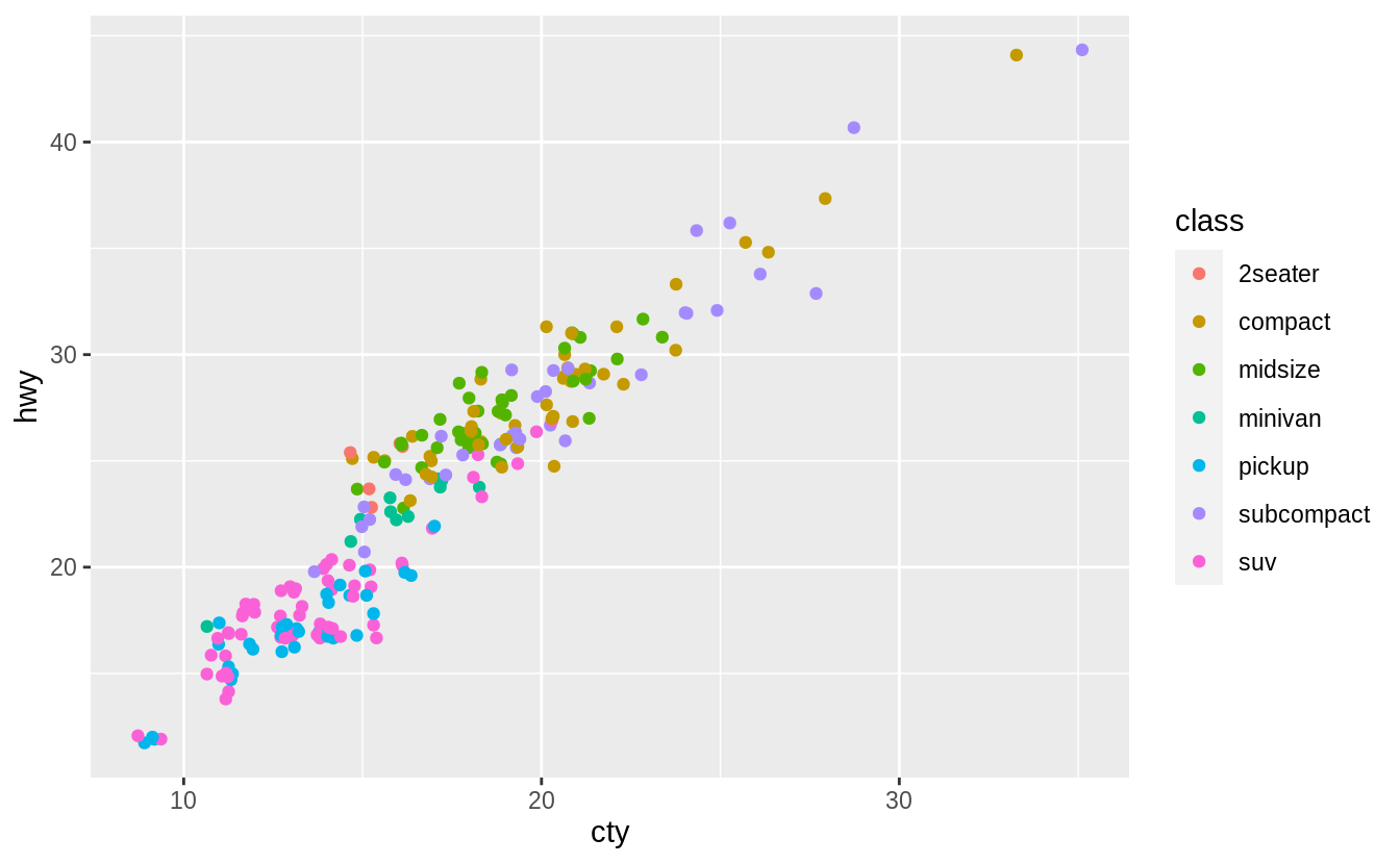
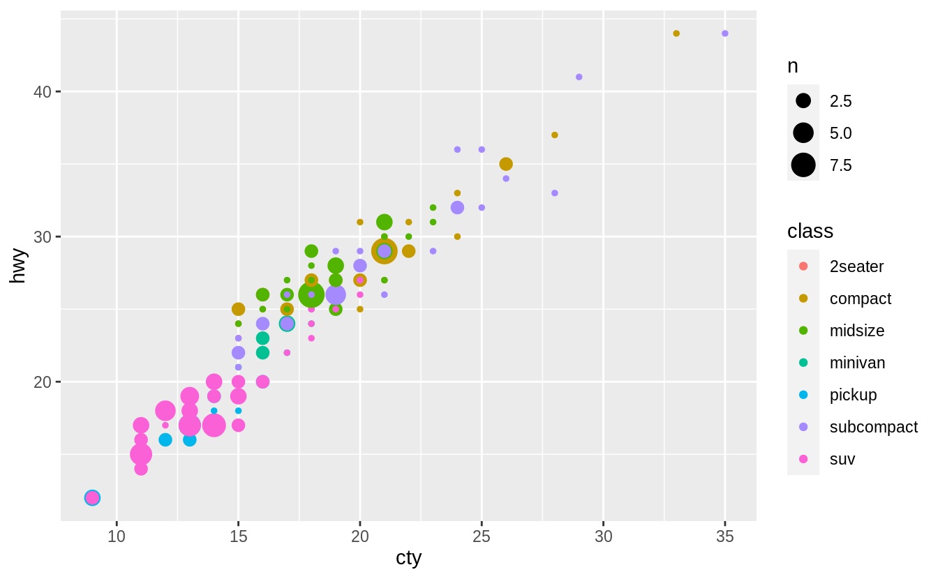
Combining geom_count() with jitter, which is specified with the position argument to geom_count() rather than its own geom, helps overplotting a little.
ggplot(data = mpg, mapping = aes(x = cty, y = hwy, color = class)) +
  geom_count(position = "jitter")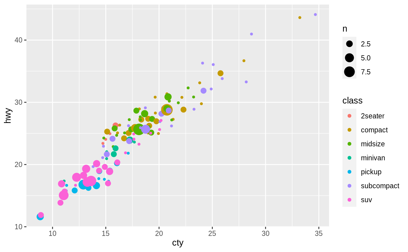
But as this example shows, unfortunately, there is no universal solution to overplotting. The costs and benefits of different approaches will depend on the structure of the data and the goal of the data scientist.
Exercise 3.8.4
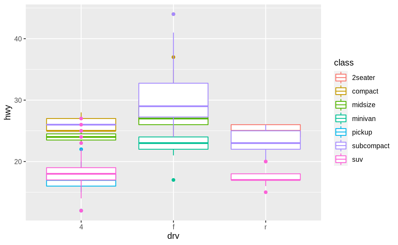
What’s the default position adjustment for geom_boxplot()?
Create a visualization of the mpg dataset that demonstrates it.
The default position for geom_boxplot() is "dodge2", which is a shortcut for position_dodge2.
This position adjustment does not change the vertical position of a geom but moves the geom horizontally to avoid overlapping other geoms.
See the documentation for position_dodge2() for additional discussion on how it works.
When we add colour = class to the box plot, the different levels of the drv variable are placed side by side, i.e., dodged.
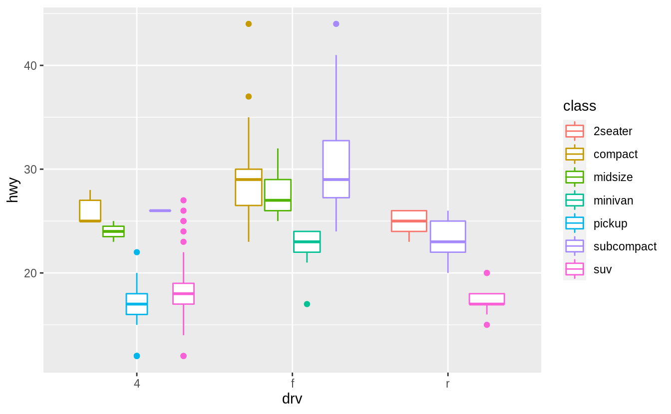 If
If position_identity() is used the boxplots overlap.
3.9 Coordinate systems
Exercise 3.9.1
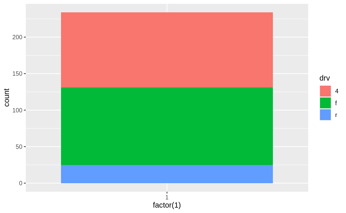
Turn a stacked bar chart into a pie chart using coord_polar().
A pie chart is a stacked bar chart with the addition of polar coordinates. Take this stacked bar chart with a single category.
Now add coord_polar(theta="y") to create pie chart.
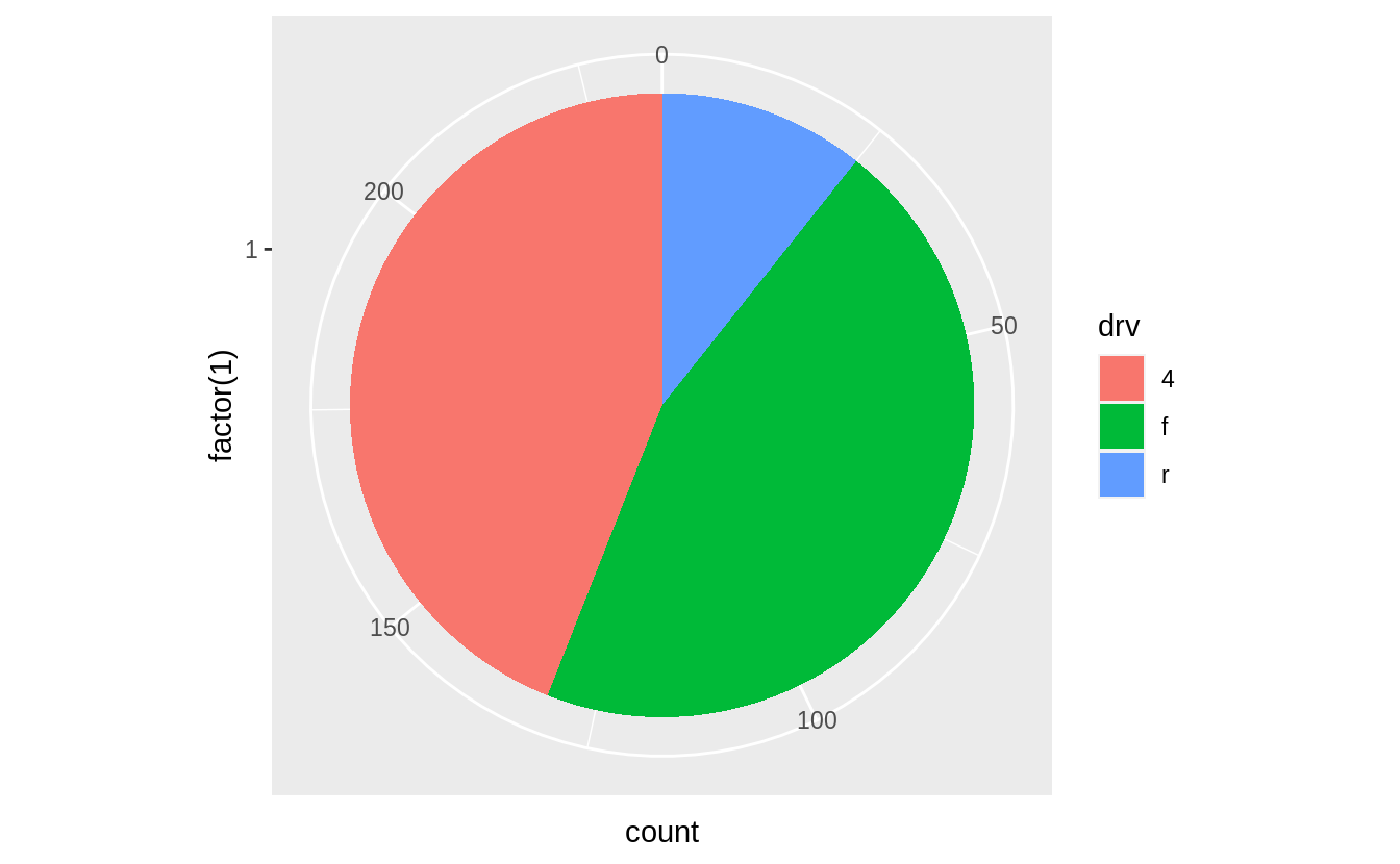
The argument theta = "y" maps y to the angle of each section.
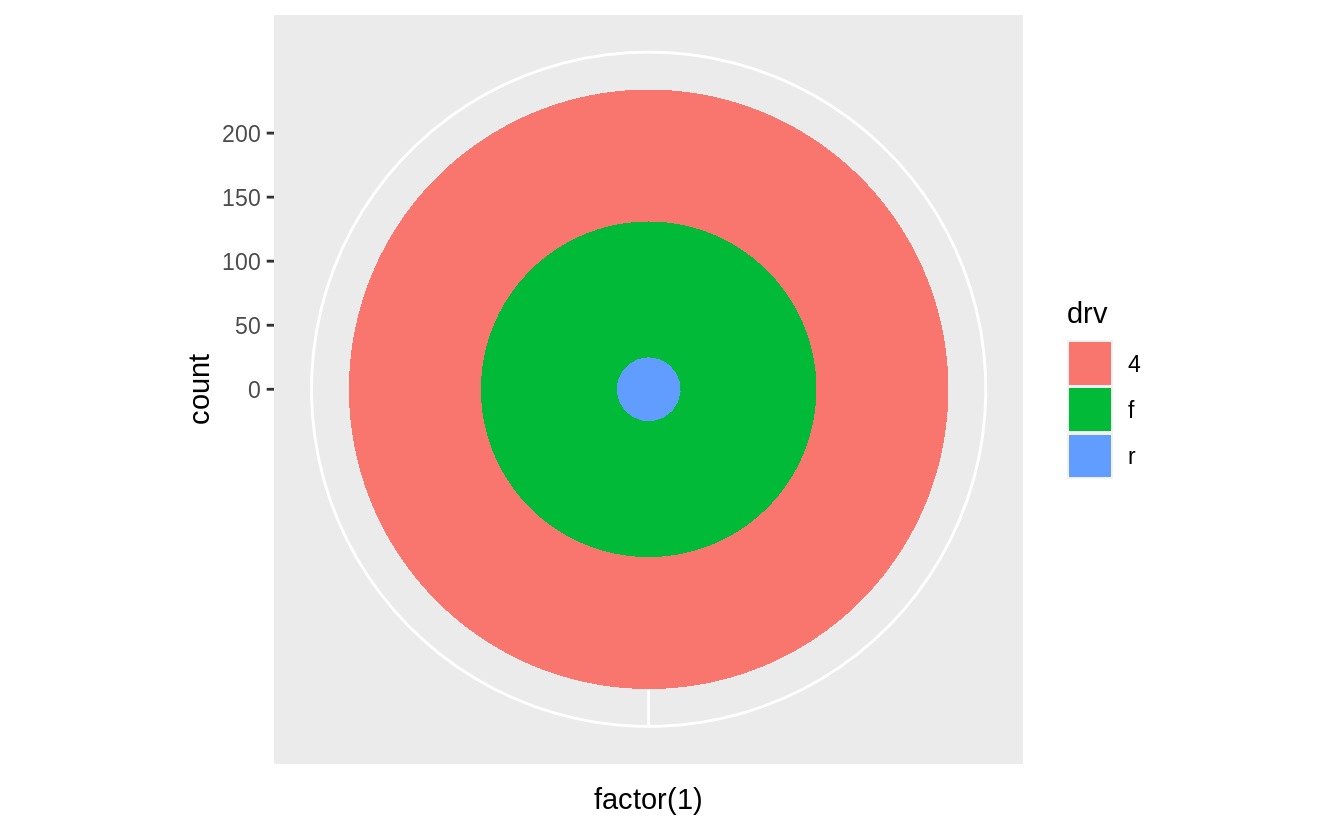
If coord_polar() is specified without theta = "y", then the resulting plot is called a bulls-eye chart.
Exercise 3.9.2
What does labs() do?
Read the documentation.
The labs function adds axis titles, plot titles, and a caption to the plot.
ggplot(data = mpg, mapping = aes(x = class, y = hwy)) +
  geom_boxplot() +
  coord_flip() +
  labs(y = "Highway MPG",
       x = "Class",
       title = "Highway MPG by car class",
       subtitle = "1999-2008",
       caption = "Source: http://fueleconomy.gov")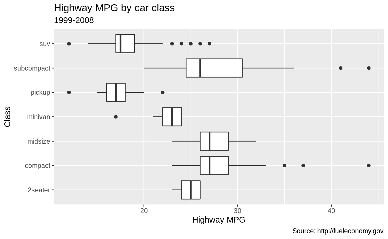
The arguments to labs() are optional, so you can add as many or as few of these as are needed.
ggplot(data = mpg, mapping = aes(x = class, y = hwy)) +
  geom_boxplot() +
  coord_flip() +
  labs(y = "Highway MPG",
       x = "Year",
       title = "Highway MPG by car class")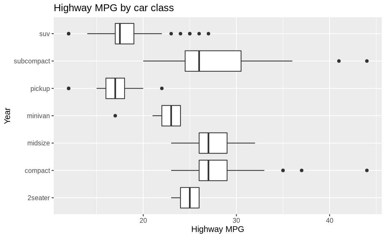
The labs() function is not the only function that adds titles to plots.
The xlab(), ylab(), and x- and y-scale functions can add axis titles.
The ggtitle() function adds plot titles.
Exercise 3.9.3
What’s the difference between coord_quickmap() and coord_map()?
The coord_map() function uses map projections to project the three-dimensional Earth onto a two-dimensional plane.
By default, coord_map() uses the Mercator projection.
This projection is applied to all the geoms in the plot.
The coord_quickmap() function uses an approximate but faster map projection.
This approximation ignores the curvature of Earth and adjusts the map for the latitude/longitude ratio.
The coord_quickmap() project is faster than coord_map() both because the projection is computationally easier, and unlike coord_map(), the coordinates of the individual geoms do not need to be transformed.
See the coord_map() documentation for more information on these functions and some examples.
Exercise 3.9.4
What does the plot below tell you about the relationship between city and highway mpg?
Why is coord_fixed() important?
What does geom_abline() do?
The function coord_fixed() ensures that the line produced by geom_abline() is at a 45-degree angle.
A 45-degree line makes it easy to compare the highway and city mileage to the case in which city and highway MPG were equal.
p <- ggplot(data = mpg, mapping = aes(x = cty, y = hwy)) +
  geom_point() +
  geom_abline()
p + coord_fixed()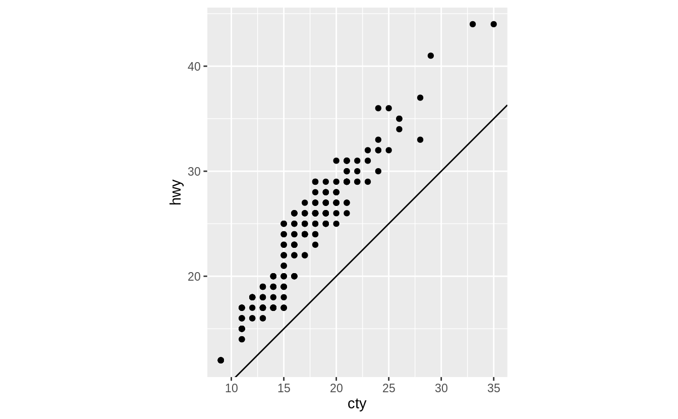
If we didn’t include coord_fixed(), then the line would no longer have an angle of 45 degrees.
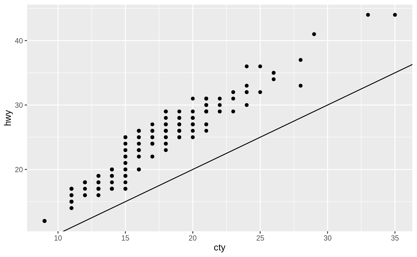
On average, humans are best able to perceive differences in angles relative to 45 degrees.
See Cleveland (1993b), Cleveland (1994),Cleveland (1993a), Cleveland, McGill, and McGill (1988), Heer and Agrawala (2006) for discussion on how the aspect ratio of a plot affects perception of the values it encodes, evidence that 45-degrees is generally the optimal aspect ratio, and methods to calculate the optimal aspect ratio of a plot.
The function ggthemes::bank_slopes() will calculate the optimal aspect ratio to bank slopes to 45-degrees.
3.10 The layered grammar of graphics
References
Cleveland, William S. 1993a. “A Model for Studying Display Methods of Statistical Graphics.” Journal of Computational and Graphical Statistics 2 (4). Taylor & Francis: 323–43. https://doi.org/10.1080/10618600.1993.10474616.
Cleveland, William S. 1993b. Visualizing Information. Hobart Press.
Cleveland, William S. 1994. The Elements of Graphing Data. Hobart Press.
Cleveland, William S., Marylyn E. McGill, and Robert McGill. 1988. “The Shape Parameter of a Two-Variable Graph.” Journal of the American Statistical Association 83 (402). [American Statistical Association, Taylor & Francis, Ltd.]: 289–300. https://www.jstor.org/stable/2288843.
Heer, Jeffrey, and Maneesh Agrawala. 2006. “Multi-Scale Banking to 45º.” Ieee Transactions on Visualization and Computer Graphics 12 (5, September/October). https://doi.org/10.1109/TVCG.2006.163.
See the Wikipedia article on Automobile layout.↩
Internally, this is what the
factorclass, which is covered in Chapter 15, does.↩