If you find any typos, errors, or places where the text may be improved, please let me know. The best ways to provide feedback are by GitHub or hypothes.is annotations.
Opening an issue or submitting a pull request on GitHub
Adding an annotation using hypothes.is.
To add an annotation, select some text and then click the
on the pop-up menu.
To see the annotations of others, click the
in the upper right-hand corner of the page.
28 Graphics for communication
28.1 Introduction
28.2 Label
Exercise 28.2.1
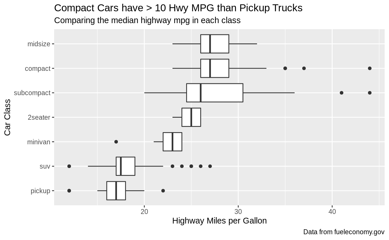
Create one plot on the fuel economy data with customized title,
subtitle, caption, x, y, and colour labels.
ggplot(
  data = mpg,
  mapping = aes(x = fct_reorder(class, hwy), y = hwy)
) +
  geom_boxplot() +
  coord_flip() +
  labs(
    title = "Compact Cars have > 10 Hwy MPG than Pickup Trucks",
    subtitle = "Comparing the median highway mpg in each class",
    caption = "Data from fueleconomy.gov",
    x = "Car Class",
    y = "Highway Miles per Gallon"
  )
Exercise 28.2.2
The geom_smooth() is somewhat misleading because the hwy for large engines is skewed upwards due to the inclusion of lightweight sports cars with big engines.
Use your modeling tools to fit and display a better model.
First, I’ll plot the relationship between fuel efficiency and engine size (displacement) using all cars. The plot shows a strong negative relationship.
ggplot(mpg, aes(displ, hwy)) +
  geom_point() +
  geom_smooth(method = "lm", se = FALSE) +
  labs(
    title = "Fuel Efficiency Decreases with Engine Size",
    caption = "Data from fueleconomy.gov",
    y = "Highway Miles per Gallon",
    x = "Engine Displacement"
  )
#> `geom_smooth()` using formula 'y ~ x'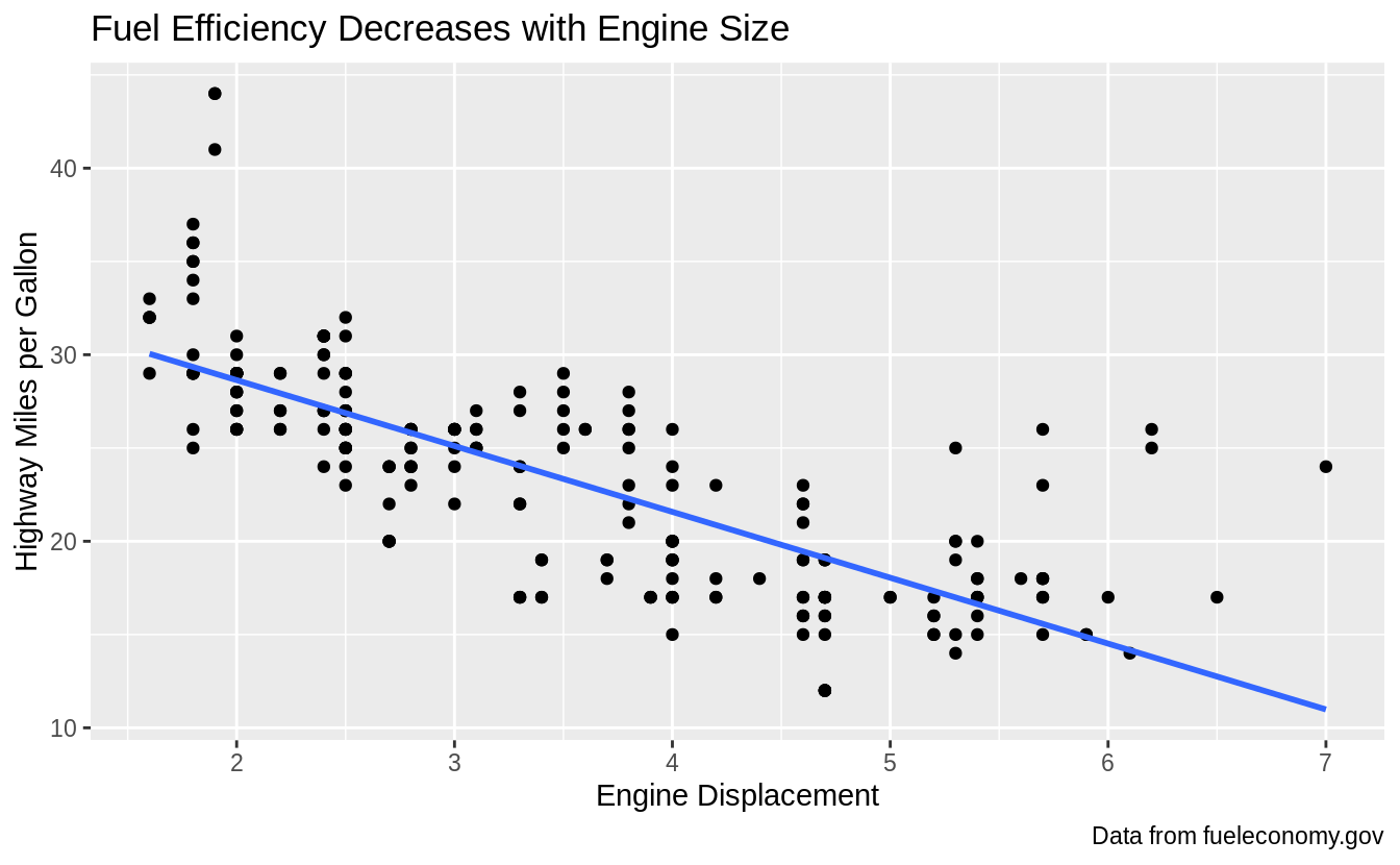
However, if I disaggregate by car class, and plot the relationship between fuel efficiency and engine displacement within each class, I see a different relationship.
For all car class except subcompact cars, there is no relationship or only a small negative relationship between fuel efficiency and engine size.
For subcompact cars, there is a strong negative relationship between fuel efficiency and engine size. As the question noted, this is because the subcompact car class includes both small cheap cars, and sports cars with large engines.
ggplot(mpg, aes(displ, hwy, colour = class)) +
  geom_point() +
  geom_smooth(method = "lm", se = FALSE) +
  labs(
    title = "Fuel Efficiency Mostly Varies by Car Class",
    subtitle = "Subcompact caries fuel efficiency varies by engine size",
    caption = "Data from fueleconomy.gov",
    y = "Highway Miles per Gallon",
    x = "Engine Displacement"
  )
#> `geom_smooth()` using formula 'y ~ x'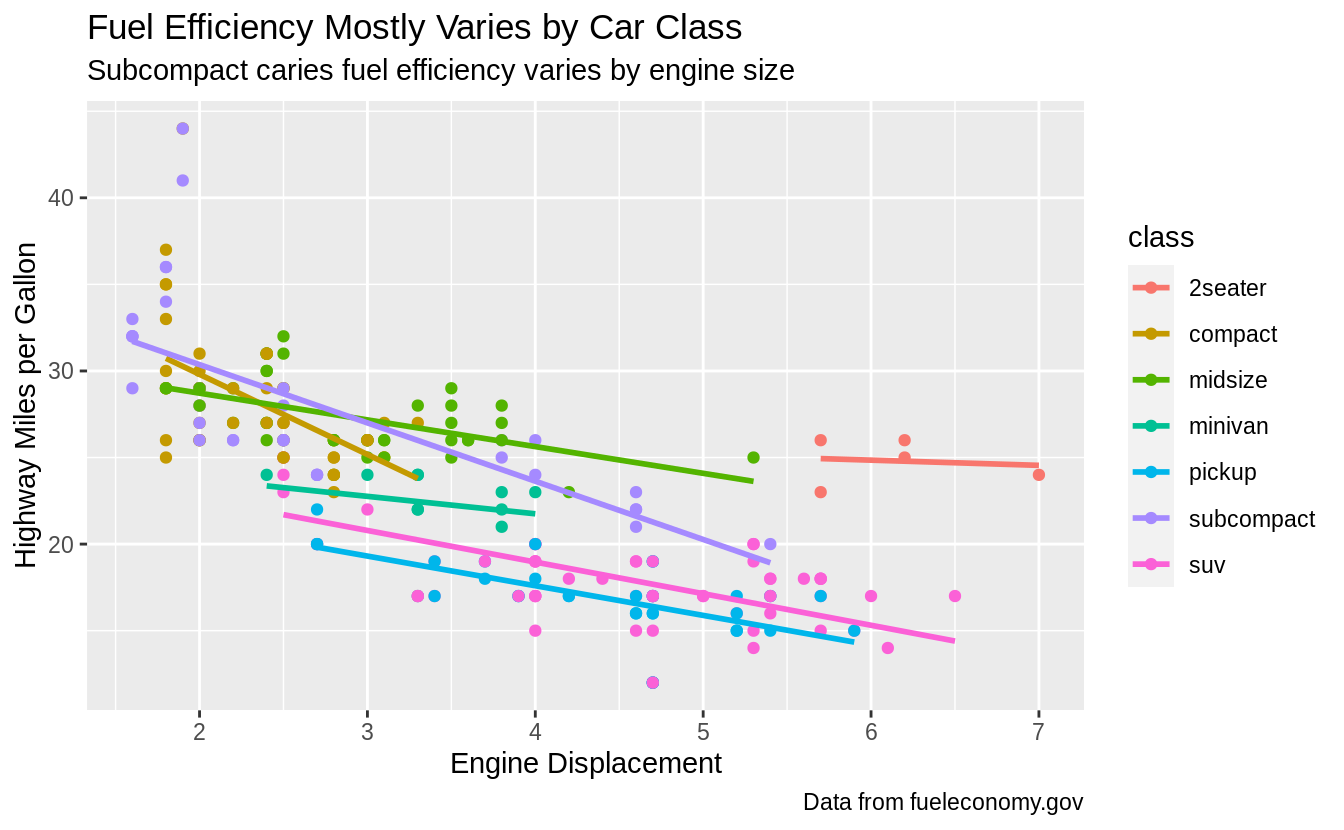
Another way to model and visualize the relationship between fuel efficiency and engine displacement after accounting for car class is to regress fuel efficiency on car class, and plot the residuals of that regression against engine displacement. The residuals of the first regression are the variation in fuel efficiency not explained by engine displacement. The relationship between fuel efficiency and engine displacement is attenuated after accounting for car class.
mod <- lm(hwy ~ class, data = mpg)
mpg %>%
  add_residuals(mod) %>%
  ggplot(aes(x = displ, y = resid)) +
  geom_point() +
  geom_smooth(method = "lm", se = FALSE) +
  labs(
    title = "Engine size has little effect on fuel efficiency",
    subtitle = "After accounting for car class",
    caption = "Data from fueleconomy.gov",
    y = "Highway MPG Relative to Class Average",
    x = "Engine Displacement"
  )
#> `geom_smooth()` using formula 'y ~ x'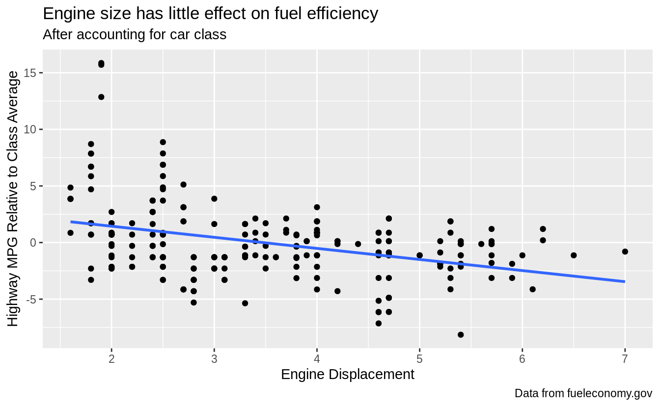
Exercise 28.2.3
Take an exploratory graphic that you’ve created in the last month, and add informative titles to make it easier for others to understand.
By its very nature, this exercise is left to readers.
28.3 Annotations
Exercise 28.3.1
Use geom_text() with infinite positions to place text at the four corners of the plot.
I can use similar code as the example in the text.
However, I need to use vjust and hjust in order for the text to appear in the plot, and these need to be different for each corner.
But, geom_text() takes hjust and vjust as aesthetics, I can add them to the data and mappings, and use a single geom_text() call instead of four different geom_text() calls with four different data arguments, and four different values of hjust and vjust arguments.
label <- tribble(
  ~displ, ~hwy, ~label, ~vjust, ~hjust,
  Inf, Inf, "Top right", "top", "right",
  Inf, -Inf, "Bottom right", "bottom", "right",
  -Inf, Inf, "Top left", "top", "left",
  -Inf, -Inf, "Bottom left", "bottom", "left"
)

ggplot(mpg, aes(displ, hwy)) +
  geom_point() +
  geom_text(aes(label = label, vjust = vjust, hjust = hjust), data = label)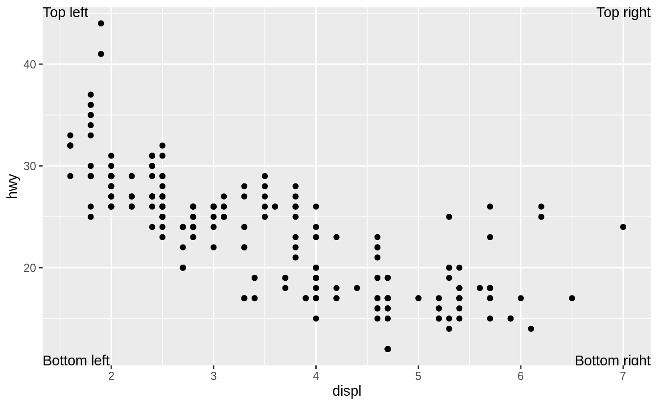
Exercise 28.3.2
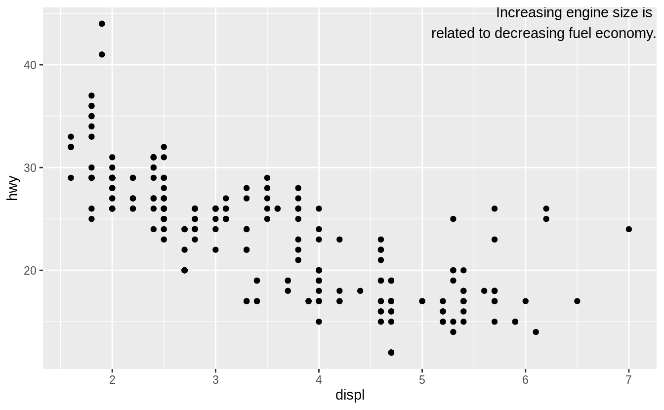
Read the documentation for annotate(). How can you use it to add a text label to a plot without having to create a tibble?
With annotate you use what would be aesthetic mappings directly as arguments:
ggplot(mpg, aes(displ, hwy)) +
  geom_point() +
  annotate("text",
    x = Inf, y = Inf,
    label = "Increasing engine size is \nrelated to decreasing fuel economy.", vjust = "top", hjust = "right"
  )
Exercise 28.3.3
How do labels with geom_text() interact with faceting?
How can you add a label to a single facet?
How can you put a different label in each facet?
(Hint: think about the underlying data.)
If the facet variable is not specified, the text is drawn in all facets.
label <- tibble(
  displ = Inf,
  hwy = Inf,
  label = "Increasing engine size is \nrelated to decreasing fuel economy."
)

ggplot(mpg, aes(displ, hwy)) +
  geom_point() +
  geom_text(aes(label = label),
    data = label, vjust = "top", hjust = "right",
    size = 2
  ) +
  facet_wrap(~class)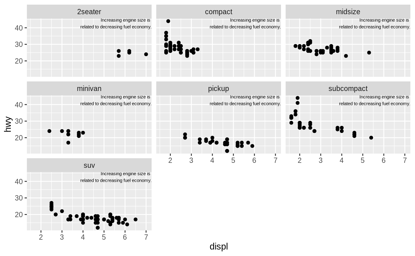
To draw the label in only one facet, add a column to the label data frame with the value of the faceting variable(s) in which to draw it.
label <- tibble(
  displ = Inf,
  hwy = Inf,
  class = "2seater",
  label = "Increasing engine size is \nrelated to decreasing fuel economy."
)

ggplot(mpg, aes(displ, hwy)) +
  geom_point() +
  geom_text(aes(label = label),
    data = label, vjust = "top", hjust = "right",
    size = 2
  ) +
  facet_wrap(~class)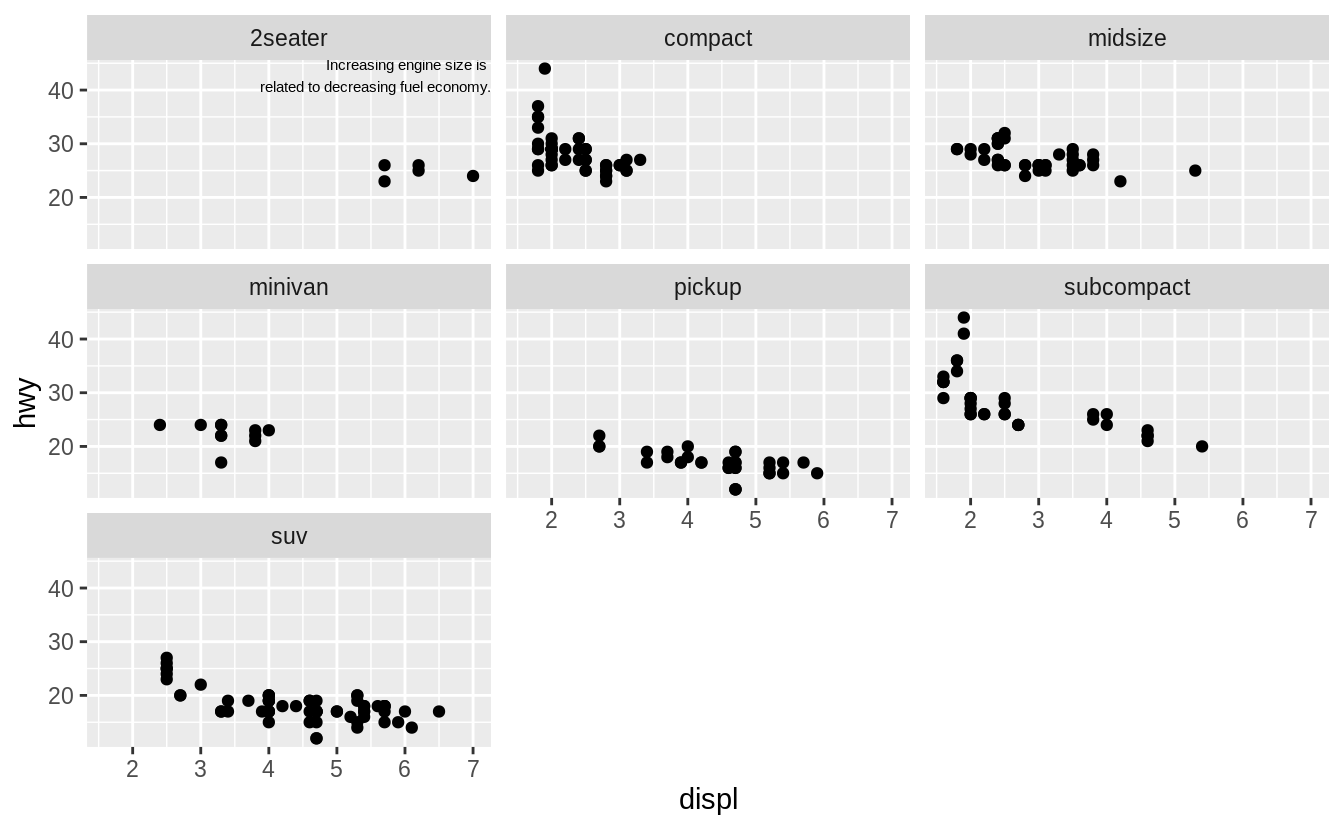
To draw labels in different plots, simply have the facetting variable(s):
label <- tibble(
  displ = Inf,
  hwy = Inf,
  class = unique(mpg$class),
  label = str_c("Label for ", class)
)

ggplot(mpg, aes(displ, hwy)) +
  geom_point() +
  geom_text(aes(label = label),
    data = label, vjust = "top", hjust = "right",
    size = 3
  ) +
  facet_wrap(~class)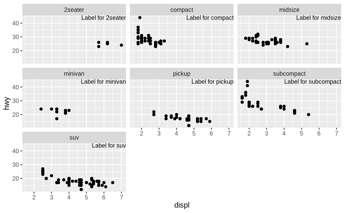
Exercise 28.3.4
What arguments to geom_label() control the appearance of the background box?
-
label.padding: padding around label -
label.r: amount of rounding in the corners -
label.size: size of label border
Exercise 28.3.5
What are the four arguments to arrow()? How do they work?
Create a series of plots that demonstrate the most important options.
The four arguments are (from the help for arrow()):
-
angle: angle of arrow head -
length: length of the arrow head -
ends: ends of the line to draw arrow head -
type:"open"or"close": whether the arrow head is a closed or open triangle
28.4 Scales
Exercise 28.4.1
Why doesn’t the following code override the default scale?
df <- tibble(
  x = rnorm(10000),
  y = rnorm(10000)
)
ggplot(df, aes(x, y)) +
  geom_hex() +
  scale_colour_gradient(low = "white", high = "red") +
  coord_fixed()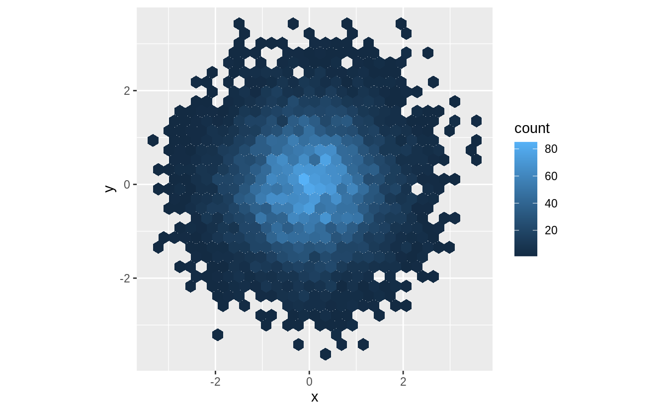
It does not override the default scale because the colors in geom_hex() are set by the fill aesthetic, not the color aesthetic.
ggplot(df, aes(x, y)) +
  geom_hex() +
  scale_fill_gradient(low = "white", high = "red") +
  coord_fixed()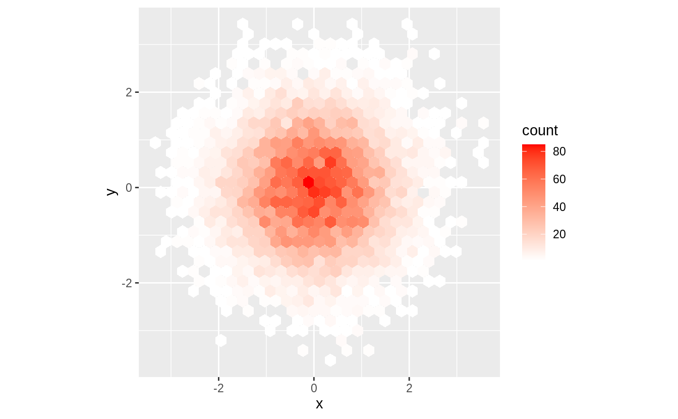
Exercise 28.4.2
The first argument to every scale is the label for the scale.
It is equivalent to using the labs function.
ggplot(mpg, aes(displ, hwy)) +
  geom_point(aes(colour = class)) +
  geom_smooth(se = FALSE) +
  labs(
    x = "Engine displacement (L)",
    y = "Highway fuel economy (mpg)",
    colour = "Car type"
  )
#> `geom_smooth()` using method = 'loess' and formula 'y ~ x'
ggplot(mpg, aes(displ, hwy)) +
  geom_point(aes(colour = class)) +
  geom_smooth(se = FALSE) +
  scale_x_continuous("Engine displacement (L)") +
  scale_y_continuous("Highway fuel economy (mpg)") +
  scale_colour_discrete("Car type")
#> `geom_smooth()` using method = 'loess' and formula 'y ~ x'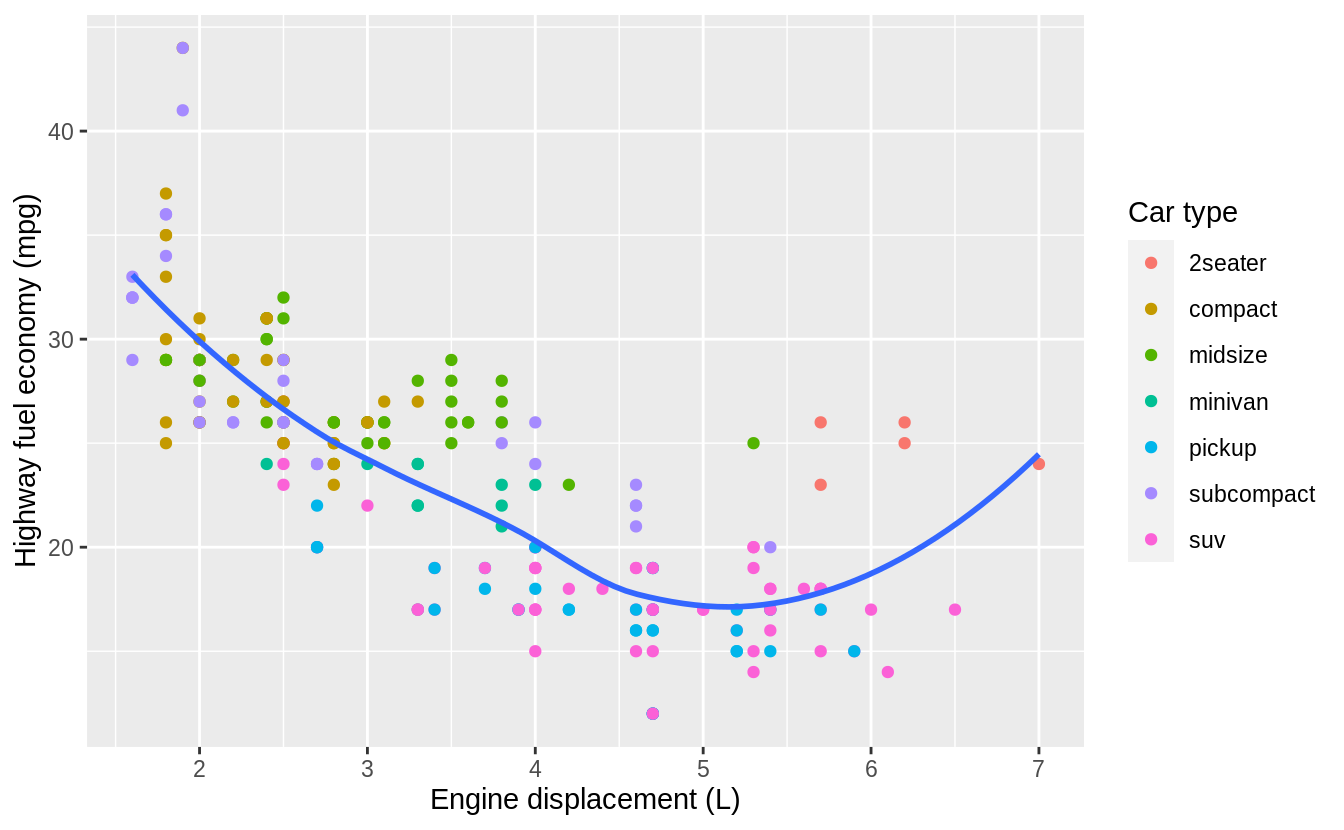
Exercise 28.4.3
Change the display of the presidential terms by:
- Combining the two variants shown above.
- Improving the display of the y axis.
- Labeling each term with the name of the president.
- Adding informative plot labels.
- Placing breaks every 4 years (this is trickier than it seems!).
fouryears <- lubridate::make_date(seq(year(min(presidential$start)),
  year(max(presidential$end)),
  by = 4
), 1, 1)

presidential %>%
  mutate(
    id = 33 + row_number(),
    name_id = fct_inorder(str_c(name, " (", id, ")"))
  ) %>%
  ggplot(aes(start, name_id, colour = party)) +
  geom_point() +
  geom_segment(aes(xend = end, yend = name_id)) +
  scale_colour_manual("Party", values = c(Republican = "red", Democratic = "blue")) +
  scale_y_discrete(NULL) +
  scale_x_date(NULL,
    breaks = presidential$start, date_labels = "'%y",
    minor_breaks = fouryears
  ) +
  ggtitle("Terms of US Presdients",
    subtitle = "Roosevelth (34th) to Obama (44th)"
  ) +
  theme(
    panel.grid.minor = element_blank(),
    axis.ticks.y = element_blank()
  )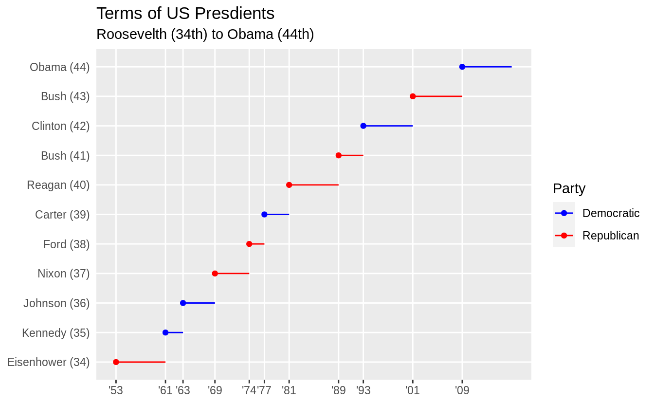
To include both the start dates of presidential terms and every four years, I use different levels of emphasis. The presidential term start years are used as major breaks with thicker lines and x-axis labels. Lines for every four years is indicated with minor breaks that use thinner lines to distinguish them from presidential term start years and to avoid cluttering the plot.
Exercise 28.4.4
Use override.aes to make the legend on the following plot easier to see.
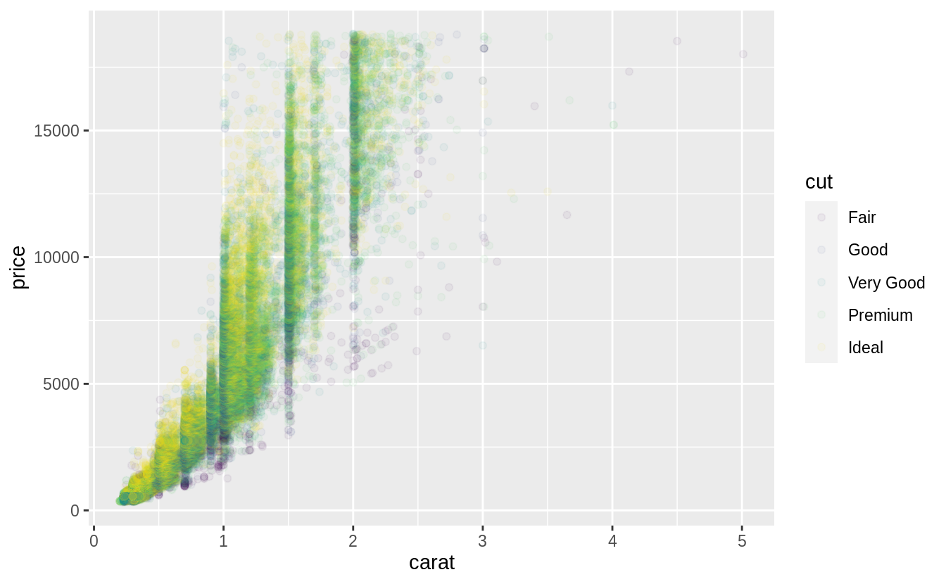
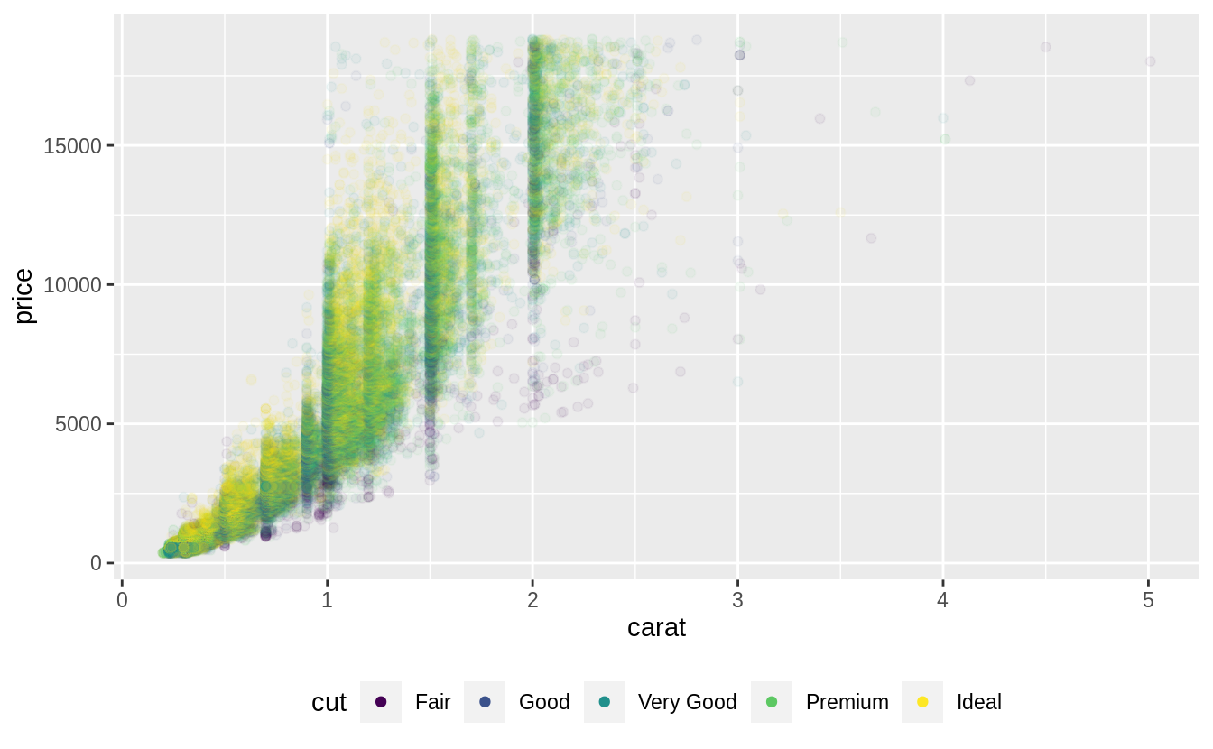
The problem with the legend is that the alpha value make the colors hard to see. So I’ll override the alpha value to make the points solid in the legend.
ggplot(diamonds, aes(carat, price)) +
geom_point(aes(colour = cut), alpha = 1 / 20) +
theme(legend.position = "bottom") +
guides(colour = guide_legend(nrow = 1, override.aes = list(alpha = 1)))