5 Discovery
The idea of tidy data and the common feature of tidyverse packages is that data should be stored in data frames with certain conventions. This works well with naturally tabular data, the type which has been common in social science applications. But there are other domains in which other data structures are more appropriate because they more naturally model the data or processes, or for computational reasons. The three applications in this chapter: text, networks, and spatial data are examples where the tidy data structure is less of an advantage. I will still rely on ggplot2 for plotting, and use tidy verse compatible packages where appropriate.
Textual data: tidytext
Network data: igraph for network computation, as in the chapter. But several ggplot22 extension packages for plotting the networks.
Spatial data: ggplot2 has some built-in support for maps. The map package provides map data.
See the R for Data Science section 12.7 Non-tidy data and this post on Non-tidy data by Jeff Leek for more on non-tidy data.
5.1 Textual data
Prerequisites
library("tidyverse")
library("lubridate")
library("stringr")
library("forcats")
library("modelr")
library("tm")
library("SnowballC")
library("tidytext")
library("wordcloud")
This section will primarily use the tidytext package. It is a relatively new package. The tm and quanteda (by Ken Benoit) packages are more established and use the document-term matrix format as described in the QSS chapter. The tidytext package stores everything in a data frame; this may be less efficient than the other packages, but has the benefit of being able to easily take advantage of the tidyverse ecosystem. If your corpus is not too large, this shouldn’t be an issue.
See Tidy Text Mining with R for a full introduction to using tidytext.
In tidy data, each row is an observation and each column is a variable. In the tidytext package, documents are stored as data frames with one-term-per-row.
We can cast data into the tidytext format either from the Corpus object, or, after processing, from the document-term matrix object.
DIR_SOURCE <- system.file("extdata/federalist", package = "qss")
corpus_raw <- VCorpus(DirSource(directory = DIR_SOURCE, pattern = "fp"))
corpus_raw
#> <<VCorpus>>
#> Metadata:  corpus specific: 0, document level (indexed): 0
#> Content:  documents: 85
Use the function tidy to convert the to a data frame with one row per document.
corpus_tidy <- tidy(corpus_raw, "corpus")
corpus_tidy
#> # A tibble: 85 x 8
#>   author datetimestamp       description heading id       language origin
#>   <lgl>  <dttm>              <lgl>       <lgl>   <chr>    <chr>    <lgl>
#> 1 NA     2018-02-08 03:01:45 NA          NA      fp01.txt en       NA
#> 2 NA     2018-02-08 03:01:45 NA          NA      fp02.txt en       NA
#> 3 NA     2018-02-08 03:01:45 NA          NA      fp03.txt en       NA
#> 4 NA     2018-02-08 03:01:45 NA          NA      fp04.txt en       NA
#> 5 NA     2018-02-08 03:01:45 NA          NA      fp05.txt en       NA
#> 6 NA     2018-02-08 03:01:45 NA          NA      fp06.txt en       NA
#> # ... with 79 more rows, and 1 more variable: text <chr>
The text column contains the text of the documents themselves. Since most of the metadata columns are either missings or irrelevant for our purposes, we’ll delete those columns, keeping only the document (id) and text columns.
corpus_tidy <- select(corpus_tidy, id, text)Also, we want to extract the essay number and use that as the document id rather than its file name.
corpus_tidy <-
  mutate(corpus_tidy, document = as.integer(str_extract(id, "\\d+"))) %>%
  select(-id)
The function tokenizes the document texts:
tokens <- corpus_tidy %>%
  # tokenizes into words and stems them
  unnest_tokens(word, text, token = "word_stems") %>%
  # remove any numbers in the strings
  mutate(word = str_replace_all(word, "\\d+", "")) %>%
  # drop any empty strings
  filter(word != "")
tokens
#> # A tibble: 202,089 x 2
#>   document word
#>      <int> <chr>
#> 1        1 after
#> 2        1 an
#> 3        1 unequivoc
#> 4        1 experi
#> 5        1 of
#> 6        1 the
#> # ... with 2.021e+05 more rows
The unnest_tokens function uses the tokenizers package to tokenize the text. By default, it uses the function which removes punctuation, and lowercases the words. I set the tokenizer to to stem the word, using the SnowballC package.
We can remove stop-words with an anti_join on the dataset stop_words
data("stop_words", package = "tidytext")
tokens <- anti_join(tokens, stop_words, by = "word")
5.1.1 Document-Term Matrix
In tokens there is one observation for each token (word) in the each document. This is almost equivalent to a document-term matrix. For a document-term matrix we need documents, and terms as the keys for the data and a column with the number of times the term appeared in the document.
dtm <- count(tokens, document, word)
head(dtm)
#> # A tibble: 6 x 3
#>   document word           n
#>      <int> <chr>      <int>
#> 1        1 abl            1
#> 2        1 absurd         1
#> 3        1 accid          1
#> 4        1 accord         1
#> 5        1 acknowledg     1
#> 6        1 act            1
5.1.2 Topic Discovery
Plot the word-clouds for essays 12 and 24:
filter(dtm, document == 12) %>% {
    wordcloud(.$word, .$n, max.words = 20)
  }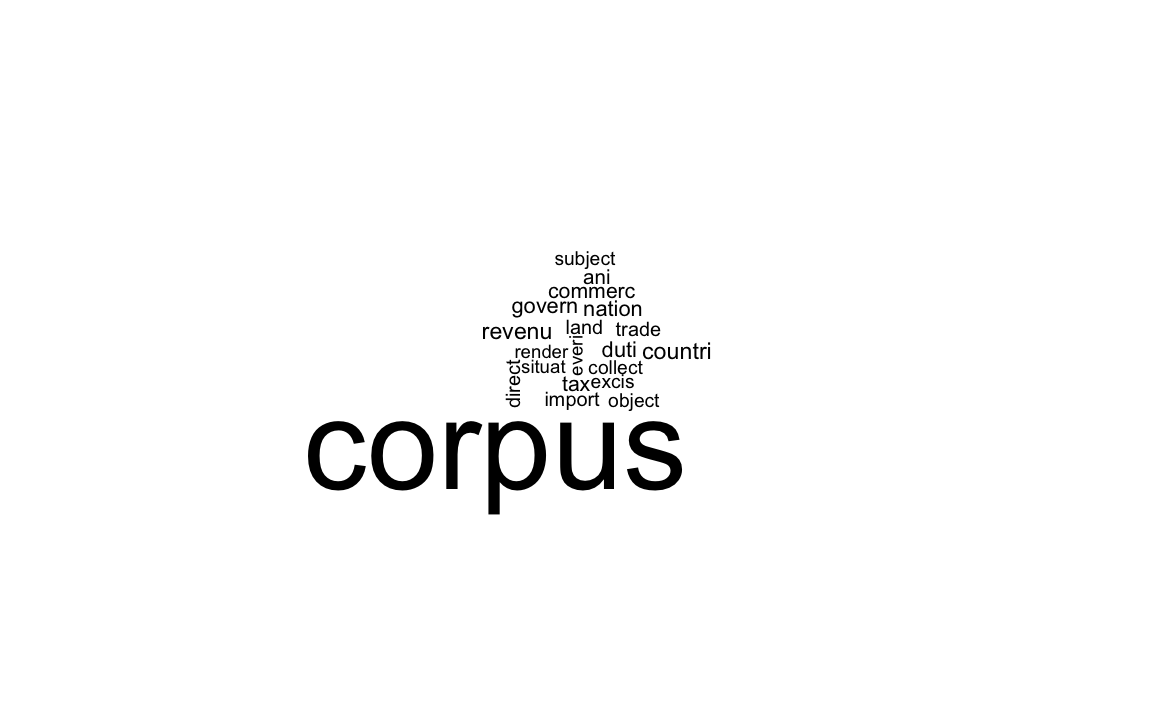
filter(dtm, document == 24) %>% {
    wordcloud(.$word, .$n, max.words = 20)
  }
Use the function bind_tf_idf to add a column with the tf-idf to the data frame.
dtm <- bind_tf_idf(dtm, word, document, n)
dtm
#> # A tibble: 38,847 x 6
#>   document word           n      tf   idf   tf_idf
#>      <int> <chr>      <int>   <dbl> <dbl>    <dbl>
#> 1        1 abl            1 0.00145 0.705 0.00102
#> 2        1 absurd         1 0.00145 1.73  0.00251
#> 3        1 accid          1 0.00145 3.75  0.00543
#> 4        1 accord         1 0.00145 0.754 0.00109
#> 5        1 acknowledg     1 0.00145 1.55  0.00225
#> 6        1 act            1 0.00145 0.400 0.000579
#> # ... with 3.884e+04 more rows
The 10 most important words for Paper No. 12 are
dtm %>%
  filter(document == 12) %>%
  top_n(10, tf_idf)
#> # A tibble: 10 x 6
#>   document word           n      tf   idf  tf_idf
#>      <int> <chr>      <int>   <dbl> <dbl>   <dbl>
#> 1       12 cent           2 0.00199  4.44 0.00884
#> 2       12 coast          3 0.00299  3.75 0.0112
#> 3       12 commerc        8 0.00796  1.11 0.00884
#> 4       12 contraband     3 0.00299  4.44 0.0133
#> 5       12 excis          5 0.00498  2.65 0.0132
#> 6       12 gallon         2 0.00199  4.44 0.00884
#> # ... with 4 more rows
and for Paper No. 24,
dtm %>%
  filter(document == 24) %>%
  top_n(10, tf_idf)
#> # A tibble: 10 x 6
#>   document word         n      tf   idf  tf_idf
#>      <int> <chr>    <int>   <dbl> <dbl>   <dbl>
#> 1       24 armi         7 0.00858  1.26 0.0108
#> 2       24 arsenal      2 0.00245  3.75 0.00919
#> 3       24 dock         3 0.00368  4.44 0.0163
#> 4       24 frontier     3 0.00368  2.83 0.0104
#> 5       24 garrison     6 0.00735  2.83 0.0208
#> 6       24 nearer       2 0.00245  3.34 0.00820
#> # ... with 4 more rows
The slightly different results from the book are due to tokenization differences.
Subset those documents known to have been written by Hamilton.
HAMILTON_ESSAYS <- c(1, 6:9, 11:13, 15:17, 21:36, 59:61, 65:85)
dtm_hamilton <- filter(dtm, document %in% HAMILTON_ESSAYS)
The kmeans function expects the input to be rows for observations and columns for each variable: in our case that would be documents as rows, and words as columns, with the tf-idf as the cell values. We could use spread to do this, but that would be a large matrix.
CLUSTERS <- 4
km_out <-
  kmeans(cast_dtm(dtm_hamilton, document, word, tf_idf), centers = CLUSTERS,
         nstart = 10)
km_out$iter
#> [1] 3
Data frame with the unique terms used by Hamilton. I extract these from the column names of the DTM after cast_dtm to ensure that the order is the same as the k-means results.
hamilton_words <-
  tibble(word = colnames(cast_dtm(dtm_hamilton, document, word, tf_idf)))
The centers of the clusters is a cluster x word matrix. We want to transpose it and then append columns to hamilton_words so the location of each word in the cluster is listed.
dim(km_out$centers)
#> [1]    4 3850
hamilton_words <- bind_cols(hamilton_words, as_tibble(t(km_out$centers)))
hamilton_words
#> # A tibble: 3,850 x 5
#> word `1` `2` `3` `4`
#> <chr> <dbl> <dbl> <dbl> <dbl>
#> 1 abl 0.000939 0.000743 0 0
#> 2 absurd 0 0.000517 0 0.000882
#> 3 accid 0 0.000202 0 0
#> 4 accord 0 0.000399 0 0.000852
#> 5 acknowledg 0 0.000388 0 0.000473
#> 6 act 0 0.000560 0.00176 0.000631
#> # ... with 3,844 more rowsTo find the top 10 words in each centroid, we use top_n with group_by:
top_words_cluster <-
  gather(hamilton_words, cluster, value, -word) %>%
  group_by(cluster) %>%
  top_n(10, value)
We can print them out using a for loop
for (i in 1:CLUSTERS) {
  cat("CLUSTER ", i, ": ",
      str_c(filter(top_words_cluster, cluster == i)$word, collapse = ", "),
      "\n\n")
}
#> CLUSTER  1 :  presid, appoint, senat, claus, expir, fill, recess, session, unfound, vacanc
#>
#> CLUSTER  2 :  offic, presid, tax, land, revenu, armi, militia, senat, taxat, claus
#>
#> CLUSTER  3 :  sedit, guilt, chief, clemenc, impun, plead, crime, pardon, treason, conniv
#>
#> CLUSTER  4 :  court, jurisdict, inferior, suprem, trial, tribun, cogniz, juri, impeach, appel
This is alternative code that prints out a table:
gather(hamilton_words, cluster, value, -word) %>%
  group_by(cluster) %>%
  top_n(10, value) %>%
  summarise(top_words = str_c(word, collapse = ", ")) %>%
knitr::kable()| cluster | top_words |
|---|---|
| 1 | presid, appoint, senat, claus, expir, fill, recess, session, unfound, vacanc |
| 2 | offic, presid, tax, land, revenu, armi, militia, senat, taxat, claus |
| 3 | sedit, guilt, chief, clemenc, impun, plead, crime, pardon, treason, conniv |
| 4 | court, jurisdict, inferior, suprem, trial, tribun, cogniz, juri, impeach, appel |
Or to print out the documents in each cluster,
enframe(km_out$cluster, "document", "cluster") %>%
  group_by(cluster) %>%
  summarise(documents = str_c(document, collapse = ", ")) %>%
knitr::kable()| cluster | documents |
|---|---|
| 1 | 67 |
| 2 | 1, 6, 7, 8, 9, 11, 12, 13, 15, 16, 17, 21, 22, 23, 24, 25, 26, 27, 28, 29, 30, 31, 32, 33, 34, 35, 36, 59, 60, 61, 66, 68, 69, 70, 71, 72, 73, 75, 76, 77, 78, 79, 80, 84, 85 |
| 3 | 74 |
| 4 | 65, 81, 82, 83 |
5.1.4 Cross-Validation
tidyverse: For cross-validation, I rely on the modelr package function RDoc("modelr::crossv_kfold"). See the tutorial Cross validation of linear regression with modelr for more on using modelr for cross validation or k-fold cross-validation with modelr and broom.
In sample, this regression perfectly predicts the authorship of the documents with known authors.
author_data %>%
  filter(!is.na(author)) %>%
  group_by(author) %>%
  summarise(`Proportion Correct` = mean(author == pred_author))
#> # A tibble: 2 x 2
#>   author   `Proportion Correct`
#>   <chr>                   <dbl>
#> 1 Hamilton                 1.00
#> 2 Madison                  1.00
Create the cross-validation data-sets using . As in the chapter, I will use a leave-one-out cross-validation, which is a k-fold cross-validation where k is the number of observations. To simplify this, I define the crossv_loo function that runs crossv_kfold with k = nrow(data).
crossv_loo <- function(data, id = ".id") {
  modelr::crossv_kfold(data, k = nrow(data), id = id)
}

# leave one out cross-validation object
cv <- author_data %>%
  filter(!is.na(author)) %>%
  crossv_loo()
Now estimate the model for each training dataset
models <- purrr::map(cv$train, ~ lm(author2 ~ upon + there + consequently + whilst,
                             data = ., model = FALSE))
Note that I use purrr::map to ensure that the correct map() function is used since the maps package also defines a map.
Now calculate the test performance on the held out observation,
test <- map2_df(models, cv$test,
                function(mod, test) {
                  add_predictions(as.data.frame(test), mod) %>%
                    mutate(pred_author =
                             if_else(pred >= 0, "Hamilton", "Madison"),
                           correct = (pred_author == author))
                })
test %>%
  group_by(author) %>%
  summarise(mean(correct))
#> # A tibble: 2 x 2
#>   author   `mean(correct)`
#>   <chr>              <dbl>
#> 1 Hamilton           1.00
#> 2 Madison            0.786
When adding prediction with add_predictions it added predictions for missing values as well.
Table of authorship of disputed papers
author_data %>%
  filter(is.na(author)) %>%
  select(document, pred, pred_author) %>%
knitr::kable()| document | pred | pred_author |
|---|---|---|
| 18 | -0.360 | Madison |
| 19 | -0.587 | Madison |
| 20 | -0.055 | Madison |
| 49 | -0.966 | Madison |
| 50 | -0.003 | Madison |
| 51 | -1.520 | Madison |
| 52 | -0.195 | Madison |
| 53 | -0.506 | Madison |
| 54 | -0.521 | Madison |
| 55 | 0.094 | Hamilton |
| 56 | -0.550 | Madison |
| 57 | -1.221 | Madison |
| 62 | -0.946 | Madison |
| 63 | -0.184 | Madison |
disputed_essays <- filter(author_data, is.na(author))$document

ggplot(mutate(author_data,
              author = fct_explicit_na(factor(author), "Disputed")),
       aes(y = document, x = pred, colour = author, shape = author)) +
  geom_ref_line(v = 0) +
  geom_point() +
  scale_y_continuous(breaks = seq(10, 80, by = 10),
                     minor_breaks = seq(5, 80, by = 5)) +
  scale_color_manual(values = c("Madison" = "blue",
                                "Hamilton" = "red",
                                "Disputed" = "black")) +
  scale_shape_manual(values = c("Madison" = 16, "Hamilton" = 15,
                                 "Disputed" = 17)) +
  labs(colour = "Author", shape = "Author",
       y = "Federalist Papers", x = "Predicted values")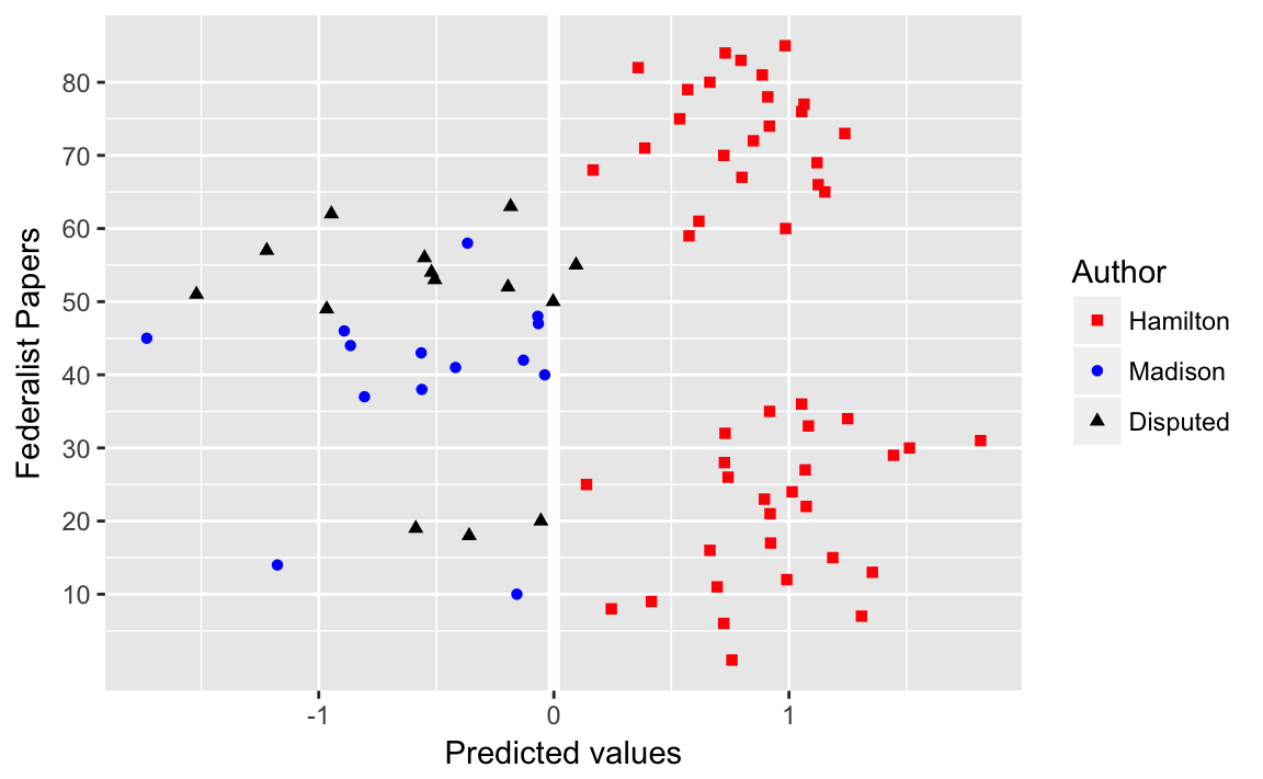
5.2 Network data
The igraph, sna, and network packages are the best in class. See the Social Network Analysis section of the Social Sciences Task View. See this tutorial by Katherin Ognyanova, Static and dynamic network visualization with R, for a good overview of network visualization with those packages in R.
There are several packages that plot networks in ggplot2.
- ggnetwork
- ggraph
- geomnet
- GGally functions ggnet,
ggnet2, andggnetworkmap. - ggCompNet compares the speed of various network plotting packages in R.
See this presentation for an overview of some of those packages for data visualization.
Examples: Network Visualization Examples with the ggplot2 Package
Prerequisites
library("tidyverse")
library("lubridate")
library("stringr")
library("forcats")
library("igraph")
library("intergraph")
library("GGally")
library("network")
5.2.1 Twitter Following Network
data("twitter.following", package = "qss")data("twitter.senator", package = "qss")Since the names twitter.following and twitter.senator are verbose, we’ll simplify future code by copying their values to variables named twitter and senator, respectively.
twitter <- twitter.following
senator <- twitter.senator
Simply use the function since twitter consists of edges (a link from a senator to another). Since graph_from_edgelist expects a matrix, convert the data frame to a matrix using .
twitter_adj <- graph_from_edgelist(as.matrix(twitter))Add in- and out-degree variables to the senator data frame:
senator <-
  mutate(senator,
         indegree = igraph::degree(twitter_adj, mode = "in"),
         outdegree = igraph::degree(twitter_adj, mode = "out"))
Now find the senators with the 3 greatest in-degrees
arrange(senator, desc(indegree)) %>%
  slice(1:3) %>%
  select(name, party, state, indegree, outdegree)
#> # A tibble: 3 x 5
#>   name              party state indegree outdegree
#>   <chr>             <chr> <chr>    <dbl>     <dbl>
#> 1 Tom Cotton        R     AR        64.0      15.0
#> 2 Richard J. Durbin D     IL        60.0      87.0
#> 3 John Barrasso     R     WY        58.0      79.0
or using the function:
top_n(senator, 3, indegree) %>%
  arrange(desc(indegree)) %>%
  select(name, party, state, indegree, outdegree)
#>                name party state indegree outdegree
#> 1        Tom Cotton     R    AR       64        15
#> 2 Richard J. Durbin     D    IL       60        87
#> 3     John Barrasso     R    WY       58        79
#> 4      Joe Donnelly     D    IN       58         9
#> 5    Orrin G. Hatch     R    UT       58        50
The top_n function catches that three senators are tied for 3rd highest outdegree, whereas the simply sorting and slicing cannot.
And we can find the senators with the three highest out-degrees similarly,
top_n(senator, 3, outdegree) %>%
  arrange(desc(outdegree)) %>%
  select(name, party, state, indegree, outdegree)
#>               name party state indegree outdegree
#> 1     Thad Cochran     R    MS       55        89
#> 2     Steve Daines     R    MT       30        88
#> 3      John McCain     R    AZ       41        88
#> 4 Joe Manchin, III     D    WV       43        88
# Define scales to reuse for the plots
scale_colour_parties <- scale_colour_manual("Party", values = c(R = "red",
D = "blue",
I = "green"))
scale_shape_parties <- scale_shape_manual("Party", values = c(R = 16,
D = 17,
I = 4))
senator %>%
mutate(closeness_in = igraph::closeness(twitter_adj, mode = "in"),
closeness_out = igraph::closeness(twitter_adj, mode = "out")) %>%
ggplot(aes(x = closeness_in, y = closeness_out,
colour = party, shape = party)) +
geom_abline(intercept = 0, slope = 1, colour = "white", size = 2) +
geom_point() +
scale_colour_parties +
scale_shape_parties +
labs(main = "Closeness", x = "Incoming path", y = "Outgoing path")
#> Warning in igraph::closeness(twitter_adj, mode = "in"): At centrality.c:
#> 2784 :closeness centrality is not well-defined for disconnected graphs
#> Warning in igraph::closeness(twitter_adj, mode = "out"): At centrality.c:
#> 2784 :closeness centrality is not well-defined for disconnected graphs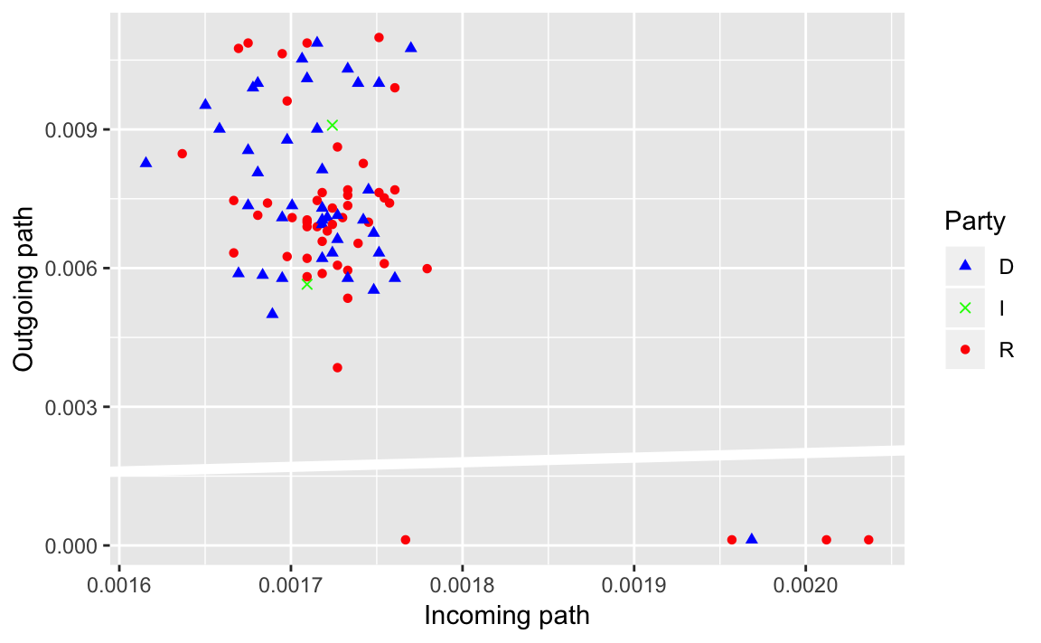
What does the reference line indicate? What does that say about senators twitter networks?
senator %>%
  mutate(betweenness_dir = igraph::betweenness(twitter_adj, directed = TRUE),
         betweenness_undir = igraph::betweenness(twitter_adj,
                                                 directed = FALSE)) %>%
  ggplot(aes(x = betweenness_dir, y = betweenness_undir, colour = party,
             shape = party)) +
  geom_abline(intercept = 0, slope = 1, colour = "white", size = 2) +
  geom_point() +
  scale_colour_parties +
  scale_shape_parties +
  labs(main = "Betweenness", x = "Directed", y = "Undirected")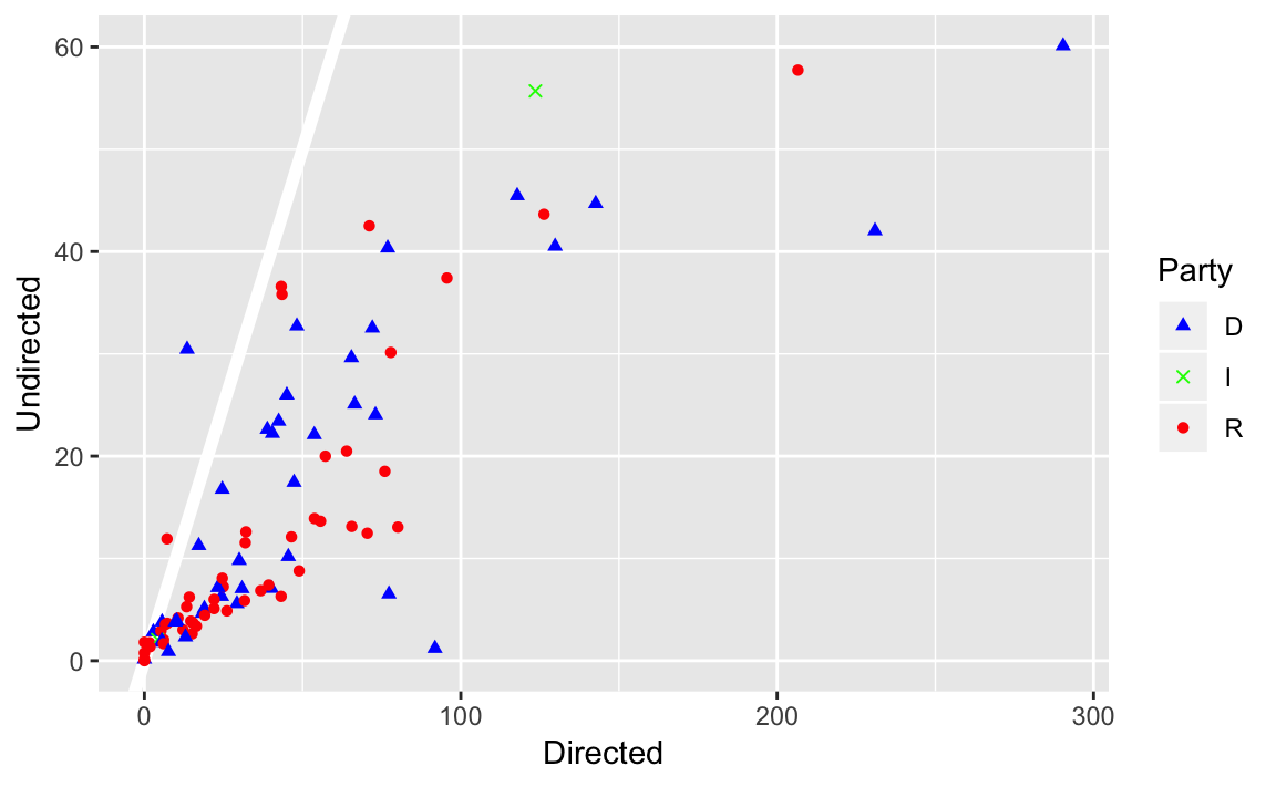
We’ve covered three different methods of calculating the importance of a node in a network: degree, closeness, and centrality. But what do they mean? What’s the “best” measure of importance? The answer to the the former is “it depends on the question”. There are probably other papers out there on this, but Borgatti (2005) is a good discussion:
Borgatti, Stephen. 2005. “Centrality and Network Flow”. Social Networks. DOI
Add and plot page-rank:
senator <- mutate(senator, page_rank = page_rank(twitter_adj)[["vector"]])
ggnet(twitter_adj, mode = "target")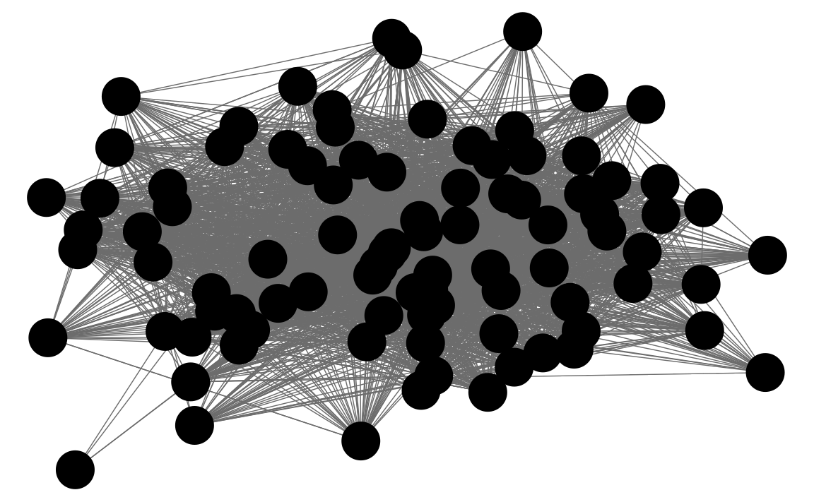
5.3 Spatial Data
Some resources on plotting spatial data in R:
ggplot2 has several map-related functions
ggmap allows ggplot to us a map from Google Maps, OpenStreet Maps or similar as a background for the plot.
- David Kahle and Hadley Wickham. 2013. ggmap: Spatial Visualization with ggplot2. Journal of Statistical Software - Github dkahle/ggmamp
tmap is not built on ggplot2 but uses a ggplot2-like API for network data.
leaflet is an R interface to a popular javascript mapping library.
Here are few tutorials on plotting spatial data in ggplot2:
Prerequisites
library("tidyverse")
library("lubridate")
library("stringr")
library("forcats")
library("modelr")
library("ggrepel")
5.3.1 Spatial Data in R
data("us.cities", package = "maps")
glimpse(us.cities)
#> Observations: 1,005
#> Variables: 6
#> $ name        <chr> "Abilene TX", "Akron OH", "Alameda CA", "Albany GA...
#> $ country.etc <chr> "TX", "OH", "CA", "GA", "NY", "OR", "NM", "LA", "V...
#> $ pop         <int> 113888, 206634, 70069, 75510, 93576, 45535, 494962...
#> $ lat         <dbl> 32.5, 41.1, 37.8, 31.6, 42.7, 44.6, 35.1, 31.3, 38...
#> $ long        <dbl> -99.7, -81.5, -122.3, -84.2, -73.8, -123.1, -106.6...
#> $ capital     <int> 0, 0, 0, 0, 2, 0, 0, 0, 0, 0, 0, 0, 0, 0, 0, 0, 0,...
usa_map <- map_data("usa")
capitals <- filter(us.cities,
capital == 2,
!country.etc %in% c("HI", "AK"))
ggplot() +
geom_map(map = usa_map) +
borders(database = "usa") +
geom_point(aes(x = long, y = lat, size = pop),
data = capitals) +
# scale size area ensures: 0 = no area
scale_size_area() +
coord_quickmap() +
theme_void() +
labs(x = "", y = "", title = "US State Capitals",
size = "Population")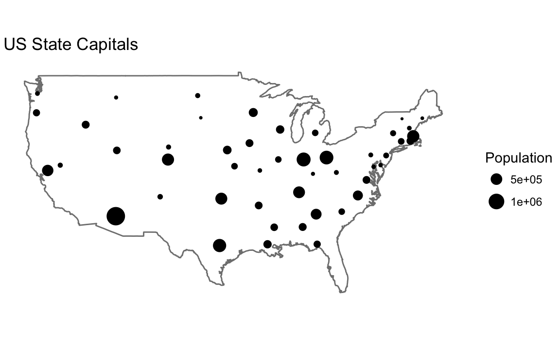
cal_cities <- filter(us.cities, country.etc == "CA") %>%
  top_n(7, pop)

ggplot() +
  borders(database = "state", regions = "California") +
  geom_point(aes(x = long, y = lat), data = cal_cities) +
  geom_text_repel(aes(x = long, y = lat, label = name), data = cal_cities) +
  coord_quickmap() +
  theme_minimal() +
  labs(x = "", y = "")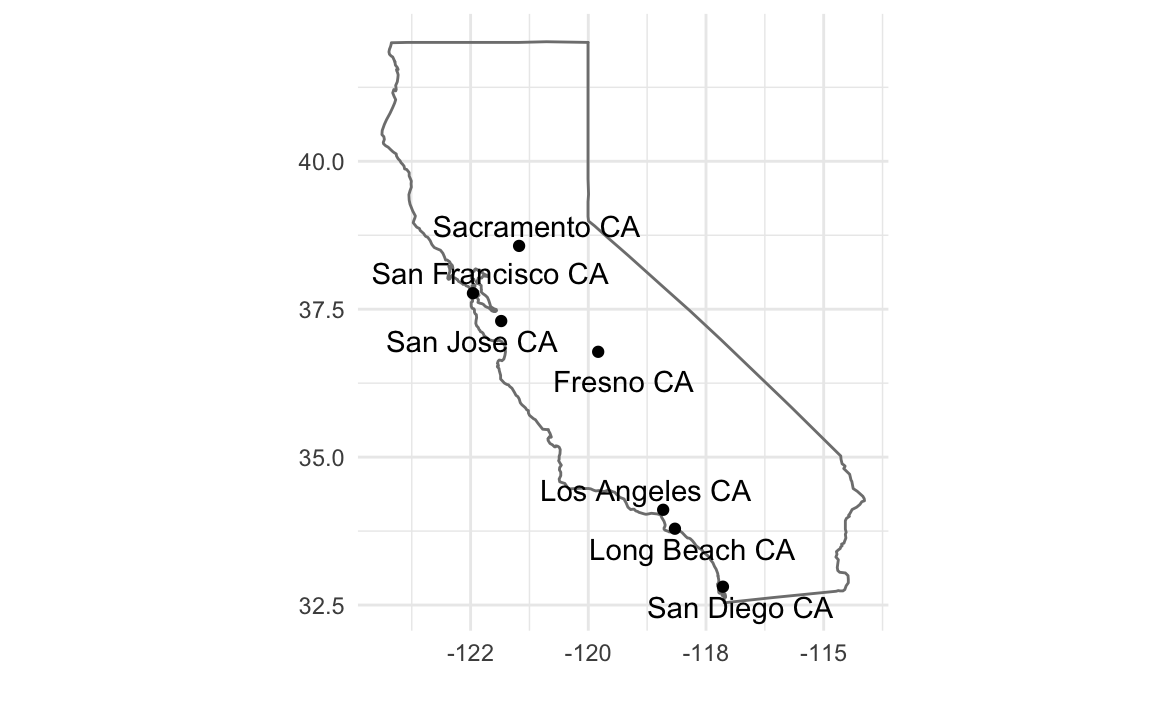
5.3.2 Colors in R
For more resources on using colors in R
R4DSchapter Graphics for Communication- ggplot2 book Chapter “Scales”
- Jenny Bryan Using colors in R
- Achim Zeileis, Kurt Hornik, Paul Murrell (2009). Escaping RGBland: Selecting Colors for Statistical Graphics. Computational Statistics & Data Analysis DOI
- colorspace vignette
- Maureen Stone Choosing Colors for Data Visualization
- ColorBrewer A website with a variety of palettes, primarily designed for maps, but also useful in data viz.
- Stephen Few Practical Rules for Using Color in Charts
- Why Should Engineers and Scientists by Worried About Color?
- A Better Default Colormap for Matplotlib A SciPy 2015 talk that describes how the viridis was created.
- Evaluation of Artery Visualizations for Heart Disease Diagnosis Using the wrong color scale can be deadly … literally.
- The python package matplotlib has a good discussion of colormaps.
- Peter Kovesi Good Color Maps: How to Design Them.
- See the viridis, ggthemes, dichromat, and pals packages for color palettes.
Use scale_identity for the color and alpha scales since the values of the variables are the values of the scale itself (the color names, and the alpha values).
ggplot(tibble(x = rep(1:4, each = 2),
              y = x + rep(c(0, 0.2), times = 2),
              colour = rep(c("black", "red"), each = 4),
              alpha = c(1, 1, 0.5, 0.5, 1, 1, 0.5, 0.5)),
  aes(x = x, y = y, colour = colour, alpha = alpha)) +
  geom_point(size = 15) +
  scale_color_identity() +
  scale_alpha_identity() +
  theme_bw() +
  theme(panel.grid = element_blank())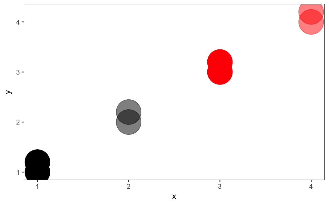
5.3.3 United States Presidential Elections
data("pres08", package = "qss")

pres08 <- pres08 %>%
  mutate(Dem = Obama / (Obama + McCain),
Rep = McCain / (Obama + McCain))ggplot() +
borders(database = "state", regions = "California", fill = "blue") +
coord_quickmap() +
theme_void()
cal_color <- filter(pres08, state == "CA") %>% {
    rgb(red = .$Rep, green = 0, blue = .$Dem)
  }

ggplot() +
  borders(database = "state", regions = "California", fill = cal_color) +
  coord_quickmap() +
  theme_void()
# America as red and blue states
map(database = "state") # create a map
for (i  in 1:nrow(pres08)) {
    if ( (pres08$state[i] != "HI") & (pres08$state[i] != "AK") &
        (pres08$state[i] != "DC")) {
        map(database = "state", regions = pres08$state.name[i],
            col = ifelse(pres08$Rep[i] > pres08$Dem[i], "red", "blue"),
            fill = TRUE, add = TRUE)
    }
}

## America as purple states
map(database = "state") # create a map
for (i in 1:nrow(pres08)) {
    if ( (pres08$state[i] != "HI") & (pres08$state[i] != "AK") &
        (pres08$state[i] != "DC")) {
        map(database = "state", regions = pres08$state.name[i],
            col = rgb(red = pres08$Rep[i], blue = pres08$Dem[i],
               green = 0), fill = TRUE, add = TRUE)
    }
}
states <- map_data("state") %>%
left_join(mutate(pres08, state.name = str_to_lower(state.name)),
by = c("region" = "state.name")) %>%
# drops DC
filter(!is.na(EV)) %>%
mutate(party = if_else(Dem > Rep, "Dem", "Rep"),
color = map2_chr(Dem, Rep, ~ rgb(blue = .x, red = .y, green = 0)))
ggplot(states) +
geom_polygon(aes(group = group, x = long, y = lat,
fill = party)) +
coord_quickmap() +
scale_fill_manual(values = c("Rep" = "red", "Dem" = "blue")) +
theme_void() +
labs(x = "", y = "")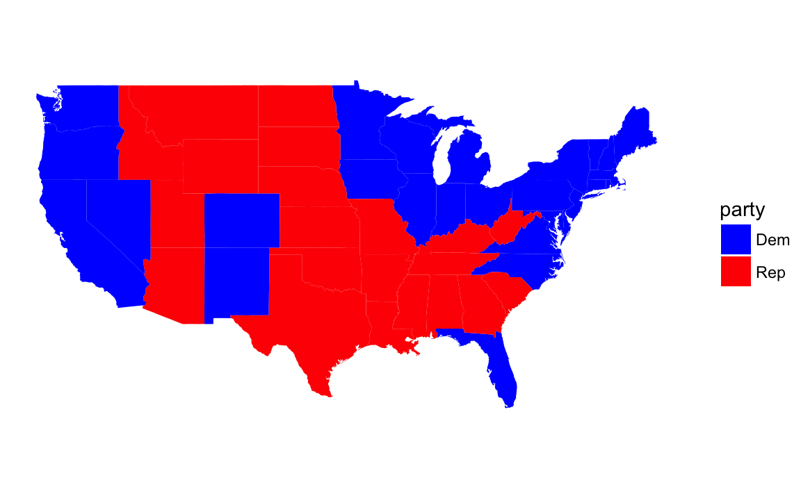
For plotting the purple states, I use since the color column contains the RGB values to use in the plot:
ggplot(states) +
  geom_polygon(aes(group = group, x = long, y = lat,
                   fill = color)) +
  coord_quickmap() +
  scale_fill_identity() +
  theme_void() +
  labs(x = "", y = "")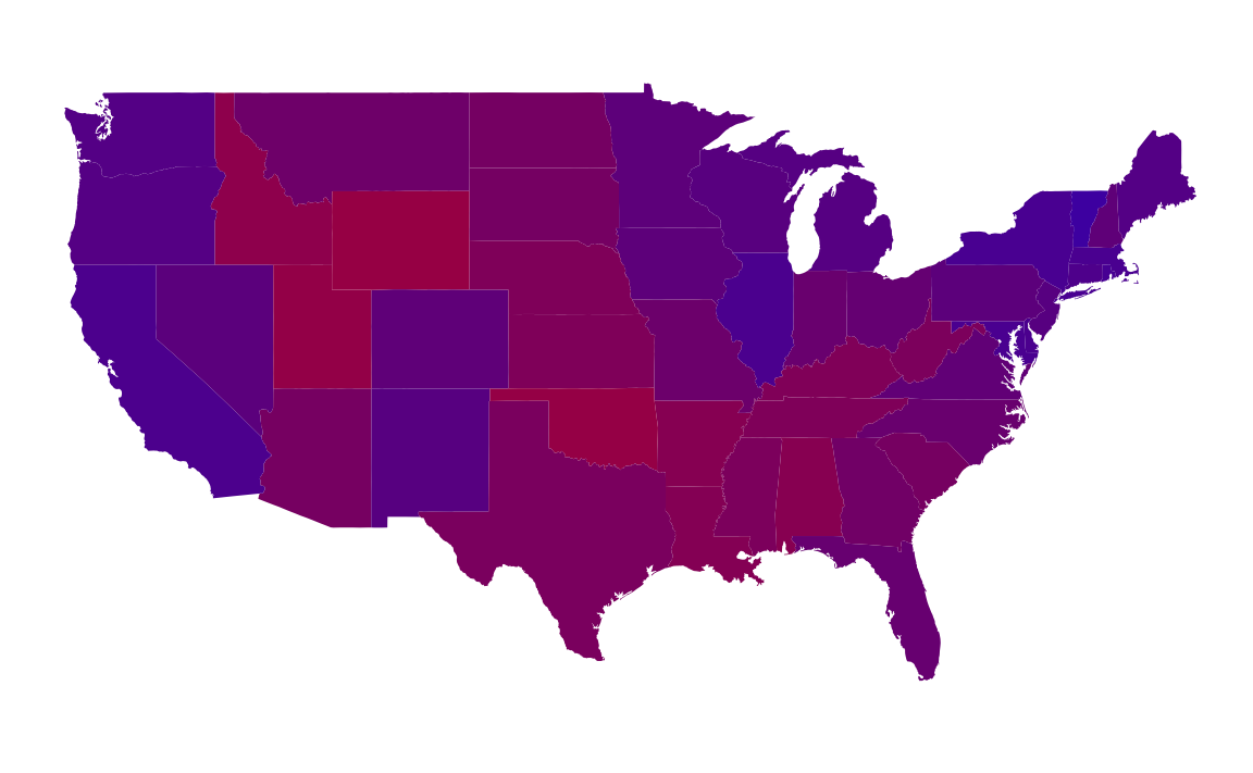
However, plotting purple states is not a good data visualization. Even though the colors are a proportional mixture of red and blue, human visual perception doesn’t work that way.
The proportion of the democratic vote is best thought of a diverging scale with 0.5 is midpoint. And since the Democratic Party is associated with the color blue and the Republican Party is associated with the color red. The Color Brewer palette RdBu is an example:
ggplot(states) +
  geom_polygon(aes(group = group, x = long, y = lat, fill = Dem)) +
  scale_fill_distiller("% Obama", direction = 1, limits = c(0, 1), type = "div",
                       palette = "RdBu") +
  coord_quickmap() +
  theme_void() +
  labs(x = "", y = "")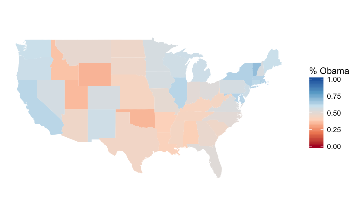
5.3.4 Expansion of Walmart
We don’t need to do the direct mapping since
data("walmart", package = "qss")
ggplot() +
borders(database = "state") +
geom_point(aes(x = long, y = lat, colour = type, size = size),
data = mutate(walmart,
size = if_else(type == "DistributionCenter", 2, 1)),
alpha = 1 / 3) +
coord_quickmap() +
scale_size_identity() +
guides(color = guide_legend(override.aes = list(alpha = 1))) +
theme_void()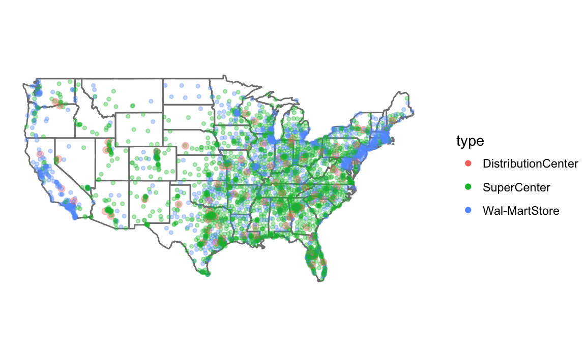 We don’t need to worry about colors since
 ggplot handles that. I use guides to so that the colors or not transparent in the legend (see R for Data Science chapterGraphics for communication).
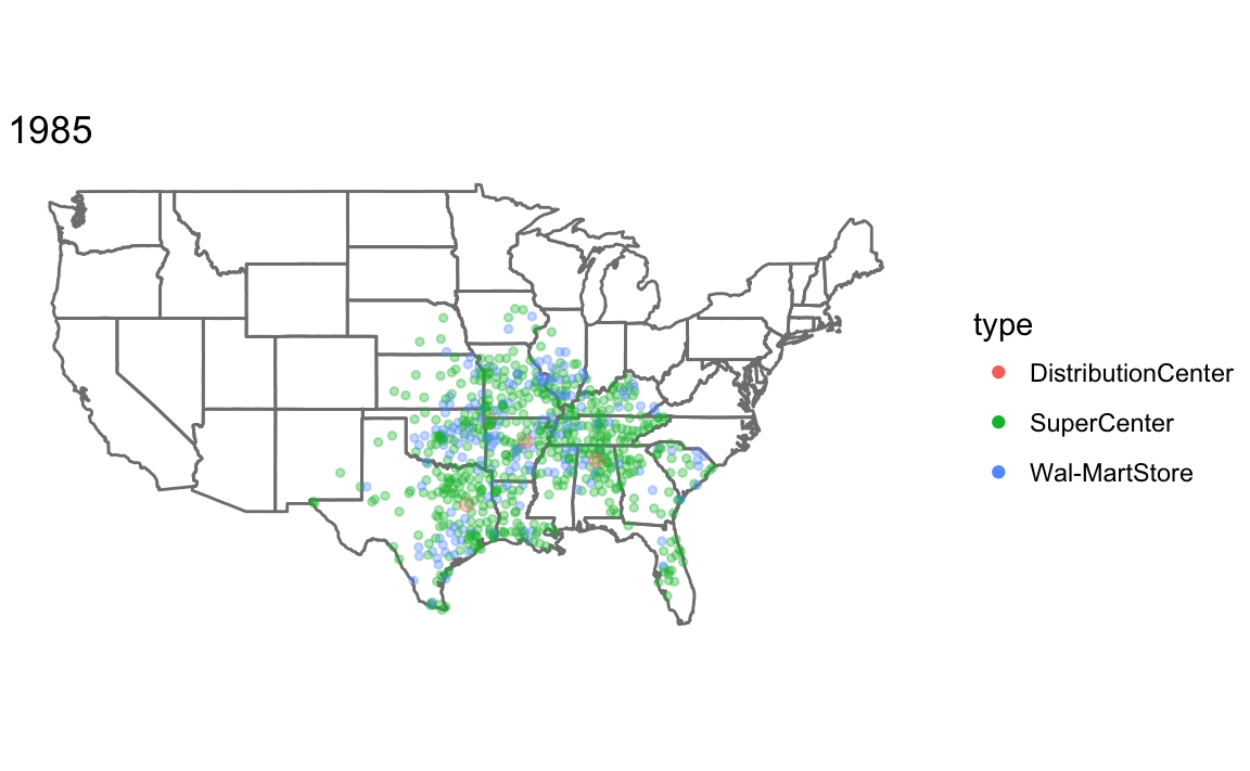
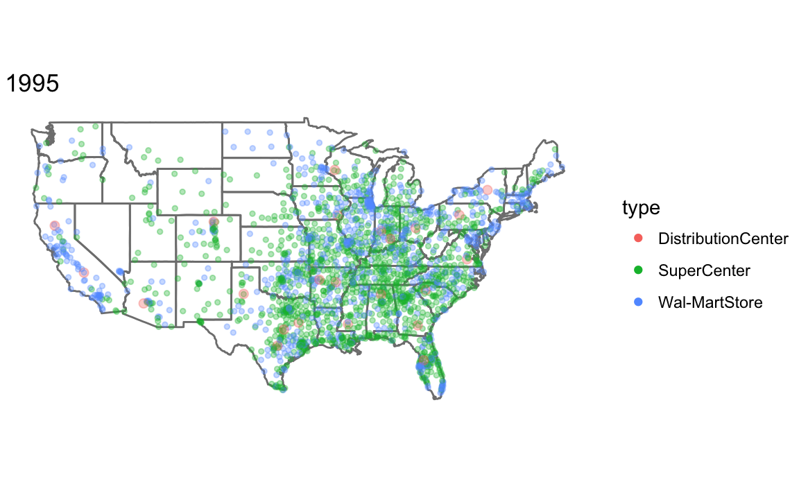
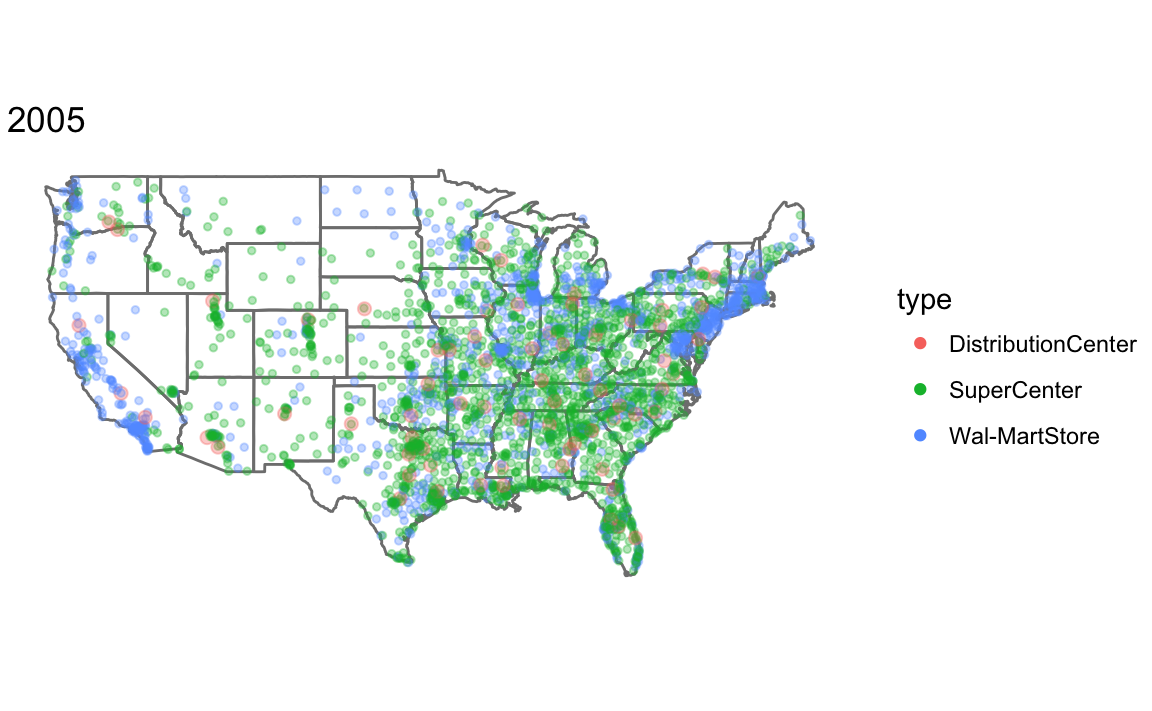
To make a plot showing all Walmart stores opened up through that year, I write a function, that takes the year and dataset as parameters.
Since I am calling the function for its side effect (printing the plot) rather than the value it returns, I use the walk function rather than map. See R for Data Science, Chapter 21.8: Walk for more information.
map_walmart <- function(year, .data) {
  .data <- filter(.data, opendate < make_date(year, 1, 1)) %>%
    mutate(size = if_else(type == "DistributionCenter", 2, 1))
  ggplot() +
    borders(database = "state") +
    geom_point(aes(x = long, y = lat, colour = type, size = size),
               data = .data, alpha = 1 / 3) +
    coord_quickmap() +
    scale_size_identity() +
    guides(color = guide_legend(override.aes = list(alpha = 1))) +
    theme_void() +
    ggtitle(year)
}

years <- c(1975, 1985, 1995, 2005)
walk(years, ~ print(map_walmart(.x, walmart)))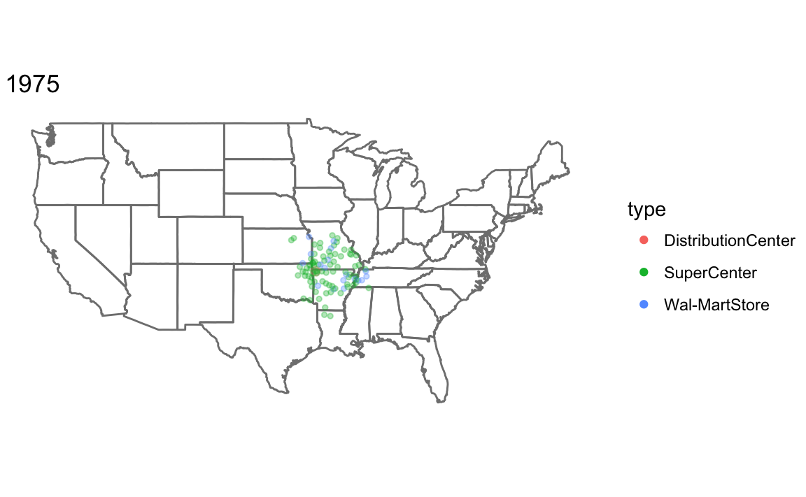
5.3.5 Animation in R
For easy animation with ggplot2, use the gganimate package. Note that the gganimate package is not on CRAN, so you have to install it with the devtools package:
install.packages("cowplot")
devtools::install_github("dgrtwo/gganimate")library("gganimate")An animation is a series of frames. The gganimate package works by adding a frame aesthetic to ggplots, and function will animate the plot.
I use frame = year(opendate) to have the animation use each year as a frame, and cumulative = TRUE so that the previous years are shown.
walmart_animated <-
  ggplot() +
    borders(database = "state") +
    geom_point(aes(x = long, y = lat,
                   colour = type,
                   fill = type,
                   frame = year(opendate),
                   cumulative = TRUE),
               data = walmart) +
    coord_quickmap() +
    theme_void()
gganimate(walmart_animated)