3 Measurement
Prerequisites
library("tidyverse")
library("forcats")
library("broom")
library("tidyr")
3.1 Measuring Civilian Victimization during Wartime
data("afghan", package = "qss")Summarize the variables of interest
afghan %>%
  select(age, educ.years, employed, income) %>%
  summary()
#>       age         educ.years    employed        income
#>  Min.   :15.0   Min.   : 0   Min.   :0.000   Length:2754
#>  1st Qu.:22.0   1st Qu.: 0   1st Qu.:0.000   Class :character
#>  Median :30.0   Median : 1   Median :1.000   Mode  :character
#>  Mean   :32.4   Mean   : 4   Mean   :0.583
#>  3rd Qu.:40.0   3rd Qu.: 8   3rd Qu.:1.000
#>  Max.   :80.0   Max.   :18   Max.   :1.000
Loading data with either data() orread_csv() does not convert strings to factors by default; see below with income. To get a summary of the different levels, either convert it to a factor (see R4DS Ch 15), or use count():
count(afghan, income)
#> # A tibble: 6 x 2
#>   income              n
#>   <chr>           <int>
#> 1 10,001-20,000     616
#> 2 2,001-10,000     1420
#> 3 20,001-30,000      93
#> 4 less than 2,000   457
#> 5 over 30,000        14
#> 6 <NA>              154
Use count to calculate the proportion of respondents who answer that they were harmed by the ISAF or the Taliban (violent.exp.ISAF and violent.exp.taliban, respectively):
afghan %>%
  group_by(violent.exp.ISAF, violent.exp.taliban) %>%
  count() %>%
  ungroup() %>%
  mutate(prop = n / sum(n))
#> # A tibble: 9 x 4
#>   violent.exp.ISAF violent.exp.taliban     n    prop
#>              <int>               <int> <int>   <dbl>
#> 1                0                   0  1330 0.483
#> 2                0                   1   354 0.129
#> 3                0                  NA    22 0.00799
#> 4                1                   0   475 0.172
#> 5                1                   1   526 0.191
#> 6                1                  NA    22 0.00799
#> # ... with 3 more rows
We need to use ungroup() in order to ensure that sum(n) sums over the entire dataset as opposed to only within categories of violent.exp.ISAF. Unlike prop.table(), the code above does not drop missing values. We can drop those values by adding filter() and !is.na() to test for missing values in those variables:
afghan %>%
  filter(!is.na(violent.exp.ISAF), !is.na(violent.exp.taliban)) %>%
  group_by(violent.exp.ISAF, violent.exp.taliban) %>%
  count() %>%
  ungroup() %>%
  mutate(prop = n / sum(n))
#> # A tibble: 4 x 4
#>   violent.exp.ISAF violent.exp.taliban     n  prop
#>              <int>               <int> <int> <dbl>
#> 1                0                   0  1330 0.495
#> 2                0                   1   354 0.132
#> 3                1                   0   475 0.177
#> 4                1                   1   526 0.196
3.2 Handling Missing Data in R
We already observed the issues with NA values in calculating the proportion answering the “experienced violence” questions. You can filter rows with specific variables having missing values using filter() as shown above.
head(afghan$income, n = 10)
#>  [1] "2,001-10,000"  "2,001-10,000"  "2,001-10,000"  "2,001-10,000"
#>  [5] "2,001-10,000"  NA              "10,001-20,000" "2,001-10,000"
#>  [9] "2,001-10,000"  NA
head(is.na(afghan$income), n = 10)
#>  [1] FALSE FALSE FALSE FALSE FALSE  TRUE FALSE FALSE FALSE  TRUE
Counts and proportion of missing values of income:
summarise(afghan,
          n_missing = sum(is.na(income)),
          p_missing = mean(is.na(income)))
#>   n_missing p_missing
#> 1       154    0.0559
Mean, and other functions, do not by default exclude missing values. Use na.rm = TRUE in these cases.
x <- c(1, 2, 3, NA)
mean(x)
#> [1] NA
mean(x, na.rm = TRUE)
#> [1] 2
Table of proportions of individuals harmed by the ISAF and Taliban that includes missing (NA) values:
violent_exp_prop <-
  afghan %>%
  group_by(violent.exp.ISAF, violent.exp.taliban) %>%
  count() %>%
  ungroup() %>%
  mutate(prop = n / sum(n)) %>%
  select(-n)
violent_exp_prop
#> # A tibble: 9 x 3
#>   violent.exp.ISAF violent.exp.taliban    prop
#>              <int>               <int>   <dbl>
#> 1                0                   0 0.483
#> 2                0                   1 0.129
#> 3                0                  NA 0.00799
#> 4                1                   0 0.172
#> 5                1                   1 0.191
#> 6                1                  NA 0.00799
#> # ... with 3 more rows
The data frame above can be reorganized so that rows are ISAF and the columns are Taliban as follows:
violent_exp_prop %>%
  spread(violent.exp.taliban, prop)
#> # A tibble: 3 x 4
#>   violent.exp.ISAF     `0`     `1`  `<NA>`
#>              <int>   <dbl>   <dbl>   <dbl>
#> 1                0 0.483   0.129   0.00799
#> 2                1 0.172   0.191   0.00799
#> 3               NA 0.00254 0.00290 0.00363
drop_na is an alternative to na.omit that allows for removing missing values,
drop_na(afghan)Tip There are multiple types of missing values.
NA  # logical
#> [1] NA
NA_integer_ # integer
#> [1] NA
NA_real_ # double
#> [1] NA
NA_character_ # character
#> [1] NA
In many cases, this distinction does not matter since many functions will coerce these missing values to the correct vector type. However, you will need to use these in some tidyverse functions that require the outputs to be the same type, e.g. map() and most of the other purrr functions, and if_else(). The code below produces an error, since the TRUE case returns an integer value (x is an integer), but the FALSE case does not specify the type of NA.
x <- 1:5
class(x)
#> [1] "integer"
if_else(x < 3, x, NA)
#> Error: `false` must be type integer, not logical
So instead of NA, use NA_integer_:
if_else(x < 3, x, NA_integer_)
#> [1]  1  2 NA NA NA
3.3 Visualizing the Univariate Distribution
3.3.1 Barplot
afghan <-
  afghan %>%
  mutate(violent.exp.ISAF.fct =
           fct_explicit_na(fct_recode(factor(violent.exp.ISAF),
                                      Harm = "1", "No Harm" = "0"),
                           "No response"))
ggplot(afghan, aes(x = violent.exp.ISAF.fct, y = ..prop.., group = 1)) +
  geom_bar() +
  xlab("Response category") +
  ylab("Proportion of respondents") +
  ggtitle("Civilian Victimization by the ISAF")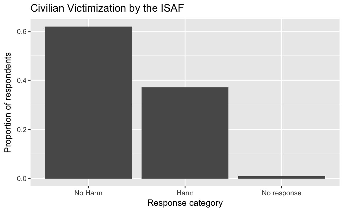
afghan <-
  afghan %>%
  mutate(violent.exp.taliban.fct =
           fct_explicit_na(fct_recode(factor(violent.exp.taliban),
                                      Harm = "1", "No Harm" = "0"),
                           "No response"))
ggplot(afghan, aes(x = violent.exp.ISAF.fct, y = ..prop.., group = 1)) +
  geom_bar() +
  xlab("Response category") +
  ylab("Proportion of respondents") +
  ggtitle("Civilian Victimization by the Taliban")
Instead of creating two separate box-plots, create a single plot facetted by ISAF and Taliban:
select(afghan, violent.exp.ISAF, violent.exp.taliban) %>%
  gather(variable, value) %>%
  mutate(value = fct_explicit_na(fct_recode(factor(value),
                                Harm = "1", "No Harm" = "0"),
                                "No response"),
         variable = recode(variable,
                           violent.exp.ISAF = "ISAF",
                           violent.exp.taliban = "Taliban")) %>%
  ggplot(aes(x = value, y = ..prop.., group = 1)) +
  geom_bar() +
  facet_wrap(~ variable, ncol = 1) +
  xlab("Response category") +
  ylab("Proportion of respondents") +
  ggtitle("Civilian Victimization")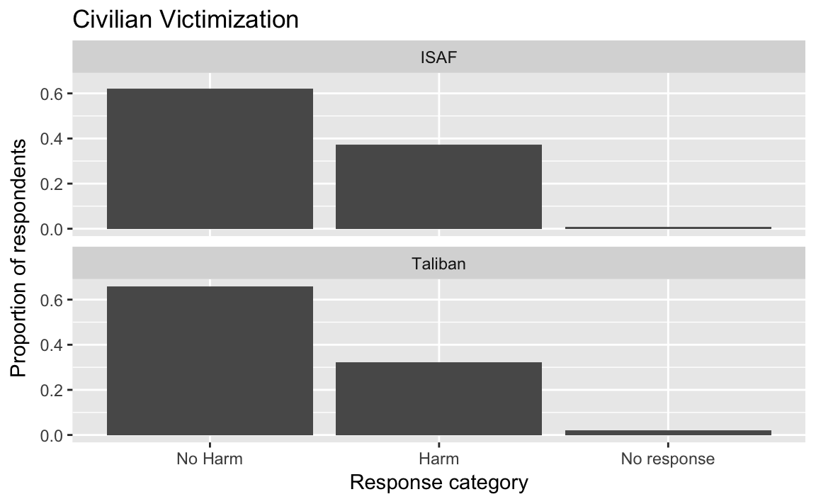
This plot could improved by plotting the two values simultaneously to be able to better compare them. This will require creating a data frame that has the following columns: perpetrator (ISAF, Taliban) and response (No Harm, Harm, No response).
violent_exp <-
  afghan %>%
  select(violent.exp.ISAF, violent.exp.taliban) %>%
  gather(perpetrator, response) %>%
  mutate(perpetrator = str_replace(perpetrator, "violent\\.exp\\.", ""),
         perpetrator = str_replace(perpetrator, "taliban", "Taliban"),
         response = fct_recode(factor(response), "Harm" = "1", "No Harm" = "0"),
         response = fct_explicit_na(response, "No response"),
         response = fct_relevel(response, c("No response", "No Harm"))
         ) %>%
  count(perpetrator, response) %>%
  mutate(prop = n / sum(n))
ggplot(violent_exp, aes(x = prop, y = response, color = perpetrator)) +
  geom_point() +
  scale_color_manual(values = c(ISAF = "green", Taliban = "black"))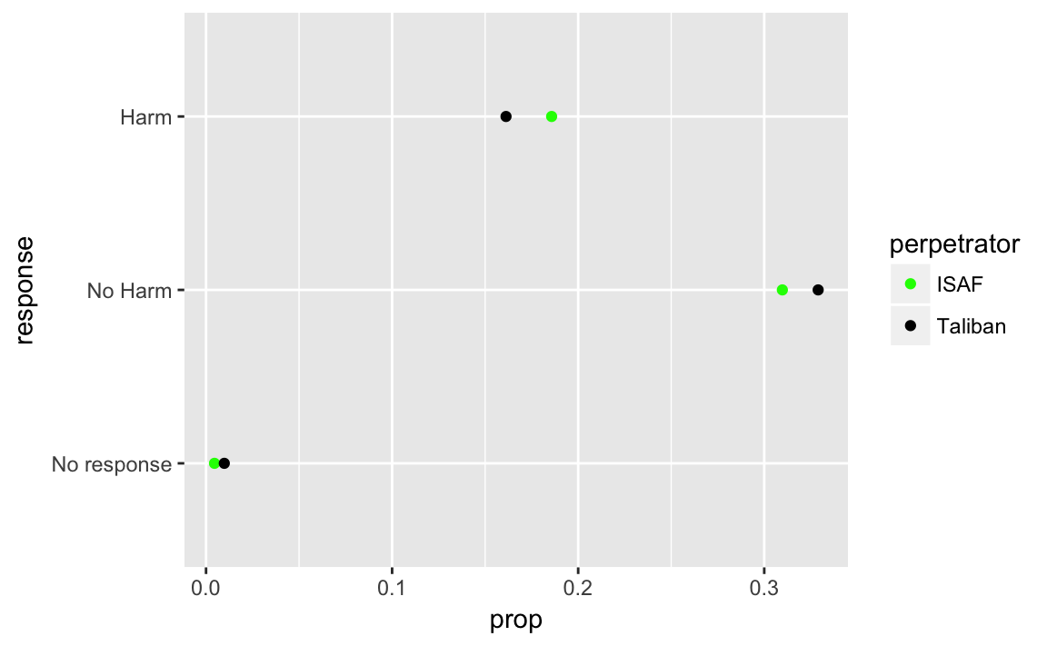
Black was chosen for the Taliban, and Green for ISAF because they are the colors of their respective flags.
3.3.2 Histogram
See the documentation for geom_histogram.
ggplot(afghan, aes(x = age, y = ..density..)) +
  geom_histogram(binwidth = 5, boundary = 0) +
  scale_x_continuous(breaks = seq(20, 80, by = 10)) +
  labs(title = "Distribution of respondent's age",
       y = "Age", x = "Density")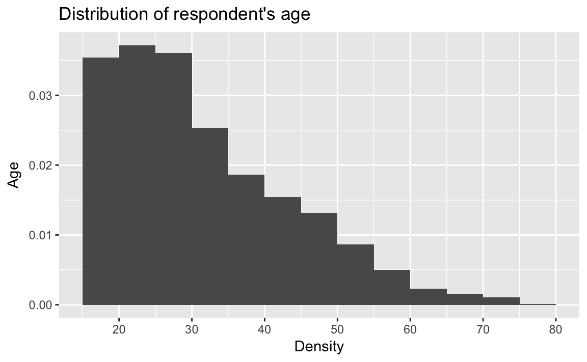
ggplot(afghan, aes(x = educ.years, y = ..density..)) +
  geom_histogram(binwidth = 1, center = 0) +
  geom_vline(xintercept = median(afghan$educ.years),
             color = "white", size = 2) +
  annotate("text", x = median(afghan$educ.years),
           y = 0.2, label = "median", hjust = 0) +
  labs(title = "Distribution of respondent's education",
       x = "Years of education",
       y = "Density")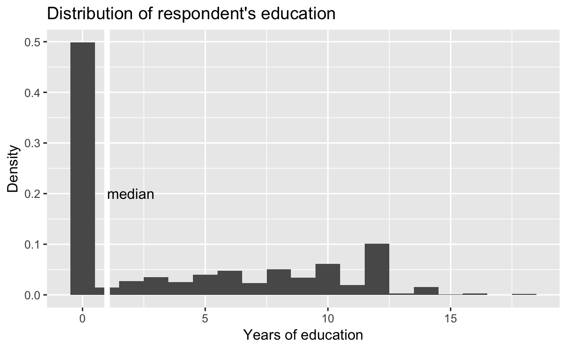
There are several alternatives to the histogram.
Density plots (geom_density):
dens_plot <- ggplot(afghan, aes(x = age)) +
  geom_density() +
  scale_x_continuous(breaks = seq(20, 80, by = 10)) +
  labs(title = "Distribution of respondent's age",
       y = "Age", x = "Density")
dens_plot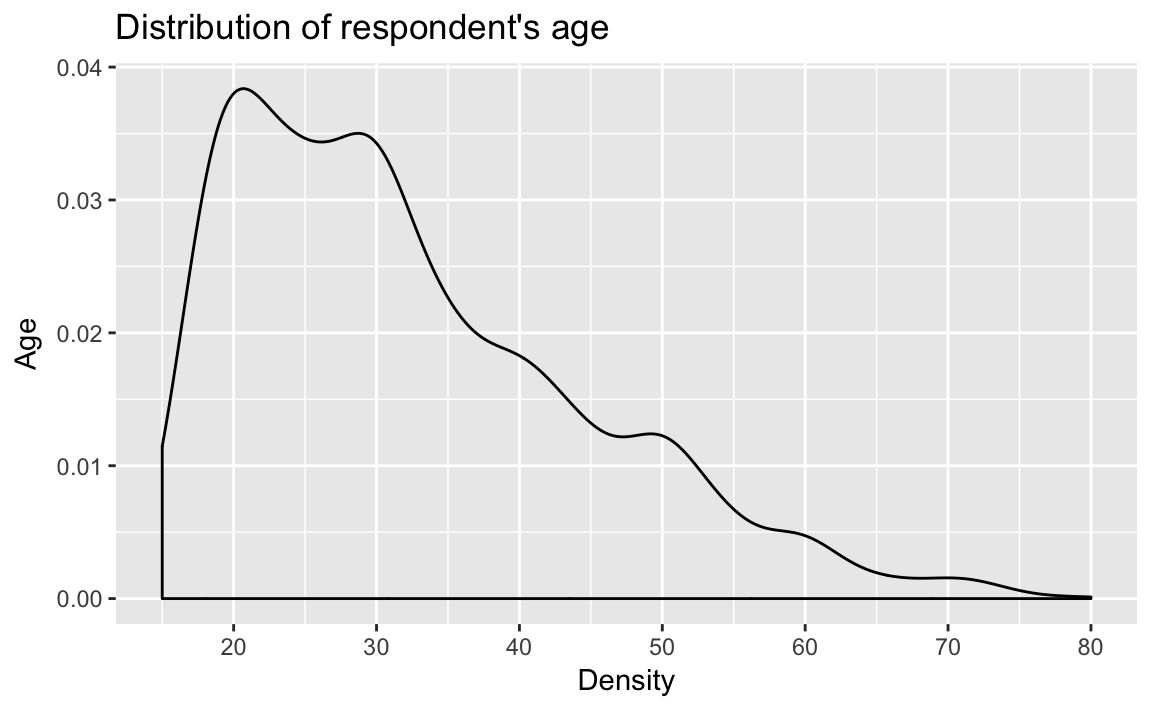
which can be combined with a geom_rug to create a rug plot, which puts small lines on the axis to represent the value of each observation. It can be combined with a scatter or density plot to add extra detail. Adjust the alpha to modify the color transparency of the rug and address overplotting.
dens_plot + geom_rug(alpha = .2)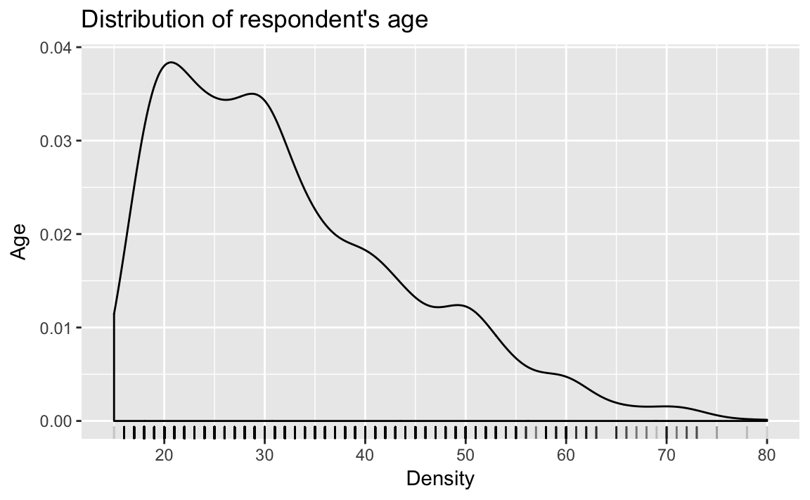
Frequency polygons (geom_freqpoly): See R for Data Science EDA.
ggplot(afghan, aes(x = age)) +
  geom_freqpoly() +
  scale_x_continuous(breaks = seq(20, 80, by = 10)) +
  labs(title = "Distribution of respondent's age",
       y = "Age", x = "Density")
#> `stat_bin()` using `bins = 30`. Pick better value with `binwidth`.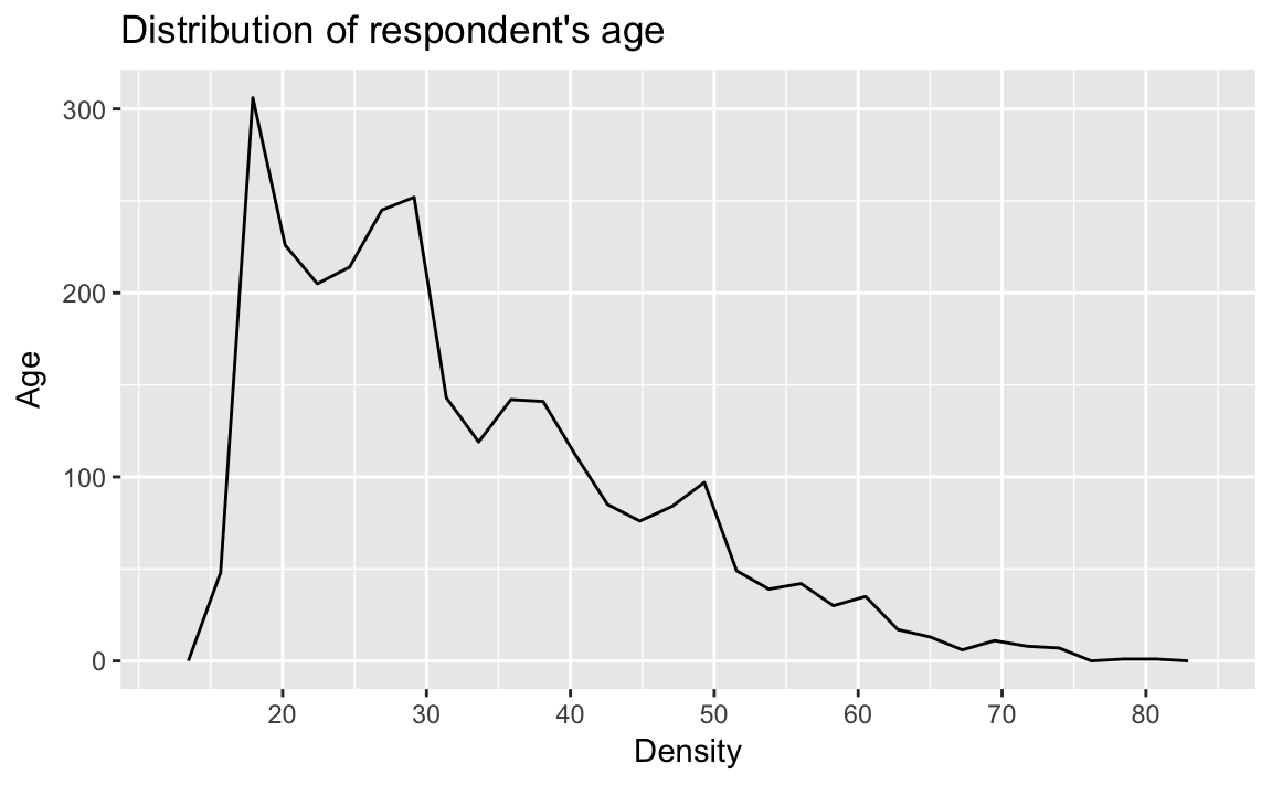
3.3.3 Boxplot
See the documentation for geom_boxplot.
ggplot(afghan, aes(x = 1, y = age)) +
  geom_boxplot() +
  coord_flip() +
  labs(y = "Age", x = "", title = "Distribution of Age")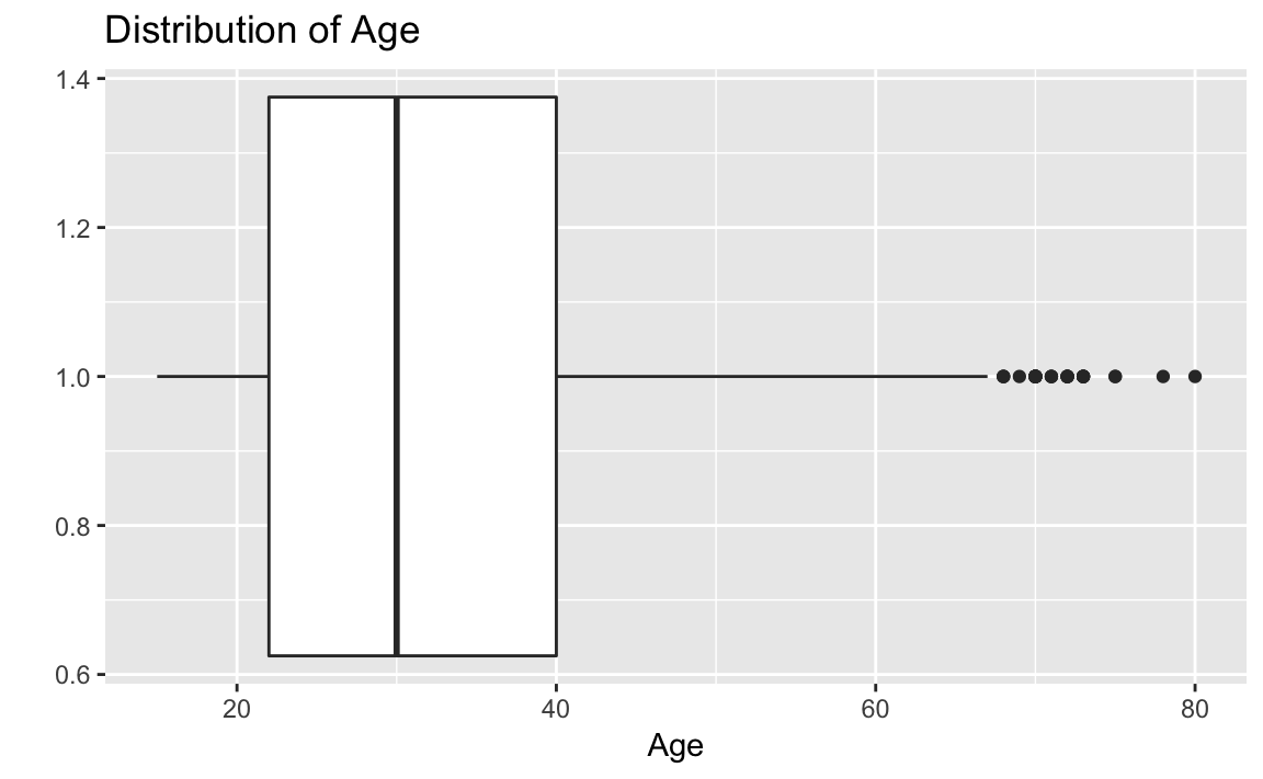
ggplot(afghan, aes(y = educ.years, x = province)) +
geom_boxplot() +
coord_flip() +
labs(x = "Province", y = "Years of education",
title = "Education by Province")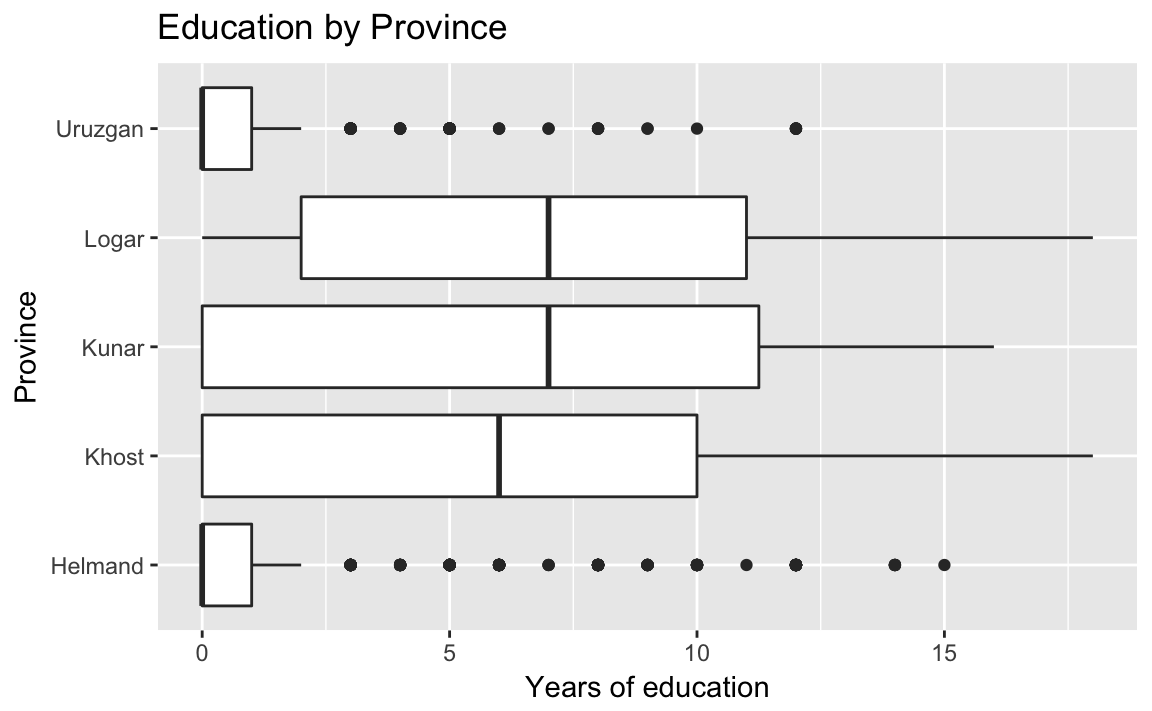 Helmand and Uruzgan have much lower levels of education than the other provinces, and also report higher levels of violence.
afghan %>%
  group_by(province) %>%
  summarise(educ.years = mean(educ.years, na.rm = TRUE),
            violent.exp.taliban =
              mean(violent.exp.taliban, na.rm = TRUE),
            violent.exp.ISAF =
              mean(violent.exp.ISAF, na.rm = TRUE)) %>%
  arrange(educ.years)
#> # A tibble: 5 x 4
#>   province educ.years violent.exp.taliban violent.exp.ISAF
#>   <chr>         <dbl>               <dbl>            <dbl>
#> 1 Uruzgan        1.04              0.455             0.496
#> 2 Helmand        1.60              0.504             0.541
#> 3 Khost          5.79              0.233             0.242
#> 4 Kunar          5.93              0.303             0.399
#> 5 Logar          6.70              0.0802            0.144
An alternatives to the traditional boxplot:
The Tufte boxplot:
library("ggthemes")
ggplot(afghan, aes(y = educ.years, x = province)) +
geom_tufteboxplot() +
coord_flip() +
labs(x = "Province", y = "Years of education",
title = "Education by Province")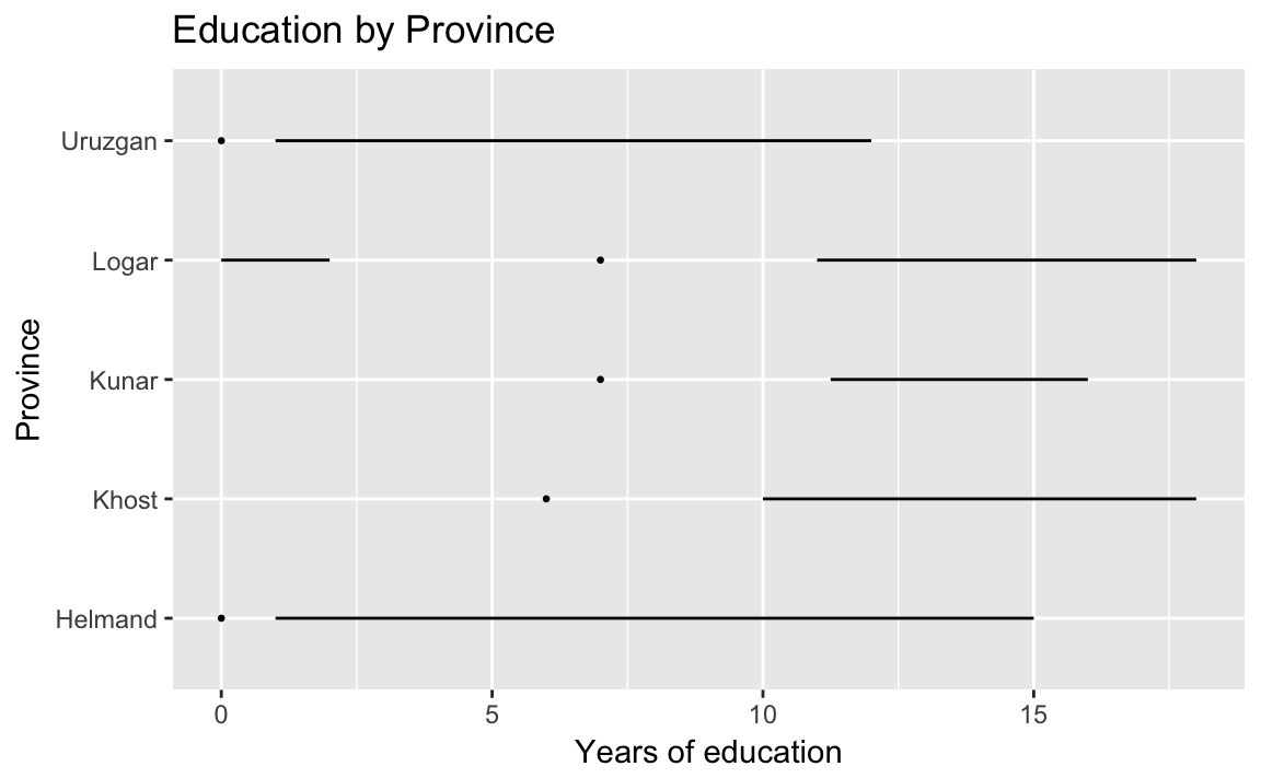 Dot plot with jitter and adjusted alpha to avoid overplotting:
ggplot(afghan, aes(y = educ.years, x = province)) +
geom_point(position = position_jitter(width = 0.25, height = 0),
alpha = .2) +
coord_flip() +
labs(x = "Province", y = "Years of education",
title = "Education by Province")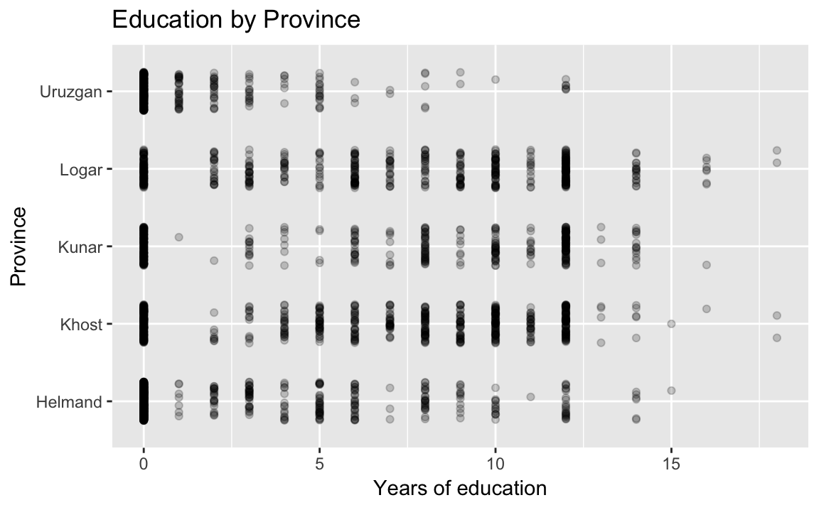 A violin plot:
ggplot(afghan, aes(y = educ.years, x = province)) +
  geom_violin() +
  coord_flip() +
  labs(x = "Province", y = "Years of education",
       title = "Education by Province")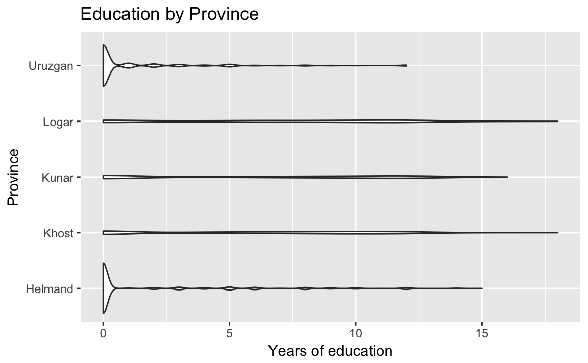
3.3.4 Printing and saving graphics
Use the function rdoc ("ggplot2", "ggsave") to save ggplot2 graphics. Also, R Markdown files have their own means of creating and saving plots created by code-chunks.
3.4 Survey Sampling
3.4.1 The Role of Randomization
data("afghan.village", package = "qss")Box-plots of altitude
ggplot(afghan.village, aes(x = factor(village.surveyed,
                                      labels = c("sampled", "non-sampled")),
                           y = altitude)) +
  geom_boxplot() +
  labs(y = "Altitude (meter)", x = "") +
  coord_flip()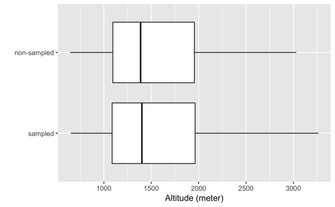
Box plots log-population values of sampled and non-sampled
ggplot(afghan.village, aes(x = factor(village.surveyed,
                                      labels = c("sampled", "non-sampled")),
                           y = log(population))) +
  geom_boxplot() +
  labs(y = "log(population)", x = "") +
  coord_flip()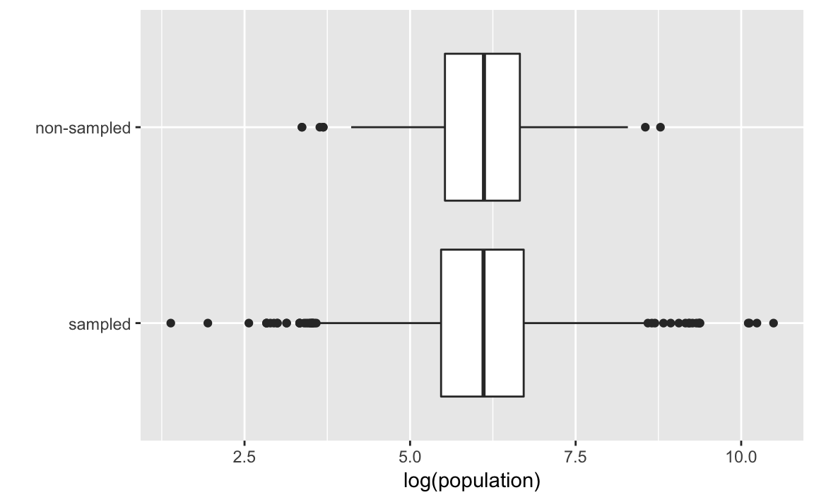
You can also compare these distributions by plotting their densities:
ggplot(afghan.village, aes(colour = factor(village.surveyed,
                                      labels = c("sampled", "non-sampled")),
                           x = log(population))) +
  geom_density() +
  geom_rug() +
  labs(x = "log(population)", colour = "")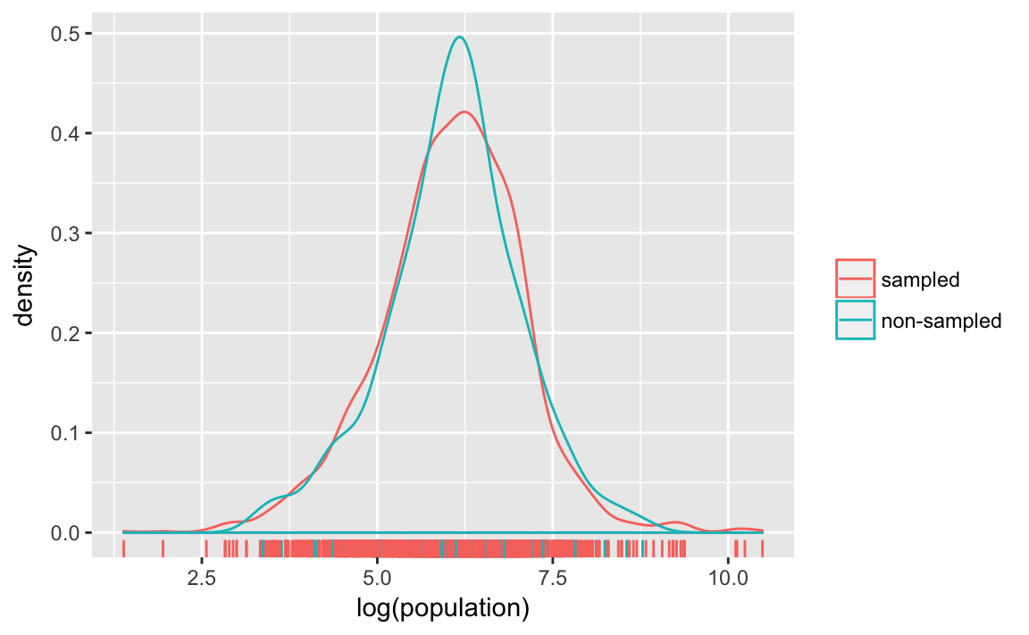
3.4.2 Non-response and other sources of bias
Calculate the rates of item non-response by province to the question about civilian victimization by ISAF and Taliban forces (violent.exp.ISAF and violent.exp.taliban):
afghan %>%
  group_by(province) %>%
  summarise(ISAF = mean(is.na(violent.exp.ISAF)),
            taliban = mean(is.na(violent.exp.taliban))) %>%
  arrange(-ISAF)
#> # A tibble: 5 x 3
#>   province    ISAF taliban
#>   <chr>      <dbl>   <dbl>
#> 1 Uruzgan  0.0207  0.0620
#> 2 Helmand  0.0164  0.0304
#> 3 Khost    0.00476 0.00635
#> 4 Kunar    0       0
#> 5 Logar    0       0
Calculate the proportion who support the ISAF using the difference in means between the ISAF and control groups:
(mean(filter(afghan, list.group == "ISAF")$list.response) -
  mean(filter(afghan, list.group == "control")$list.response))
#> [1] 0.049
To calculate the table responses to the list experiment in the control, ISAF, and Taliban groups:
afghan %>%
  group_by(list.response, list.group) %>%
  count() %>%
  glimpse() %>%
  spread(list.group, n, fill = 0)
#> Observations: 12
#> Variables: 3
#> $ list.response <int> 0, 0, 1, 1, 1, 2, 2, 2, 3, 3, 3, 4
#> $ list.group    <chr> "control", "ISAF", "control", "ISAF", "taliban",...
#> $ n             <int> 188, 174, 265, 278, 433, 265, 260, 287, 200, 182...
#> # A tibble: 5 x 4
#> # Groups:   list.response [5]
#>   list.response control  ISAF taliban
#>           <int>   <dbl> <dbl>   <dbl>
#> 1             0     188 174         0
#> 2             1     265 278       433
#> 3             2     265 260       287
#> 4             3     200 182       198
#> 5             4       0  24.0       0
3.5 Measuring Political Polarization
data("congress", package = "qss")glimpse(congress)
#> Observations: 14,552
#> Variables: 7
#> $ congress <int> 80, 80, 80, 80, 80, 80, 80, 80, 80, 80, 80, 80, 80, 8...
#> $ district <int> 0, 1, 2, 3, 4, 5, 6, 7, 8, 9, 98, 98, 1, 2, 3, 4, 5, ...
#> $ state <chr> "USA", "ALABAMA", "ALABAMA", "ALABAMA", "ALABAMA", "A...
#> $ party <chr> "Democrat", "Democrat", "Democrat", "Democrat", "Demo...
#> $ name <chr> "TRUMAN", "BOYKIN F.", "GRANT G.", "ANDREWS G.", "...
#> $ dwnom1 <dbl> -0.276, -0.026, -0.042, -0.008, -0.082, -0.170, -0.12...
#> $ dwnom2 <dbl> 0.016, 0.796, 0.999, 1.005, 1.066, 0.870, 0.990, 0.89...q <-
congress %>%
filter(congress %in% c(80, 112),
party %in% c("Democrat", "Republican")) %>%
ggplot(aes(x = dwnom1, y = dwnom2, colour = party)) +
geom_point() +
facet_wrap(~ congress) +
coord_fixed() +
scale_y_continuous("racial liberalism/conservatism",
limits = c(-1.5, 1.5)) +
scale_x_continuous("economic liberalism/conservatism",
limits = c(-1.5, 1.5))
q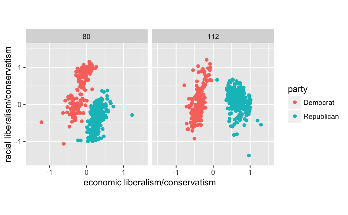
However, since there are colors associated with Democrats (blue) and Republicans (blue), we should use them rather than the defaults. There’s some evidence that using semantically-resonant colors can help decoding data visualizations (See Lin, et al. 2013). Since I’ll reuse the scale several times, I’ll save it in a variable.
scale_colour_parties <-
  scale_colour_manual(values = c(Democrat = "blue",
                                 Republican = "red",
                                 Other = "green"))
q + scale_colour_parties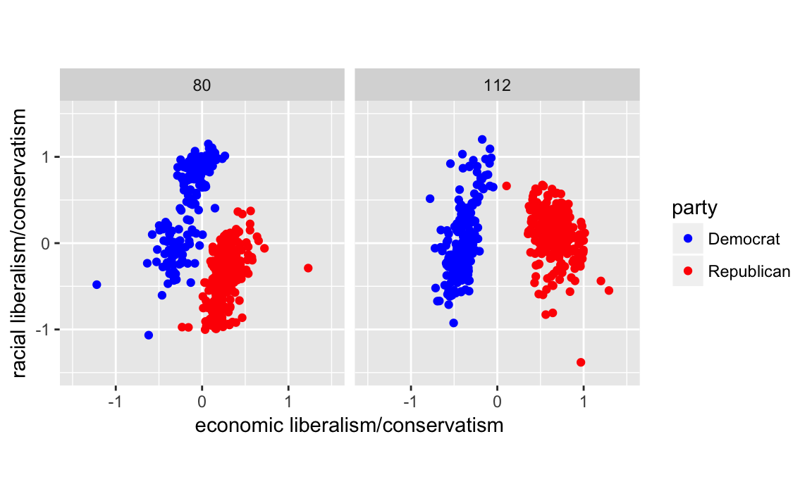
congress %>%
  ggplot(aes(x = dwnom1, y = dwnom2, colour = party)) +
  geom_point() +
  facet_wrap(~ congress) +
  coord_fixed() +
  scale_y_continuous("racial liberalism/conservatism",
                     limits = c(-2, 2)) +
  scale_x_continuous("economic liberalism/conservatism",
                     limits = c(-2, 2))
  #scale_colour_parties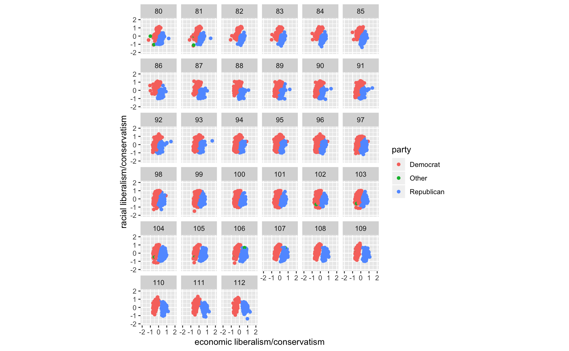
congress %>%
  group_by(congress, party) %>%
  summarise(dwnom1 = mean(dwnom1)) %>%
  filter(party %in% c("Democrat", "Republican")) %>%
  ggplot(aes(x = congress, y = dwnom1,
             colour = fct_reorder2(party, congress, dwnom1))) +
  geom_line() +
  scale_colour_parties +
  labs(y = "DW-NOMINATE score (1st Dimension)", x = "Congress",
       colour = "Party")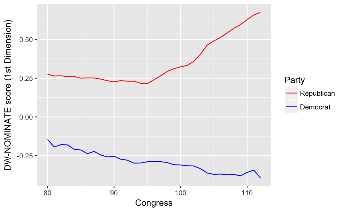
Alternatively, you can plot the mean DW-Nominate scores for each party and congress over time. This plot uses color for parties and lets the points and labels for the first and last congresses (80 and 112) to convey progress through time.
party_means <-
  congress %>%
  filter(party %in% c("Democrat", "Republican")) %>%
  group_by(party, congress) %>%
  summarise(dwnom1 = mean(dwnom1),
            dwnom2 = mean(dwnom2))

party_endpoints <-
  party_means %>%
  filter(congress %in% c(min(congress), max(congress))) %>%
  mutate(label = str_c(party, congress, sep = " - "))

ggplot(party_means,
         aes(x = dwnom1, y = dwnom2, color = party,
             group = party)) +
  geom_point() +
  geom_path() +
  ggrepel::geom_text_repel(data = party_endpoints,
                           mapping = aes(label = congress),
                           color = "black") +
  scale_y_continuous("racial liberalism/conservatism") +
  scale_x_continuous("economic liberalism/conservatism") +
  scale_colour_parties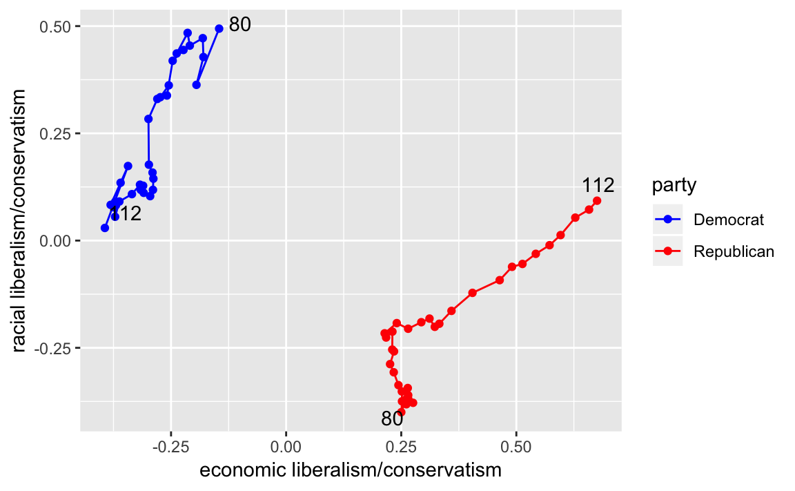
3.5.1 Correlation
Let’s plot the Gini coefficient
data("USGini", package = "qss")ggplot(USGini, aes(x = year, y = gini)) +
geom_point() +
geom_line() +
labs(x = "Year", y = "Gini coefficient") +
ggtitle("Income Inequality")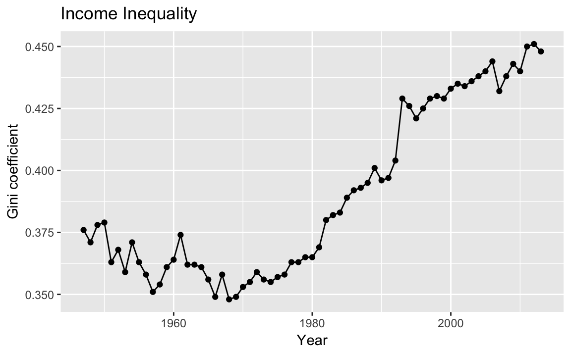
To calculate a measure of party polarization take the code used in the plot of Republican and Democratic party median ideal points and adapt it to calculate the difference in the party medians:
party_polarization <-
  congress %>%
  group_by(congress, party) %>%
  summarise(dwnom1 = mean(dwnom1)) %>%
  filter(party %in% c("Democrat", "Republican")) %>%
  spread(party, dwnom1) %>%
  mutate(polarization = Republican - Democrat)
party_polarization
#> # A tibble: 33 x 4
#> # Groups:   congress [33]
#>   congress Democrat Republican polarization
#>      <int>    <dbl>      <dbl>        <dbl>
#> 1       80   -0.146      0.276        0.421
#> 2       81   -0.195      0.264        0.459
#> 3       82   -0.180      0.265        0.445
#> 4       83   -0.181      0.261        0.442
#> 5       84   -0.209      0.261        0.471
#> 6       85   -0.214      0.250        0.464
#> # ... with 27 more rowsggplot(party_polarization, aes(x = congress, y = polarization)) +
geom_point() +
geom_line() +
ggtitle("Political Polarization") +
labs(x = "Year", y = "Republican median − Democratic median")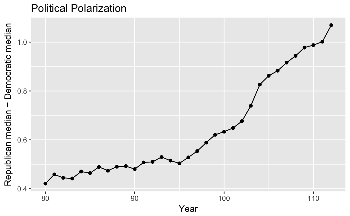
3.5.2 Quantile-Quantile Plot
congress %>%
  filter(congress == 112, party %in% c("Republican", "Democrat")) %>%
  ggplot(aes(x = dwnom2, y = ..density..)) +
  geom_histogram(binwidth = .2) +
  facet_grid(party ~ .) +
  labs(x = "racial liberalism/conservatism dimension")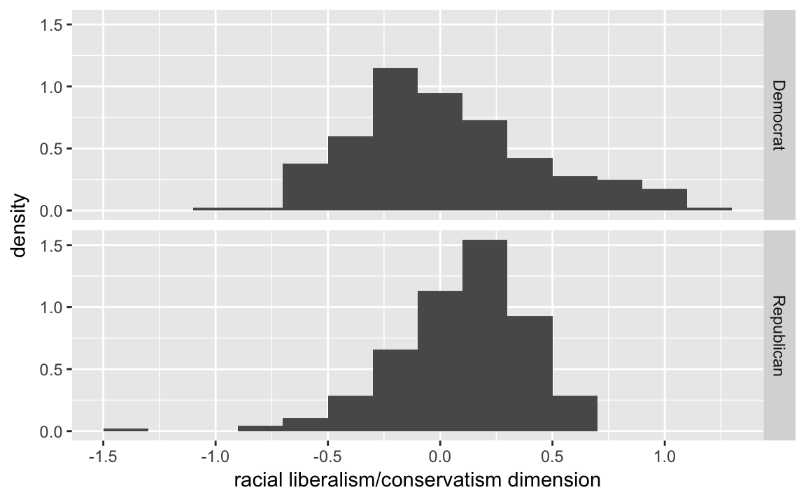
The package ggplot2 includes a function stat_qq which can be used to create qq-plots but it is more suited to comparing a sample distribution with a theoretical distribution, usually the normal one. However, we can calculate one by hand, which may give more insight into exactly what the qq-plot is doing.
party_qtiles <- tibble(
  probs = seq(0, 1, by = 0.01),
  Democrat = quantile(filter(congress, congress == 112,
                             party == "Democrat")$dwnom2,
         probs = probs),
  Republican = quantile(filter(congress, congress == 112,
                               party == "Republican")$dwnom2,
         probs = probs)
)
party_qtiles
#> # A tibble: 101 x 3
#>    probs Democrat Republican
#>    <dbl>    <dbl>      <dbl>
#> 1 0        -0.925     -1.38
#> 2 0.0100   -0.672     -0.720
#> 3 0.0200   -0.619     -0.566
#> 4 0.0300   -0.593     -0.526
#> 5 0.0400   -0.567     -0.468
#> 6 0.0500   -0.560     -0.436
#> # ... with 95 more rows
The plot looks different than the one in the text since the x- and y-scales are in the original values instead of z-scores (see the next section).
party_qtiles %>%
  ggplot(aes(x = Democrat, y = Republican)) +
  geom_point() +
  geom_abline() +
  coord_fixed()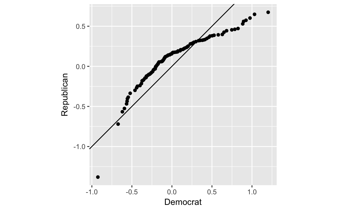
3.6 Clustering
3.6.1 Matrices
While matrices are great for numerical computations, such as when you are implementing algorithms, generally keeping data in data frames is more convenient for data wrangling.
See R for Data Science chapter Vectors.
3.6.2 Lists
See R for Data Science chapters Vectors and Iteration, as well as the purrr package for more powerful methods of computing on lists.
3.6.3 k-means algorithms
Calculate the clusters by the 80th and 112th congresses:
k80two.out <-
  kmeans(select(filter(congress, congress == 80),
                       dwnom1, dwnom2),
              centers = 2, nstart = 5)
Add the cluster ids to data sets:
congress80 <-
  congress %>%
  filter(congress == 80) %>%
  mutate(cluster2 = factor(k80two.out$cluster))
We will also create a data sets with the cluster centroids. These are in the centers element of the cluster object.
k80two.out$centers
#>    dwnom1 dwnom2
#> 1 -0.0484  0.783
#> 2  0.1468 -0.339
To make it easier to use with ggplot2, we need to convert this to a data frame. The tidy function from the broom package:
k80two.clusters <- tidy(k80two.out)
k80two.clusters
#>        x1     x2 size withinss cluster
#> 1 -0.0484  0.783  135     10.9       1
#> 2  0.1468 -0.339  311     54.9       2
Plot the ideal points and clusters:
ggplot() +
  geom_point(data = congress80,
             aes(x = dwnom1, y = dwnom2, colour = cluster2)) +
  geom_point(data = k80two.clusters, mapping = aes(x = x1, y = x2))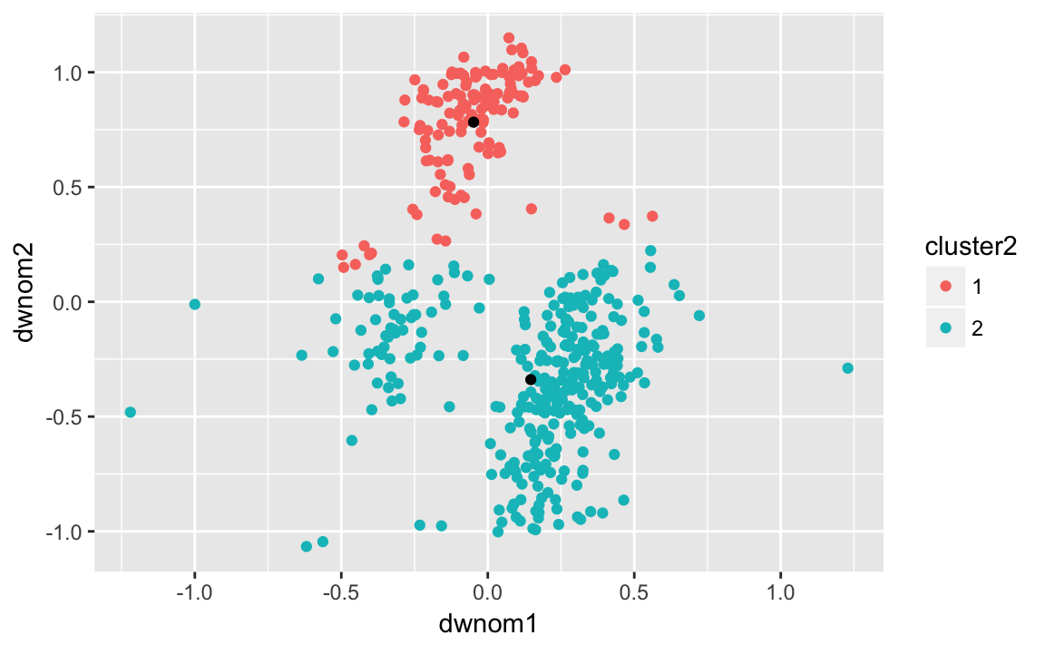
congress80 %>%
  group_by(party, cluster2) %>%
  count()
#> # A tibble: 5 x 3
#> # Groups:   party, cluster2 [5]
#>   party      cluster2     n
#>   <chr>      <fct>    <int>
#> 1 Democrat   1          132
#> 2 Democrat   2           62
#> 3 Other      2            2
#> 4 Republican 1            3
#> 5 Republican 2          247
And now we can repeat these steps for the 112th congress:
k112two.out <-
  kmeans(select(filter(congress, congress == 112),
                dwnom1, dwnom2),
         centers = 2, nstart = 5)
congress112 <-
  filter(congress, congress == 112) %>%
  mutate(cluster2 = factor(k112two.out$cluster))
k112two.clusters <- tidy(k112two.out)
ggplot() +
  geom_point(data = congress112,
             mapping = aes(x = dwnom1, y = dwnom2, colour = cluster2)) +
  geom_point(data = k112two.clusters,
             mapping = aes(x = x1, y = x2))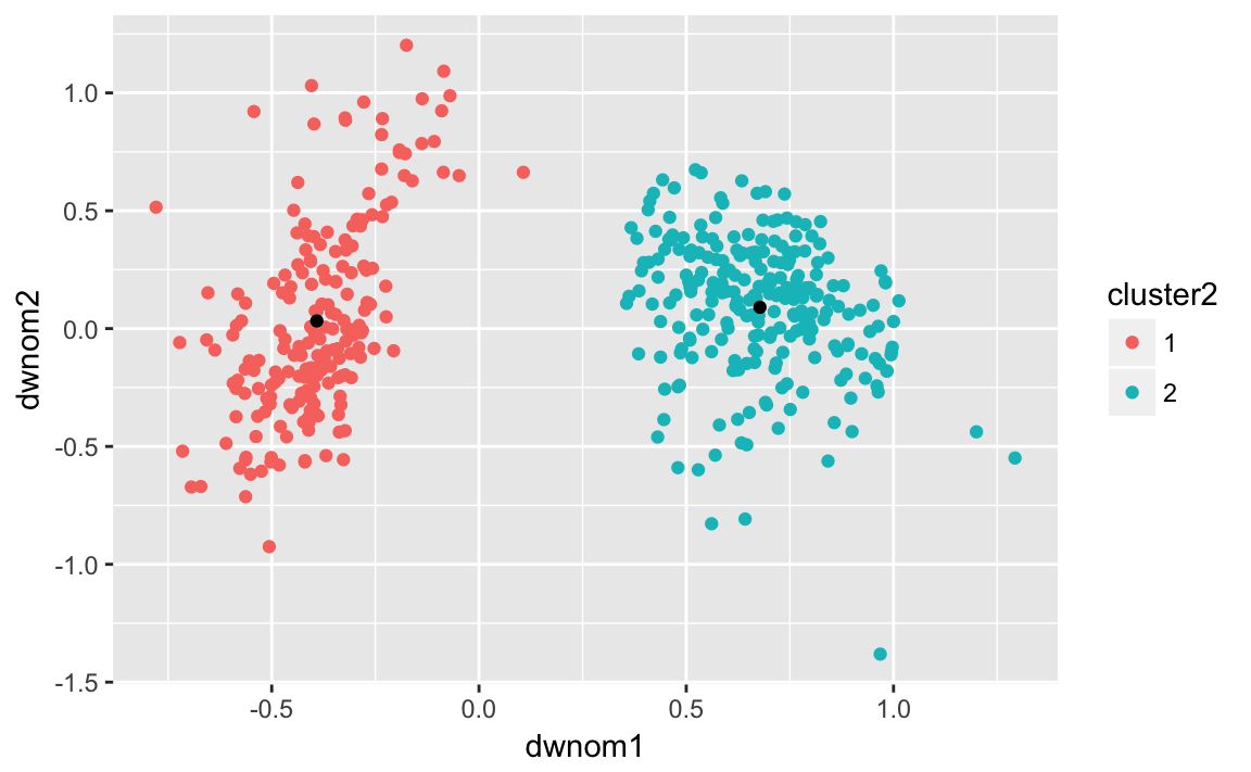
Number of observations from each party in each cluster:
congress112 %>%
group_by(party, cluster2) %>%
count()
#> # A tibble: 3 x 3
#> # Groups: party, cluster2 [3]
#> party cluster2 n
#> <chr> <fct> <int>
#> 1 Democrat 1 200
#> 2 Republican 1 1
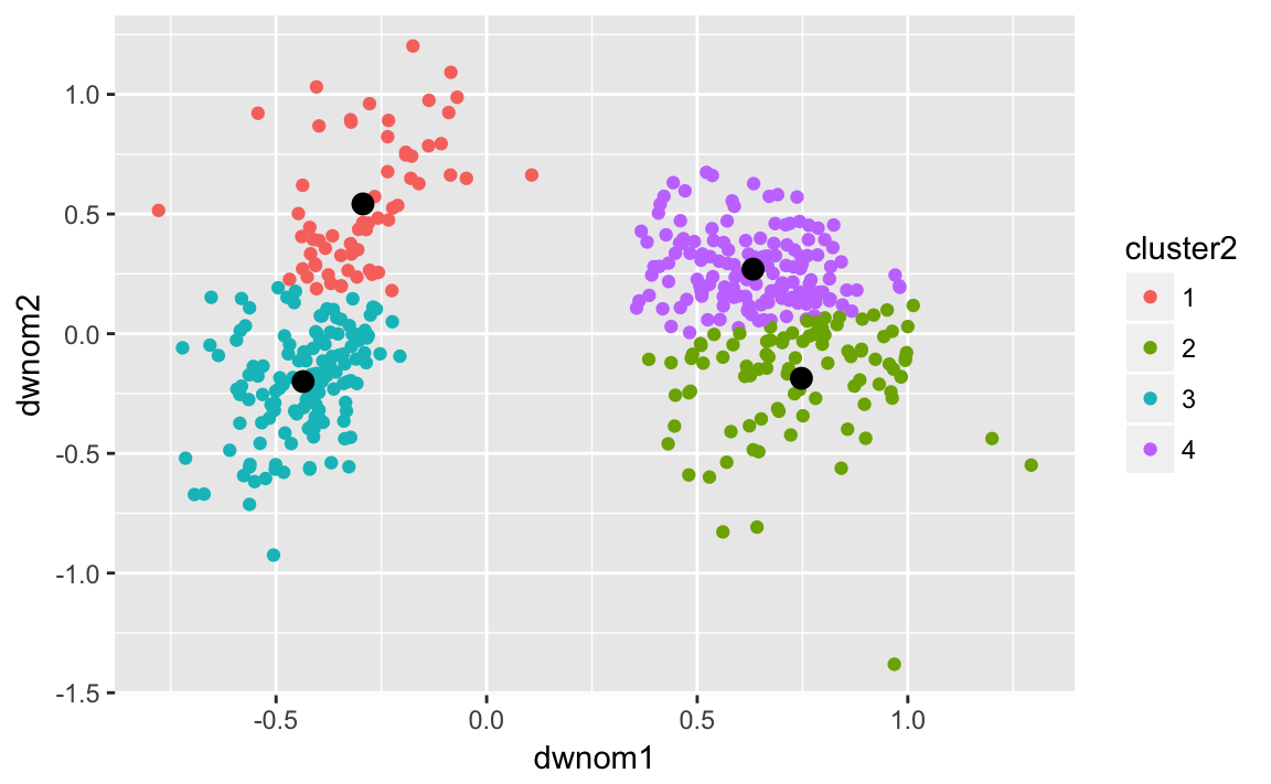
#> 3 Republican 2 242Now repeat the same with four clusters on the 80th congress:
k80four.out <-
kmeans(select(filter(congress, congress == 80),
dwnom1, dwnom2),
centers = 4, nstart = 5)
congress80 <-
filter(congress, congress == 80) %>%
mutate(cluster2 = factor(k80four.out$cluster))
k80four.clusters <- tidy(k80four.out)
ggplot() +
geom_point(data = congress80,
mapping = aes(x = dwnom1, y = dwnom2, colour = cluster2)) +
geom_point(data = k80four.clusters,
mapping = aes(x = x1, y = x2), size = 3)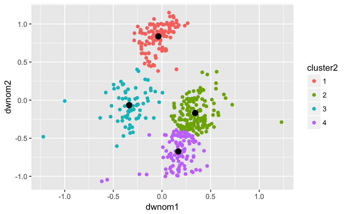 and on the 112th congress:
k112four.out <-
  kmeans(select(filter(congress, congress == 112),
                dwnom1, dwnom2),
         centers = 4, nstart = 5)
congress112 <-
  filter(congress, congress == 112) %>%
  mutate(cluster2 = factor(k112four.out$cluster))
k112four.clusters <- tidy(k112four.out)
ggplot() +
  geom_point(data = congress112,
             mapping = aes(x = dwnom1, y = dwnom2, colour = cluster2)) +
  geom_point(data = k112four.clusters,
             mapping = aes(x = x1, y = x2), size = 3)