4 Prediction
Prerequisites
library("tidyverse")
library("lubridate")
library("stringr")
library("forcats")
The packages modelr and broom are used to wrangle the results of linear regressions,
library("broom")
library("modelr")
4.1 Predicting Election Outcomes
4.1.1 Loops in R
RStudio provides many features to help debugging, which will be useful in for loops and function: see this article for an example.
values <- c(2, 3, 6)
n <- length(values)
results <- rep(NA, n)
for (i in 1:n) {
  results[[i]] <- values[[i]] * 2
  cat(values[[i]], "times 2 is equal to", results[[i]], "\n")
}
#> 2 times 2 is equal to 4
#> 3 times 2 is equal to 6
#> 6 times 2 is equal to 12
Note that the above code uses the for loop for pedagogical purposes only, this could have simply been written
results <- values * 2
results
#> [1]  4  6 12
In general, avoid using for loops when there is a vectorized function.
But sticking with the for loop, there are several things that could be improved.
Avoid using the idiom 1:n in for loops. To see why, look what happens when values are empty:
values <- c()
n <- length(values)
results <- rep(NA, n)
for (i in 1:n) {
  cat("i = ", i, "\n")
  results[i] <- values[i] * 2
  cat(values[i], "times 2 is equal to", results[i], "\n")
}
#> i =  1
#> Error in results[i] <- values[i] * 2: replacement has length zero
Instead of not running a loop, as you would expect, it runs two loops, where i = 1, then i = 0. This edge case occurs more than you may think, especially if you are writing functions where you don’t know the length of the vector is ex ante.
The way to avoid this is to use either rdoc("base", "seq_len") or rdoc("base", "seq_along"), which will handle 0-length vectors correctly.
values <- c()
n <- length(values)
results <- rep(NA, n)
for (i in seq_along(values)) {
  results[i] <- values[i] * 2
}
print(results)
#> logical(0)
or
values <- c()
n <- length(values)
results <- rep(NA, n)
for (i in seq_len(n)) {
  results[i] <- values[i] * 2
}
print(results)
#> logical(0)
Also, note that the the result is logical(0). That’s because the NA missing value has class logical, and thus rep(NA, ...) returns a logical vector. It is better style to initialize the vector with the same data type that you will be using,
results <- rep(NA_real_, length(values))
results
#> numeric(0)
class(results)
#> [1] "numeric"
Often loops can be rewritten to use a map function. Read the R for Data Science chapter Iteration before proceeding.
To do so, we first write a function that will be applied to each element of the vector. When converting from a for loop to a function, this is usually simply the body of the for loop, though you may need to add arguments for any variables defined outside the body of the for loop. In this case,
mult_by_two <- function(x) {
  x * 2
}
We can now test that this function works on different values:
mult_by_two(0)
#> [1] 0
mult_by_two(2.5)
#> [1] 5
mult_by_two(-3)
#> [1] -6
At this point, we could replace the body of the for loop with this function:
values <- c(2, 4, 6)
n <- length(values)
results <- rep(NA, n)
for (i in seq_len(n)) {
  results[i] <- mult_by_two(values[i])
}
print(results)
#> [1]  4  8 12
This can be useful if the body of a for loop is many lines long.
However, this loop is still unwieldy code. We have to remember to define an empty vector results that is the same size as values to hold the results, and then correctly loop over all the values. We already saw how these steps have possibilities for errors. Functionals like map, apply a function to each element of a vector.
results <- map(values, mult_by_two)
results
#> [[1]]
#> [1] 4
#>
#> [[2]]
#> [1] 8
#>
#> [[3]]
#> [1] 12
The values of each element are correct, but map returns a list vector, not a numeric vector like we may have been expecting. If we want a numeric vector, use map_dbl,
results <- map_dbl(values, mult_by_two)
results
#> [1]  4  8 12
Also, instead of explicitly defining a function, like mult_by_two, we could have instead used an anonymous function with the functional. An anonymous function is a function that is not assigned to a name.
results <- map_dbl(values, function(x) x * 2)
results
#> [1]  4  8 12
The various purrr functions also will interpret formulas as functions where .x and .y are interpreted as (up to) two arguments.
results <- map_dbl(values, ~ .x * 2)
results
#> [1]  4  8 12
This is for parsimony and convenience; in the background, these functions are creating anonymous functions from the given formula.
QSS discusses several debugging strategies. The functional approach lends itself to easier debugging because the function can be tested with input values independently of the loop.
4.1.2 General Conditional Statements in R
See the R for Data Science section Conditional Execution for a more complete discussion of conditional execution.
If you are using conditional statements to assign values for data frame, see the dplyr functions if_else, recode, and case_when
The following code which uses a for loop,
values <- 1:5
n <- length(values)
results <- rep(NA_real_, n)
for (i in seq_len(n)) {
  x <- values[i]
  r <- x %% 2
  if (r == 0) {
    cat(x, "is even and I will perform addition", x, " + ", x, "\n")
    results[i] <- x + x
  } else {
    cat(x, "is even and I will perform multiplication", x, " * ", x, "\n")
    results[i] <- x * x
  }
}
#> 1 is even and I will perform multiplication 1  *  1
#> 2 is even and I will perform addition 2  +  2
#> 3 is even and I will perform multiplication 3  *  3
#> 4 is even and I will perform addition 4  +  4
#> 5 is even and I will perform multiplication 5  *  5
results
#> [1]  1  4  9  8 25
could be rewritten to use if_else,
if_else(values %% 2 == 0, values + values, values * values)
#> [1]  1  4  9  8 25
or using the map_dbl functional with a named function,
myfunc <- function(x) {
  if (x %% 2 == 0) {
    x + x
  } else {
    x * x
  }
}
map_dbl(values, myfunc)
#> [1]  1  4  9  8 25
or map_dbl with an anonymous function,
map_dbl(values, function(x) {
  if (x %% 2 == 0) {
    x + x
  } else {
    x * x
  }
})
#> [1]  1  4  9  8 25
4.1.3 Poll Predictions
Load the election polls by state for the 2008 US Presidential election,
data("polls08", package = "qss")
glimpse(polls08)
#> Observations: 1,332
#> Variables: 5
#> $ state    <chr> "AL", "AL", "AL", "AL", "AL", "AL", "AL", "AL", "AL",...
#> $ Pollster <chr> "SurveyUSA-2", "Capital Survey-2", "SurveyUSA-2", "Ca...
#> $ Obama    <int> 36, 34, 35, 35, 39, 34, 36, 25, 35, 34, 37, 36, 36, 3...
#> $ McCain   <int> 61, 54, 62, 55, 60, 64, 58, 52, 55, 47, 55, 51, 49, 5...
#> $ middate  <date> 2008-10-27, 2008-10-15, 2008-10-08, 2008-10-06, 2008...
and the election results,
data("pres08", package = "qss")
glimpse(pres08)
#> Observations: 51
#> Variables: 5
#> $ state.name <chr> "Alabama", "Alaska", "Arizona", "Arkansas", "Califo...
#> $ state      <chr> "AL", "AK", "AZ", "AR", "CA", "CO", "CT", "DC", "DE...
#> $ Obama      <int> 39, 38, 45, 39, 61, 54, 61, 92, 62, 51, 47, 72, 36,...
#> $ McCain     <int> 60, 59, 54, 59, 37, 45, 38, 7, 37, 48, 52, 27, 62, ...
#> $ EV         <int> 9, 3, 10, 6, 55, 9, 7, 3, 3, 27, 15, 4, 4, 21, 11, ...
Compute Obama’s margin in polls and final election
polls08 <-
  polls08 %>% mutate(margin = Obama - McCain)
pres08 <-
  pres08 %>% mutate(margin = Obama - McCain)
To work with dates, the R package lubridate makes wrangling them much easier. See the R for Data Science chapter Dates and Times.
The function ymd will convert character strings like year-month-day and more into dates, as long as the order is (year, month, day). See dmy, mdy, and others for other ways to convert strings to dates.
x <- ymd("2008-11-04")
y <- ymd("2008/9/1")
x - y
#> Time difference of 64 days
However, note that in polls08, the date middate is already a date object,
class(polls08$middate)
#> [1] "Date"
The function read_csv by default will check character vectors to see if they have patterns that appear to be dates, and if so, will parse those columns as dates.
We’ll create a variable for election day
ELECTION_DAY <- ymd("2008-11-04")and add a new column to poll08 with the days to the election
polls08 <- mutate(polls08, ELECTION_DAY - middate)Although the code in the chapter uses a for loop, there is no reason to do so. We can accomplish the same task by merging the election results data to the polling data by state.
polls_w_results <- left_join(polls08,
                            select(pres08, state, elec_margin = margin),
                            by = "state") %>%
  mutate(error = elec_margin - margin)
glimpse(polls_w_results)
#> Observations: 1,332
#> Variables: 9
#> $ state                    <chr> "AL", "AL", "AL", "AL", "AL", "AL", "...
#> $ Pollster                 <chr> "SurveyUSA-2", "Capital Survey-2", "S...
#> $ Obama                    <int> 36, 34, 35, 35, 39, 34, 36, 25, 35, 3...
#> $ McCain                   <int> 61, 54, 62, 55, 60, 64, 58, 52, 55, 4...
#> $ middate                  <date> 2008-10-27, 2008-10-15, 2008-10-08, ...
#> $ margin                   <int> -25, -20, -27, -20, -21, -30, -22, -2...
#> $ `ELECTION_DAY - middate` <time> 8 days, 20 days, 27 days, 29 days, 4...
#> $ elec_margin              <int> -21, -21, -21, -21, -21, -21, -21, -2...
#> $ error                    <int> 4, -1, 6, -1, 0, 9, 1, 6, -1, -8, -3,...
To get the last poll in each state, arrange and filter on middate
last_polls <-
  polls_w_results %>%
  arrange(state, desc(middate)) %>%
  group_by(state) %>%
  slice(1)
last_polls
#> # A tibble: 51 x 9
#> # Groups:   state [51]
#>   state Pollster      Obama McCain middate    margin `ELECTION_DAY - midd…
#>   <chr> <chr>         <int>  <int> <date>      <int> <time>
#> 1 AK    Research 200…    39     58 2008-10-29    -19 6
#> 2 AL    SurveyUSA-2      36     61 2008-10-27    -25 8
#> 3 AR    ARG-4            44     51 2008-10-29    - 7 6
#> 4 AZ    ARG-3            46     50 2008-10-29    - 4 6
#> 5 CA    SurveyUSA-3      60     36 2008-10-30     24 5
#> 6 CO    ARG-3            52     45 2008-10-29      7 6
#> # ... with 45 more rows, and 2 more variables: elec_margin <int>,
#> #   error <int>
Challenge: Instead of using the last poll, use the average of polls in the last week? Last month? How do the margins on the polls change over the election period?
To simplify things for later, let’s define a function rmse which calculates the root mean squared error, as defined in the book. See the R for Data Science chapter Functions for more on writing functions.
rmse <- function(actual, pred) {
  sqrt(mean( (actual - pred) ^ 2))
}
Now we can use rmse() to calculate the RMSE for all the final polls:
rmse(last_polls$margin, last_polls$elec_margin)
#> [1] 5.88
Or since we already have a variable error,
sqrt(mean(last_polls$error ^ 2))
#> [1] 5.88
The mean prediction error is
mean(last_polls$error)
#> [1] 1.08
This is slightly different than what is in the book due to the difference in the poll used as the final poll; many states have many polls on the last day.
I’ll choose bin widths of 1%, since that is fairly interpretable:
ggplot(last_polls, aes(x = error)) +
  geom_histogram(binwidth = 1, boundary = 0)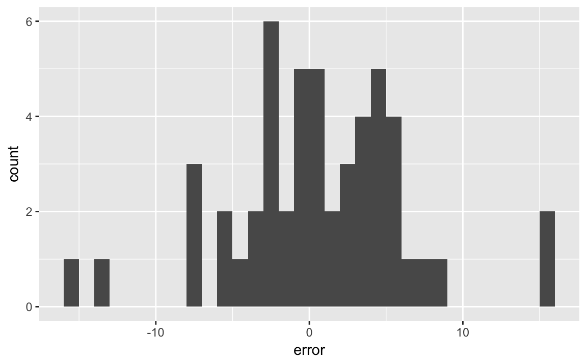
The text uses bin widths of 5%:
ggplot(last_polls, aes(x = error)) +
  geom_histogram(binwidth = 5, boundary = 0)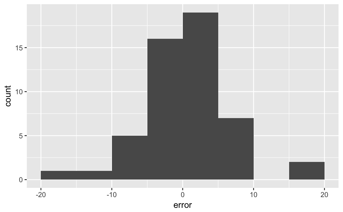
Challenge: What other ways could you visualize the results? How would you show all states? What about plotting the absolute or squared errors instead of the errors?
Challenge: What happens to prediction error if you average polls? Consider averaging back over time? What happens if you take the averages of the state poll average and average of all polls - does that improve prediction?
To create a scatter plots using the state abbreviations instead of points use geom_text instead of geom_point.
ggplot(last_polls, aes(x = margin, y = elec_margin, label = state)) +
  geom_abline(color = "white", size = 2) +
  geom_hline(yintercept = 0, color = "gray", size = 2) +
  geom_vline(xintercept = 0, color = "gray", size = 2) +
  geom_text() +
  coord_fixed() +
  labs(x = "Poll Results", y = "Actual Election Results")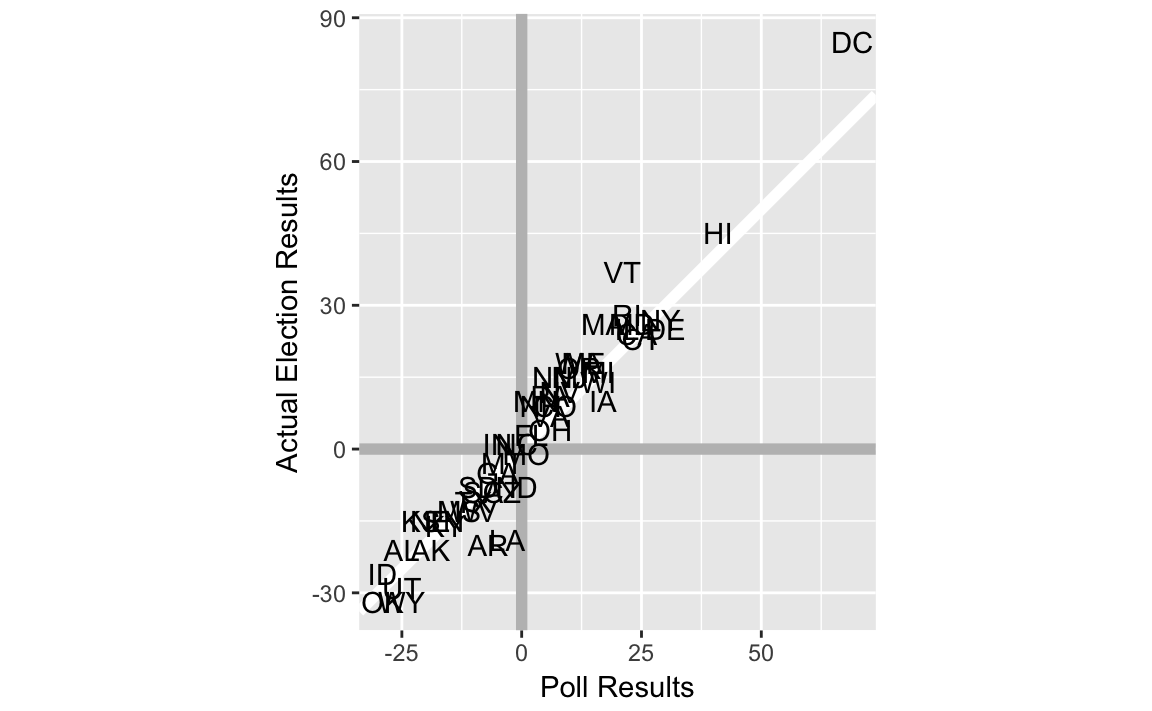
We can create a confusion matrix as follows. Create a new column classification which shows how the poll’s classification was related to the actual election outcome (“true positive”, “false positive”, “true negative”, “false negative”). If there were two outcomes, then we would use the function. But with more than two outcomes, it is easier to use the dplyr function .
last_polls <-
  last_polls %>%
  ungroup() %>%
  mutate(classification =
           case_when(
             (.$margin > 0 & .$elec_margin > 0) ~ "true positive",
             (.$margin > 0 & .$elec_margin < 0) ~ "false positive",
             (.$margin < 0 & .$elec_margin < 0) ~ "true negative",
             (.$margin < 0 & .$elec_margin > 0) ~ "false negative"
           ))
You need to use . to refer to the data frame when using case_when() within mutate(). Also, we needed to first use in order to remove the grouping variable so mutate() will work.
Now simply count the number of polls in each category of classification:
last_polls %>%
  group_by(classification) %>%
  count()
#> # A tibble: 4 x 2
#> # Groups:   classification [4]
#>   classification     n
#>   <chr>          <int>
#> 1 false negative     2
#> 2 false positive     1
#> 3 true negative     21
#> 4 true positive     27
Which states were incorrectly predicted by the polls, and what was their margins?
last_polls %>%
  filter(classification %in% c("false positive", "false negative")) %>%
  select(state, margin, elec_margin, classification) %>%
  arrange(desc(elec_margin))
#> # A tibble: 3 x 4
#>   state margin elec_margin classification
#>   <chr>  <int>       <int> <chr>
#> 1 IN        -5           1 false negative
#> 2 NC        -1           1 false negative
#> 3 MO         1          -1 false positive
What was the difference in the poll prediction of electoral votes and actual electoral votes? We hadn’t included the variable EV when we first merged, but that’s no problem, we’ll just merge again in order to grab that variable:
last_polls %>%
  left_join(select(pres08, state, EV), by = "state") %>%
  summarise(EV_pred = sum( (margin > 0) * EV),
            EV_actual = sum( (elec_margin > 0) * EV))
#> # A tibble: 1 x 2
#>   EV_pred EV_actual
#>     <int>     <int>
#> 1 349 364data("pollsUS08", package = "qss")pollsUS08 <- mutate(pollsUS08, DaysToElection = ELECTION_DAY - middate)We’ll produce the seven-day averages slightly differently than the method used in the text. For all dates in the data, we’ll calculate the moving average. The code presented in QSS uses a for loop similar to the following:
all_dates <- seq(min(polls08$middate), ELECTION_DAY, by = "days")

# Number of poll days to use
POLL_DAYS <- 7

pop_vote_avg <- vector(length(all_dates), mode = "list")
for (i in seq_along(all_dates)) {
  date <- all_dates[i]
  # summarise the seven day
  week_data <-
     filter(polls08,
            as.integer(middate - date) <= 0,
            as.integer(middate - date) > - POLL_DAYS) %>%
     summarise(Obama = mean(Obama, na.rm = TRUE),
               McCain = mean(McCain, na.rm = TRUE))
  # add date for the observation
  week_data$date <- date
  pop_vote_avg[[i]] <- week_data
}

pop_vote_avg <- bind_rows(pop_vote_avg)
Write a function which takes a date, and calculates the days (set the default to 7 days) moving average using the dataset .data:
poll_ma <- function(date, .data, days = 7) {
  filter(.data,
        as.integer(middate - date) <= 0,
        as.integer(middate - date) > - !!days) %>%
  summarise(Obama = mean(Obama, na.rm = TRUE),
           McCain = mean(McCain, na.rm = TRUE)) %>%
  mutate(date = !!date)
}
The code above uses !!. This tells filter that days refers to a variable days in the calling environment, and not a column named days in the data frame. In this case, there wouldn’t be any ambiguities since there is not a column named days, but in general there can be ambiguities in the dplyr functions as to whether the names refer to columns in the data frame or variables in the environment calling the function. Read Programming with dplyr for an in-depth discussion of this.
This returns a one row data frame with the moving average for McCain and Obama on Nov 1, 2008.
poll_ma(as.Date("2008-11-01"), polls08)
#>   Obama McCain       date
#> 1  49.1   45.4 2008-11-01
Since we made days an argument to the function we could easily change the code to calculate other moving averages,
poll_ma(as.Date("2008-11-01"), polls08, days = 3)
#>   Obama McCain       date
#> 1  50.6   45.4 2008-11-01
Now use a functional to execute that function with all dates for which we want moving averages. The function poll_ma returns a data frame, and our ideal output is a data frame that stacks those data frames row-wise. So we will use the map_df function,
map_df(all_dates, poll_ma, polls08)Note that the other arguments for poll_ma are placed after the name of the function as additional arguments to map_df.
It is easier to plot this if the data are tidy, with Obama and McCain as categories of a column candidate.
pop_vote_avg_tidy <-
  pop_vote_avg %>%
  gather(candidate, share, -date, na.rm = TRUE)
head(pop_vote_avg_tidy)
#>         date candidate share
#> 1 2008-01-01     Obama  46.5
#> 2 2008-01-02     Obama  46.5
#> 3 2008-01-03     Obama  46.5
#> 4 2008-01-04     Obama  46.5
#> 5 2008-01-05     Obama  46.5
#> 6 2008-01-06 Obama 46.5ggplot(pop_vote_avg_tidy, aes(x = date, y = share,
colour = fct_reorder2(candidate, date, share))) +
geom_point() +
geom_line() +
scale_colour_manual("Candidate",
values = c(Obama = "blue", McCain = "red"))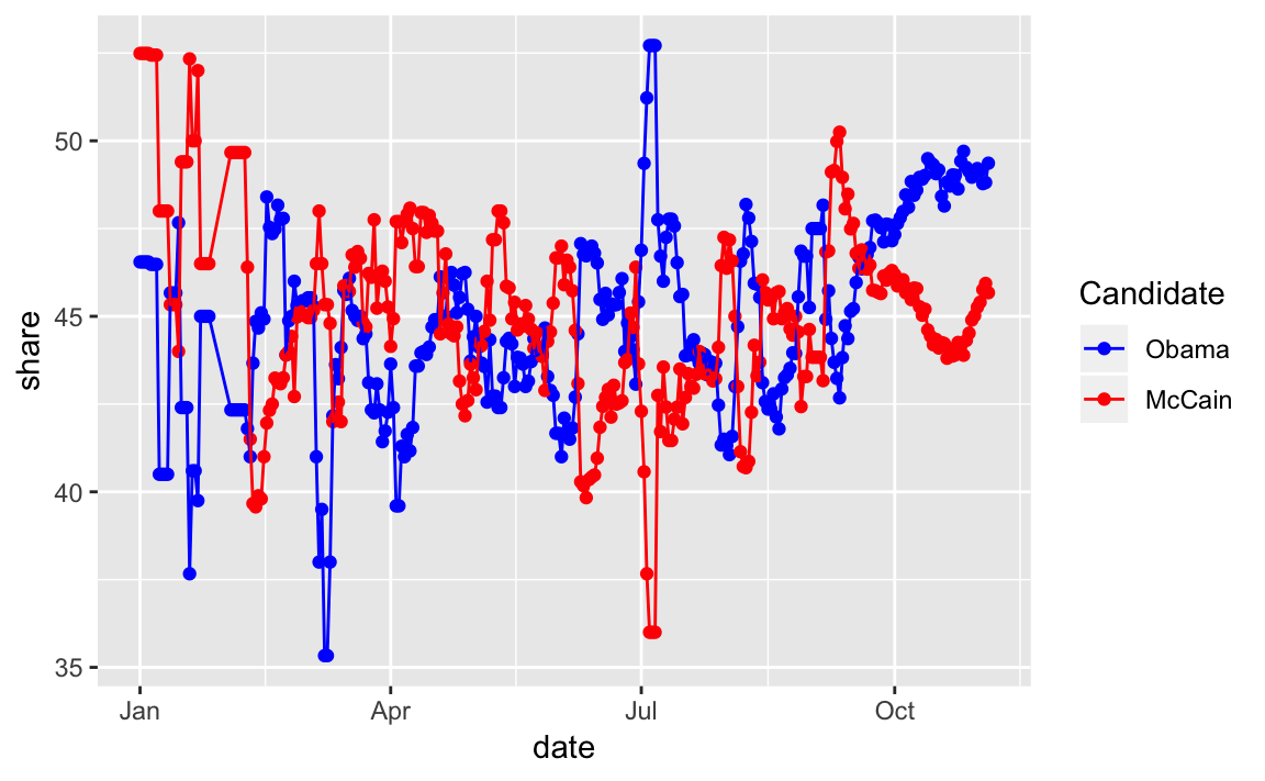
Challenge: read R for Data Science chapter Iteration and use the function map_df to create the object poll_vote_avg as above instead of a for loop.
The 7-day average is similar to the simple method used by Real Clear Politics. The RCP average is simply the average of all polls in their data for the last seven days. Sites like 538 and the Huffpost Pollster, on the other hand, also use what amounts to averaging polls, but using more sophisticated statistical methods to assign different weights to different polls.
Challenge: Why do we need to use different polls for the popular vote data? Why not simply average all the state polls? What would you have to do? Would the overall popular vote be useful in predicting state-level polling, or vice-versa? How would you use them?
4.2 Linear Regression
4.2.1 Facial Appearance and Election Outcomes
Load the face dataset:
data("face", package = "qss")Add Democrat and Republican vote shares, and the difference in shares:
face <- mutate(face,
                d.share = d.votes / (d.votes + r.votes),
                r.share = r.votes / (d.votes + r.votes),
                diff.share = d.share - r.share)
Plot facial competence vs. vote share:
ggplot(face, aes(x = d.comp, y = diff.share, colour = w.party)) +
  geom_ref_line(h = 0) +
  geom_point() +
  scale_colour_manual("Winning\nParty",
                      values = c(D = "blue", R = "red")) +
  labs(x = "Competence scores for Democrats",
       y = "Democratic margin in vote share")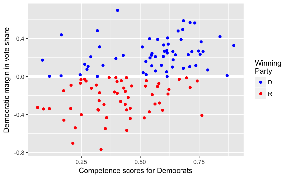
4.2.2 Correlation and Scatter Plots
cor(face$d.comp, face$diff.share)
#> [1] 0.433
4.2.3 Least Squares
Run the linear regression
fit <- lm(diff.share ~ d.comp, data = face)
fit
#>
#> Call:
#> lm(formula = diff.share ~ d.comp, data = face)
#>
#> Coefficients:
#> (Intercept)       d.comp
#>      -0.312        0.660
There are many functions to get data out of the lm model.
In addition to these, the broom package provides three functions: glance, tidy, and augment that always return data frames.
The function glance returns a one-row data-frame summary of the model,
glance(fit)
#>   r.squared adj.r.squared sigma statistic  p.value df logLik AIC  BIC
#> 1     0.187          0.18 0.266        27 8.85e-07  2  -10.5  27 35.3
#>   deviance df.residual
#> 1     8.31         117
The function tidy returns a data frame in which each row is a coefficient,
tidy(fit)
#>          term estimate std.error statistic  p.value
#> 1 (Intercept)   -0.312     0.066     -4.73 6.24e-06
#> 2      d.comp    0.660     0.127      5.19 8.85e-07
The function augment returns the original data with fitted values, residuals, and other observation level stats from the model appended to it.
augment(fit) %>% head()
#>   diff.share d.comp .fitted .se.fit  .resid    .hat .sigma  .cooksd
#> 1     0.2101  0.565  0.0606  0.0266  0.1495 0.00996  0.267 0.001600
#> 2     0.1194  0.342 -0.0864  0.0302  0.2059 0.01286  0.267 0.003938
#> 3     0.0499  0.612  0.0922  0.0295 -0.0423 0.01229  0.268 0.000158
#> 4     0.1965  0.542  0.0454  0.0256  0.1511 0.00922  0.267 0.001510
#> 5     0.4958  0.680  0.1370  0.0351  0.3588 0.01737  0.266 0.016307
#> 6    -0.3495  0.321 -0.1006  0.0319 -0.2490 0.01433  0.267 0.006436
#>   .std.resid
#> 1      0.564
#> 2      0.778
#> 3     -0.160
#> 4      0.570
#> 5      1.358
#> 6     -0.941
We can plot the results of the bivariate linear regression as follows:
ggplot() +
  geom_point(data = face, mapping = aes(x = d.comp, y = diff.share)) +
  geom_ref_line(v = mean(face$d.comp)) +
  geom_ref_line(h = mean(face$diff.share)) +
  geom_abline(slope = coef(fit)["d.comp"],
              intercept = coef(fit)["(Intercept)"],
              colour = "red") +
  annotate("text", x = 0.9, y = mean(face$diff.share) + 0.05,
           label = "Mean of Y", color = "blue", vjust = 0) +
  annotate("text", y = -0.9, x = mean(face$d.comp), label = "Mean of X",
           color = "blue", hjust = 0) +
  scale_y_continuous("Democratic margin in vote shares",
                     breaks = seq(-1, 1, by = 0.5), limits = c(-1, 1)) +
  scale_x_continuous("Democratic margin in vote shares",
                     breaks = seq(0, 1, by = 0.2), limits = c(0, 1)) +
  ggtitle("Facial compotence and vote share")
A more general way to plot the predictions of the model against the data is to use the methods described in Ch 23.3.3 of R4DS. Create an evenly spaced grid of values of d.comp, and add predictions of the model to it.
grid <- face %>%
  data_grid(d.comp) %>%
  add_predictions(fit)
head(grid)
#> # A tibble: 6 x 2
#>   d.comp   pred
#>    <dbl>  <dbl>
#> 1 0.0640 -0.270
#> 2 0.0847 -0.256
#> 3 0.0893 -0.253
#> 4 0.115  -0.237
#> 5 0.115  -0.236
#> 6 0.164  -0.204
Now we can plot the regression line and the original data just like any other plot.
ggplot() +
geom_point(data = face, mapping = aes(x = d.comp, y = diff.share)) +
geom_line(data = grid, mapping = aes(x = d.comp, y = pred),
colour = "red")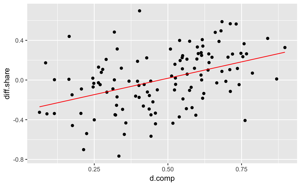 This method is more complicated than the
 geom_abline method for a bivariate regression, but will work for more complicated models, while the geom_abline method won’t.
Note that geom_smooth can be used to add a regression line to a data-set.
ggplot(data = face, mapping = aes(x = d.comp, y = diff.share)) +
geom_point() +
geom_smooth(method = "lm", se = FALSE)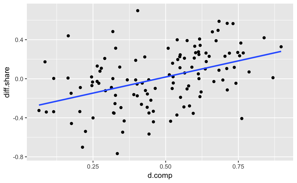 The argument
 method = "lm" specifies that the function lm is to be used to generate fitted values. It is equivalent to running the regression lm(y ~ x) and plotting the regression line, where y and x are the aesthetics specified by the mappings. The argument se = FALSE tells the function not to plot the confidence interval of the regression (discussed later).
4.2.4 Regression towards the mean
4.2.5 Merging Data Sets in R
See the R for Data Science chapter Relational data.
data("pres12", package = "qss")To join both data frames
full_join(pres08, pres12, by = "state")However, since there are duplicate names, .x and .y are appended.
Challenge: What would happen if by = "state" was dropped?
To avoid the duplicate names, or change them, you can rename before merging,
full_join(select(pres08, state, Obama_08 = Obama, McCain_08 = McCain,
                 EV_08 = EV),
          select(pres12, state, Obama_12 = Obama, Romney_12 = Romney,
                 EV_12 = EV),
          by = "state")
or use the suffix argument to full_join
pres <- full_join(pres08, pres12, by = "state", suffix = c("_08", "_12"))
head(pres)
#>   state.name state Obama_08 McCain EV_08 margin Obama_12 Romney EV_12
#> 1    Alabama    AL       39     60     9    -21       38     61     9
#> 2     Alaska    AK       38     59     3    -21       41     55     3
#> 3    Arizona    AZ       45     54    10     -9       45     54    11
#> 4   Arkansas    AR       39     59     6    -20       37     61     6
#> 5 California    CA       61     37    55     24       60     37    55
#> 6   Colorado    CO       54     45     9      9       51     46     9
Challenge Would you consider this data tidy? How would you make it tidy?
The dplyr equivalent functions for cbind is bind_cols.
pres <- pres %>%
  mutate(Obama2008_z = as.numeric(scale(Obama_08)),
         Obama2012_z = as.numeric(scale(Obama_12)))
Likewise, bind_cols concatenates data frames by row.
We need to use the as.numeric function because scale() always returns a matrix. Omitting as.numeric() would not produce an error in the code chunk above, since the columns of a data frame can be matrices, but it would produce errors in some of the following code if it were omitted.
Scatter plot of states with vote shares in 2008 and 2012
ggplot(pres, aes(x = Obama2008_z, y = Obama2012_z, label = state)) +
  geom_abline(colour = "white", size = 2) +
  geom_text() +
  coord_fixed() +
  scale_x_continuous("Obama's standardized vote share in 2008",
                     limits = c(-4, 4)) +
  scale_y_continuous("Obama's standardized vote share in 2012",
                     limits = c(-4, 4))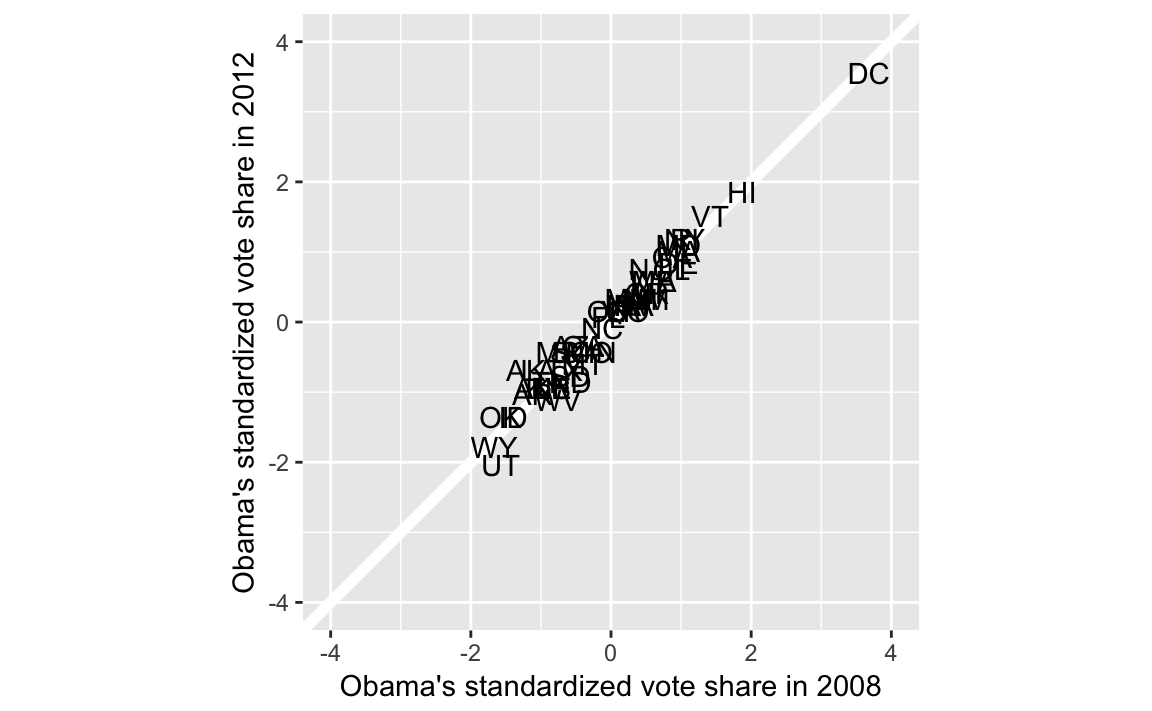
To calculate the bottom and top quartiles
pres %>%
  filter(Obama2008_z < quantile(Obama2008_z, 0.25)) %>%
  summarise(improve = mean(Obama2012_z > Obama2008_z))
#>   improve
#> 1   0.583

pres %>%
  filter(Obama2008_z < quantile(Obama2008_z, 0.75)) %>%
  summarise(improve = mean(Obama2012_z > Obama2008_z))
#>   improve
#> 1     0.5
Challenge: Why is it important to standardize the vote shares?
4.2.6 Model Fit
data("florida", package = "qss")
fit2 <- lm(Buchanan00 ~ Perot96, data = florida)
fit2
#>
#> Call:
#> lm(formula = Buchanan00 ~ Perot96, data = florida)
#>
#> Coefficients:
#> (Intercept)      Perot96
#>      1.3458       0.0359
Extract \(R ^ 2\) from the results of summary,
summary(fit2)$r.squared
#> [1] 0.513
Alternatively, can get the R squared value from the data frame glance returns:
glance(fit2)
#>   r.squared adj.r.squared sigma statistic  p.value df logLik AIC BIC
#> 1     0.513         0.506   316      68.5 9.47e-12  2   -480 966 972
#>   deviance df.residual
#> 1  6506118          65
We can add predictions and residuals to the original data frame using the modelr functions add_residuals and add_predictions
florida <-
  florida %>%
  add_predictions(fit2) %>%
  add_residuals(fit2)
glimpse(florida)
#> Observations: 67
#> Variables: 9
#> $ county     <chr> "Alachua", "Baker", "Bay", "Bradford", "Brevard", "...
#> $ Clinton96  <int> 40144, 2273, 17020, 3356, 80416, 320736, 1794, 2712...
#> $ Dole96     <int> 25303, 3684, 28290, 4038, 87980, 142834, 1717, 2783...
#> $ Perot96    <int> 8072, 667, 5922, 819, 25249, 38964, 630, 7783, 7244...
#> $ Bush00     <int> 34124, 5610, 38637, 5414, 115185, 177323, 2873, 354...
#> $ Gore00     <int> 47365, 2392, 18850, 3075, 97318, 386561, 2155, 2964...
#> $ Buchanan00 <int> 263, 73, 248, 65, 570, 788, 90, 182, 270, 186, 122,...
#> $ pred       <dbl> 291.3, 25.3, 214.0, 30.8, 908.2, 1400.7, 24.0, 280....
#> $ resid      <dbl> -2.83e+01, 4.77e+01, 3.40e+01, 3.42e+01, -3.38e+02,...
There are now two new columns in florida, pred with the fitted values (predictions), and resid with the residuals.
Use fit2_augment to create a residual plot:
fit2_resid_plot <-
ggplot(florida, aes(x = pred, y = resid)) +
geom_ref_line(h = 0) +
geom_point() +
labs(x = "Fitted values", y = "residuals")
fit2_resid_plot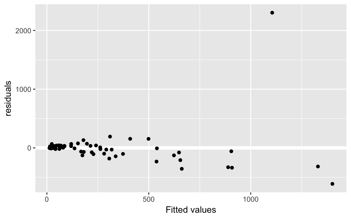 Note, we use the function geom_refline to add a reference line at 0.
Let’s add some labels to points, who is that outlier?
fit2_resid_plot +
  geom_label(aes(label = county))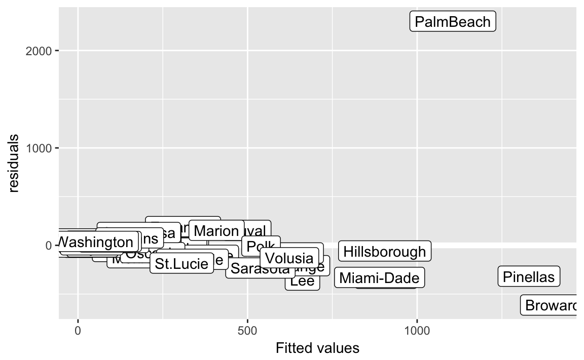
The outlier county is “Palm Beach”
arrange(florida) %>%
  arrange(desc(abs(resid))) %>%
  select(county, resid) %>%
  head()
#>       county resid
#> 1  PalmBeach  2302
#> 2    Broward  -613
#> 3        Lee  -357
#> 4    Brevard  -338
#> 5 Miami-Dade  -329
#> 6   Pinellas  -317
Data without Palm Beach
florida_pb <- filter(florida, county != "PalmBeach")
fit3 <- lm(Buchanan00 ~ Perot96, data = florida_pb)
fit3
#>
#> Call:
#> lm(formula = Buchanan00 ~ Perot96, data = florida_pb)
#>
#> Coefficients:
#> (Intercept)      Perot96
#>     45.8419       0.0244
\(R^2\) or coefficient of determination
glance(fit3)
#>   r.squared adj.r.squared sigma statistic  p.value df logLik AIC BIC
#> 1     0.851         0.849  87.7       366 3.61e-28  2   -388 782 788
#>   deviance df.residual
#> 1   492803          64
florida_pb %>%
add_residuals(fit3) %>%
add_predictions(fit3) %>%
ggplot(aes(x = pred, y = resid)) +
geom_ref_line(h = 0) +
geom_point() +
ylim(-750, 2500) +
xlim(0, 1500) +
labs(x = "Fitted values", y = "residuals")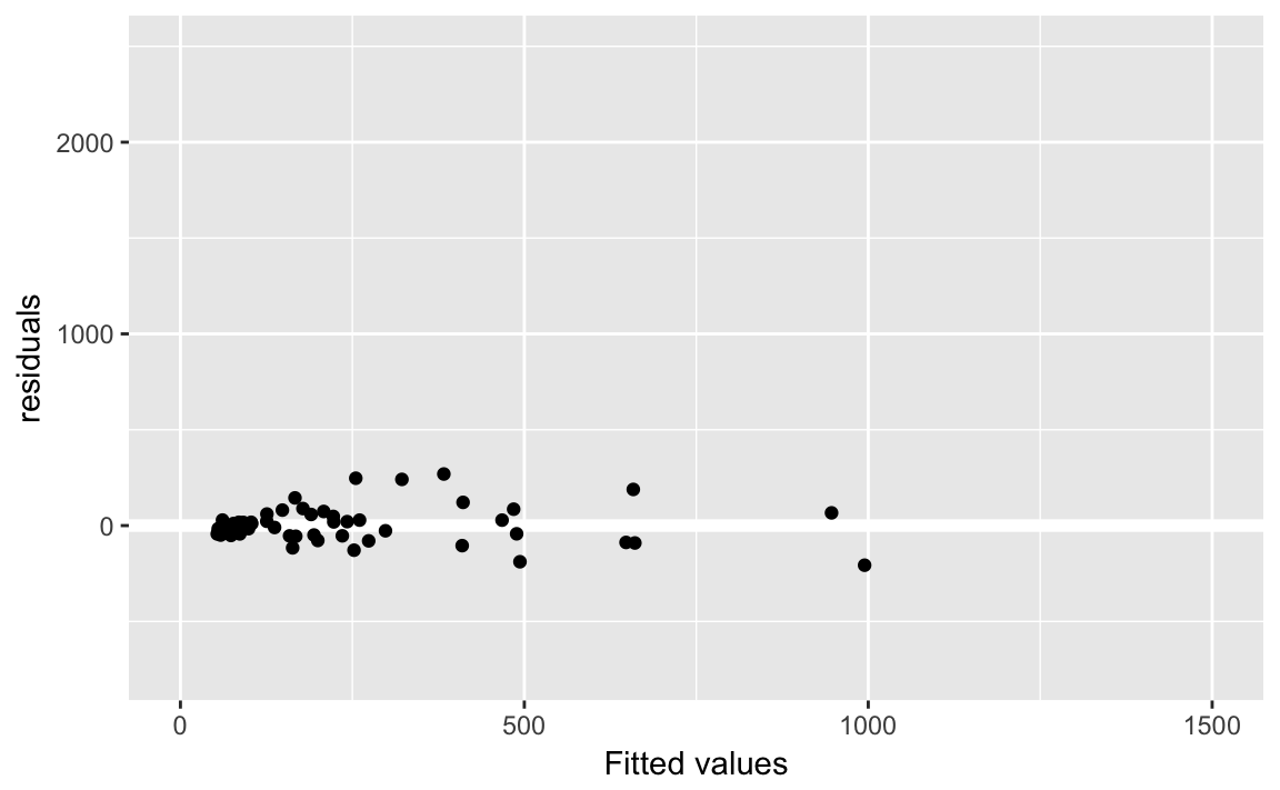
Create predictions for both models using data_grid and gather_predictions:
florida_grid <-
  florida %>%
  data_grid(Perot96) %>%
  gather_predictions(fit2, fit3) %>%
  mutate(model =
           fct_recode(model,
                      "Regression\n with Palm Beach" = "fit2",
                      "Regression\n without Palm Beach" = "fit3"))
Note this is an example of using non-syntactic column names in a tibble, as discussed in Chapter 10 of R for data science.
ggplot() +
geom_point(data = florida, mapping = aes(x = Perot96, y = Buchanan00)) +
geom_line(data = florida_grid,
mapping = aes(x = Perot96, y = pred,
colour = model)) +
geom_label(data = filter(florida, county == "PalmBeach"),
mapping = aes(x = Perot96, y = Buchanan00, label = county),
vjust = "top", hjust = "right") +
geom_text(data = tibble(label = unique(florida_grid$model),
x = c(20000, 31000),
y = c(1000, 300)),
mapping = aes(x = x, y = y, label = label, colour = label)) +
labs(x = "Perot's Vote in 1996", y = "Buchanan's Votes in 1996") +
theme(legend.position = "none")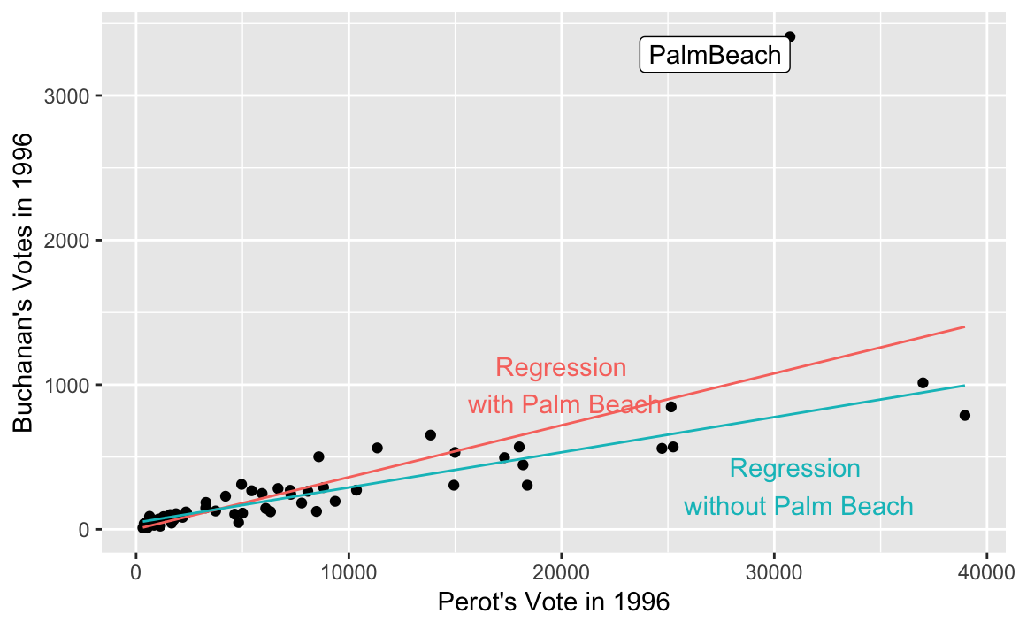 See Graphics for communication in R for Data Science on labels and annotations in plots.
4.3 Regression and Causation
4.3.1 Randomized Experiments
Load data
data("women", package = "qss")Proportion of female politicians in reserved GP vs. unreserved GP
women %>%
  group_by(reserved) %>%
  summarise(prop_female = mean(female))
#> # A tibble: 2 x 2
#>   reserved prop_female
#>      <int>       <dbl>
#> 1        0      0.0748
#> 2        1      1.00
The diff in means estimator:
# drinking water facilities

# irrigation facilities
mean(women$irrigation[women$reserved == 1]) -
    mean(women$irrigation[women$reserved == 0])
#> [1] -0.369
Mean values of irrigation and water in reserved and non-reserved districts.
women %>%
  group_by(reserved) %>%
  summarise(irrigation = mean(irrigation),
            water = mean(water))
#> # A tibble: 2 x 3
#>   reserved irrigation water
#>      <int>      <dbl> <dbl>
#> 1        0       3.39  14.7
#> 2        1       3.02  24.0
The difference between the two groups can be calculated with the function diff, which calculates the difference between subsequent observations. This works as long as we are careful about which group is first or second.
women %>%
  group_by(reserved) %>%
  summarise(irrigation = mean(irrigation),
            water = mean(water)) %>%
  summarise(diff_irrigation = diff(irrigation),
            diff_water = diff(water))
#> # A tibble: 1 x 2
#>   diff_irrigation diff_water
#>             <dbl>      <dbl>
#> 1          -0.369       9.25
The other way uses tidyr spread and gather,
women %>%
  group_by(reserved) %>%
  summarise(irrigation = mean(irrigation),
            water = mean(water)) %>%
  gather(variable, value, -reserved) %>%
  spread(reserved, value) %>%
  mutate(diff = `1` - `0`)
#> # A tibble: 2 x 4
#>   variable     `0`   `1`   diff
#>   <chr>      <dbl> <dbl>  <dbl>
#> 1 irrigation  3.39  3.02 -0.369
#> 2 water      14.7  24.0   9.25
Now each row is an outcome variable of interest, and there are columns for the treatment (1) and control (0) groups, and the difference (diff).
lm(water ~ reserved, data = women)
#>
#> Call:
#> lm(formula = water ~ reserved, data = women)
#>
#> Coefficients:
#> (Intercept)     reserved
#> 14.74 9.25lm(irrigation ~ reserved, data = women)
#>
#> Call:
#> lm(formula = irrigation ~ reserved, data = women)
#>
#> Coefficients:
#> (Intercept) reserved
#> 3.388 -0.3694.3.2 Regression with multiple predictors
data("social", package = "qss")
glimpse(social)
#> Observations: 305,866
#> Variables: 6
#> $ sex         <chr> "male", "female", "male", "female", "female", "mal...
#> $ yearofbirth <int> 1941, 1947, 1951, 1950, 1982, 1981, 1959, 1956, 19...
#> $ primary2004 <int> 0, 0, 0, 0, 0, 0, 0, 0, 0, 0, 1, 0, 0, 1, 1, 1, 0,...
#> $ messages    <chr> "Civic Duty", "Civic Duty", "Hawthorne", "Hawthorn...
#> $ primary2006 <int> 0, 0, 1, 1, 1, 0, 1, 1, 0, 0, 1, 0, 1, 0, 1, 1, 1,...
#> $ hhsize      <int> 2, 2, 3, 3, 3, 3, 3, 3, 2, 2, 1, 2, 2, 1, 2, 2, 1,...
levels(social$messages)
#> NULL
fit <- lm(primary2006 ~ messages, data = social)
fit
#>
#> Call:
#> lm(formula = primary2006 ~ messages, data = social)
#>
#> Coefficients:
#>       (Intercept)    messagesControl  messagesHawthorne
#>           0.31454           -0.01790            0.00784
#> messagesNeighbors
#>           0.06341
Create indicator variables for each message:
social <-
  social %>%
  mutate(Control = as.integer(messages == "Control"),
         Hawthorne = as.integer(messages == "Hawthorne"),
         Neighbors = as.integer(messages == "Neighbors"))
alternatively, create these using a for loop. This is easier to understand and less prone to typos:
for (i in unique(social$messages)) {
  social[[i]] <- as.integer(social[["messages"]] == i)
}
We created a variable for each level of messages even though we will exclude one of them.
lm(primary2006 ~ Control + Hawthorne + Neighbors, data = social)
#>
#> Call:
#> lm(formula = primary2006 ~ Control + Hawthorne + Neighbors, data = social)
#>
#> Coefficients:
#> (Intercept)      Control    Hawthorne    Neighbors
#>     0.31454     -0.01790      0.00784      0.06341
Create predictions for each unique value of messages
unique_messages <-
  data_grid(social, messages) %>%
  add_predictions(fit)
unique_messages
#> # A tibble: 4 x 2
#>   messages    pred
#>   <chr>      <dbl>
#> 1 Civic Duty 0.315
#> 2 Control    0.297
#> 3 Hawthorne  0.322
#> 4 Neighbors  0.378
Compare to the sample averages
social %>%
  group_by(messages) %>%
  summarise(mean(primary2006))
#> # A tibble: 4 x 2
#>   messages   `mean(primary2006)`
#>   <chr>                    <dbl>
#> 1 Civic Duty               0.315
#> 2 Control                  0.297
#> 3 Hawthorne                0.322
#> 4 Neighbors                0.378
Linear regression without intercept.
fit_noint <- lm(primary2006 ~ -1 + messages, data = social)
fit_noint
#>
#> Call:
#> lm(formula = primary2006 ~ -1 + messages, data = social)
#>
#> Coefficients:
#> messagesCivic Duty     messagesControl   messagesHawthorne
#>              0.315               0.297               0.322
#>  messagesNeighbors
#>              0.378
Calculating the regression average effect is also easier if we make the control group the first level so all regression coefficients are comparisons to it. Use fct_relevel to make “Control”
fit_control <-
  mutate(social, messages = fct_relevel(messages, "Control")) %>%
  lm(primary2006 ~ messages, data = .)
fit_control
#>
#> Call:
#> lm(formula = primary2006 ~ messages, data = .)
#>
#> Coefficients:
#>        (Intercept)  messagesCivic Duty   messagesHawthorne
#>             0.2966              0.0179              0.0257
#>  messagesNeighbors
#>             0.0813
Difference in means
social %>%
  group_by(messages) %>%
  summarise(primary2006 = mean(primary2006)) %>%
  mutate(Control = primary2006[messages == "Control"],
         diff = primary2006 - Control)
#> # A tibble: 4 x 4
#>   messages   primary2006 Control   diff
#>   <chr>            <dbl>   <dbl>  <dbl>
#> 1 Civic Duty       0.315   0.297 0.0179
#> 2 Control          0.297   0.297 0
#> 3 Hawthorne        0.322   0.297 0.0257
#> 4 Neighbors        0.378   0.297 0.0813
Adjusted R-squared is included in the output of broom::glance()
glance(fit)
#>   r.squared adj.r.squared sigma statistic   p.value df  logLik    AIC
#> 1   0.00328       0.00327 0.463       336 1.06e-217  4 -198247 396504
#>      BIC deviance df.residual
#> 1 396557    65468      305862
glance(fit)[["adj.r.squared"]]
#> [1] 0.00327
4.3.3 Heterogeneous Treatment Effects
Average treatment effect (ate) among those who voted in 2004 primary
ate <-
  social %>%
  group_by(primary2004, messages) %>%
  summarise(primary2006 = mean(primary2006)) %>%
  spread(messages, primary2006) %>%
  mutate(ate_Neighbors = Neighbors - Control) %>%
  select(primary2004, Neighbors, Control, ate_Neighbors)
ate
#> # A tibble: 2 x 4
#> # Groups:   primary2004 [2]
#>   primary2004 Neighbors Control ate_Neighbors
#>         <int>     <dbl>   <dbl>         <dbl>
#> 1           0     0.306   0.237        0.0693
#> 2           1     0.482   0.386        0.0965
Difference in ATE in 2004 voters and non-voters
diff(ate$ate_Neighbors)
#> [1] 0.0272
social_neighbor <- social %>%
filter( (messages == "Control") | (messages == "Neighbors"))
fit_int <- lm(primary2006 ~ primary2004 + messages + primary2004:messages,
data = social_neighbor)
fit_int
#>
#> Call:
#> lm(formula = primary2006 ~ primary2004 + messages + primary2004:messages,
#> data = social_neighbor)
#>
#> Coefficients:
#> (Intercept) primary2004
#> 0.2371 0.1487
#> messagesNeighbors primary2004:messagesNeighbors
#> 0.0693 0.0272lm(primary2006 ~ primary2004 * messages, data = social_neighbor)
#>
#> Call:
#> lm(formula = primary2006 ~ primary2004 * messages, data = social_neighbor)
#>
#> Coefficients:
#> (Intercept) primary2004
#> 0.2371 0.1487
#> messagesNeighbors primary2004:messagesNeighbors
#> 0.0693 0.0272social_neighbor <-
social_neighbor %>%
mutate(age = 2008 - yearofbirth)
summary(social_neighbor$age)
#> Min. 1st Qu. Median Mean 3rd Qu. Max.
#> 22.0 43.0 52.0 51.8 61.0 108.0
fit.age <- lm(primary2006 ~ age * messages, data = social_neighbor)
fit.age
#>
#> Call:
#> lm(formula = primary2006 ~ age * messages, data = social_neighbor)
#>
#> Coefficients:
#> (Intercept) age messagesNeighbors
#> 0.089477 0.003998 0.048573
#> age:messagesNeighbors
#> 0.000628Calculate average treatment effects
ate.age <-
  crossing(age = seq(from = 25, to = 85, by = 20),
         messages = c("Neighbors", "Control")) %>%
  add_predictions(fit.age) %>%
  spread(messages, pred) %>%
  mutate(diff = Neighbors - Control)
ate.age
#> # A tibble: 4 x 4
#>     age Control Neighbors   diff
#>   <dbl>   <dbl>     <dbl>  <dbl>
#> 1    25   0.189     0.254 0.0643
#> 2    45   0.269     0.346 0.0768
#> 3    65   0.349     0.439 0.0894
#> 4    85   0.429     0.531 0.102
You can use poly function to calculate polynomials instead of adding each term, age + I(age ^ 2). Though note that the coefficients will be be different since by default poly calculates orthogonal polynomials instead of the natural (raw) polynomials. However, you really shouldn’t interpret the coefficients directly anyways, so this should matter.
fit.age2 <- lm(primary2006 ~ poly(age, 2) * messages,
               data = social_neighbor)
fit.age2
#>
#> Call:
#> lm(formula = primary2006 ~ poly(age, 2) * messages, data = social_neighbor)
#>
#> Coefficients:
#>                     (Intercept)                    poly(age, 2)1
#>                          0.2966                          27.6665
#>                   poly(age, 2)2                messagesNeighbors
#>                        -10.2832                           0.0816
#> poly(age, 2)1:messagesNeighbors  poly(age, 2)2:messagesNeighbors
#>                          4.5820                          -5.5124
Create a data frame of combinations of ages and messages using data_grid, which means that we only need to specify the variables, and not the specific values,
y.hat <-
  data_grid(social_neighbor, age, messages) %>%
add_predictions(fit.age2)ggplot(y.hat, aes(x = age, y = pred,
colour = str_c(messages, " condition"))) +
geom_line() +
labs(colour = "", y = "Predicted turnout rates") +
theme(legend.position = "bottom")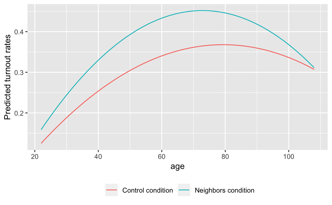
y.hat %>%
  spread(messages, pred) %>%
  mutate(ate = Neighbors - Control) %>%
  filter(age > 20, age < 90) %>%
  ggplot(aes(x = age, y = ate)) +
  geom_line() +
  labs(y = "Estimated average treatment effect",
       x = "Age") +
  ylim(0, 0.1)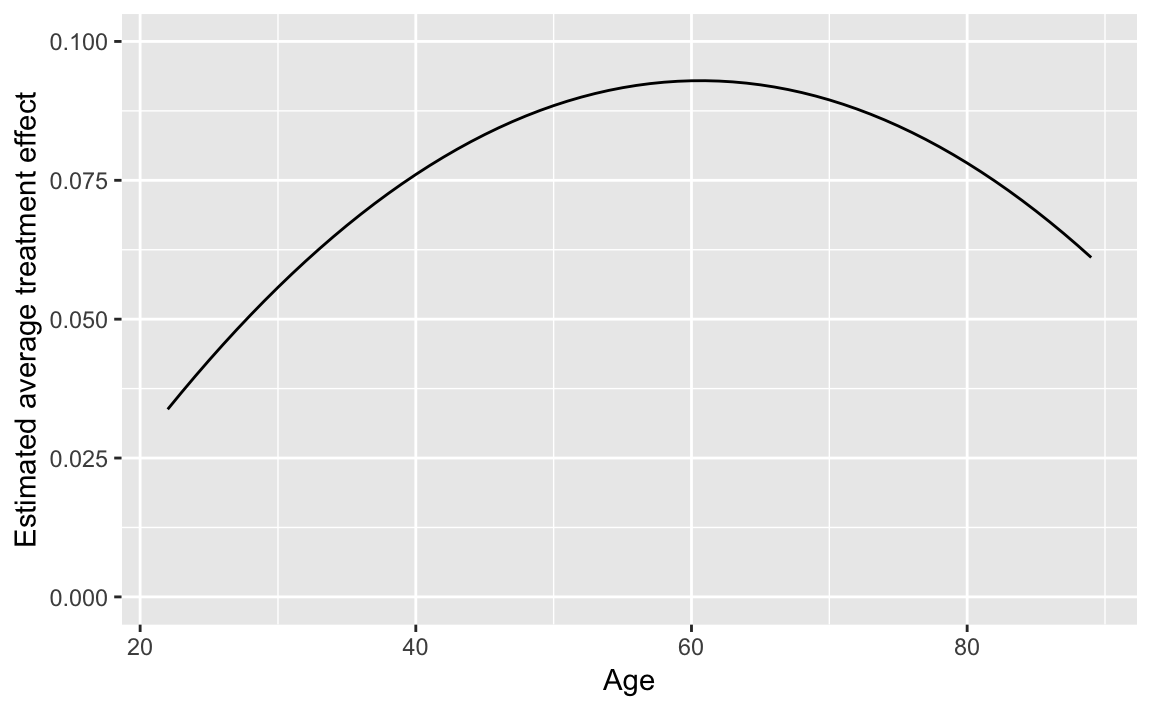
4.3.4 Regression Discontinuity Design
data("MPs", package = "qss")

MPs_labour <- filter(MPs, party == "labour")
MPs_tory <- filter(MPs, party == "tory")

labour_fit1 <- lm(ln.net ~ margin,
                 data = filter(MPs_labour, margin < 0))
labour_fit2 <- lm(ln.net ~ margin, MPs_labour, margin > 0)

tory_fit1 <- lm(ln.net ~ margin,
                data = filter(MPs_tory, margin < 0))
tory_fit2 <- lm(ln.net ~ margin, data = filter(MPs_tory, margin > 0))
Use to generate a grid for predictions.
y1_labour <-
  filter(MPs_labour, margin < 0) %>%
  data_grid(margin) %>%
  add_predictions(labour_fit1)
y2_labour <-
  filter(MPs_labour, margin > 0) %>%
  data_grid(margin) %>%
  add_predictions(labour_fit2)

y1_tory <-
  filter(MPs_tory, margin < 0) %>%
  data_grid(margin) %>%
  add_predictions(tory_fit1)

y2_tory <-
  filter(MPs_tory, margin > 0) %>%
  data_grid(margin) %>%
  add_predictions(tory_fit2)
Tory politicians
ggplot() +
  geom_ref_line(v = 0) +
  geom_point(data = MPs_tory,
             mapping = aes(x = margin, y = ln.net)) +
  geom_line(data = y1_tory,
            mapping = aes(x = margin, y = pred), colour = "red", size = 1.5) +
  geom_line(data = y2_tory,
            mapping = aes(x = margin, y = pred), colour = "red", size = 1.5) +
  labs(x = "margin of victory", y = "log net wealth at death",
       title = "labour")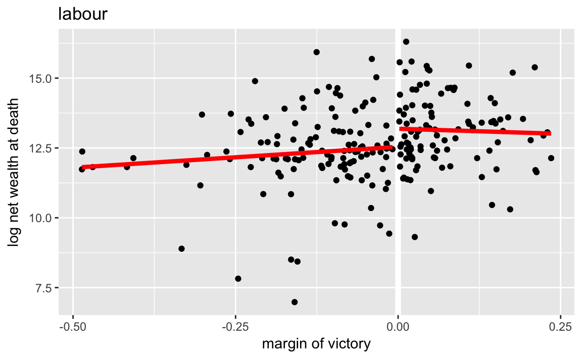
We can actually produce this plot easily without running the regressions, by using geom_smooth:
ggplot(mutate(MPs, winner = (margin > 0)),
       aes(x = margin, y = ln.net)) +
  geom_ref_line(v = 0) +
  geom_point() +
  geom_smooth(method = lm, se = FALSE, mapping = aes(group = winner)) +
  facet_grid(party ~ .) +
  labs(x = "margin of victory", y = "log net wealth at death")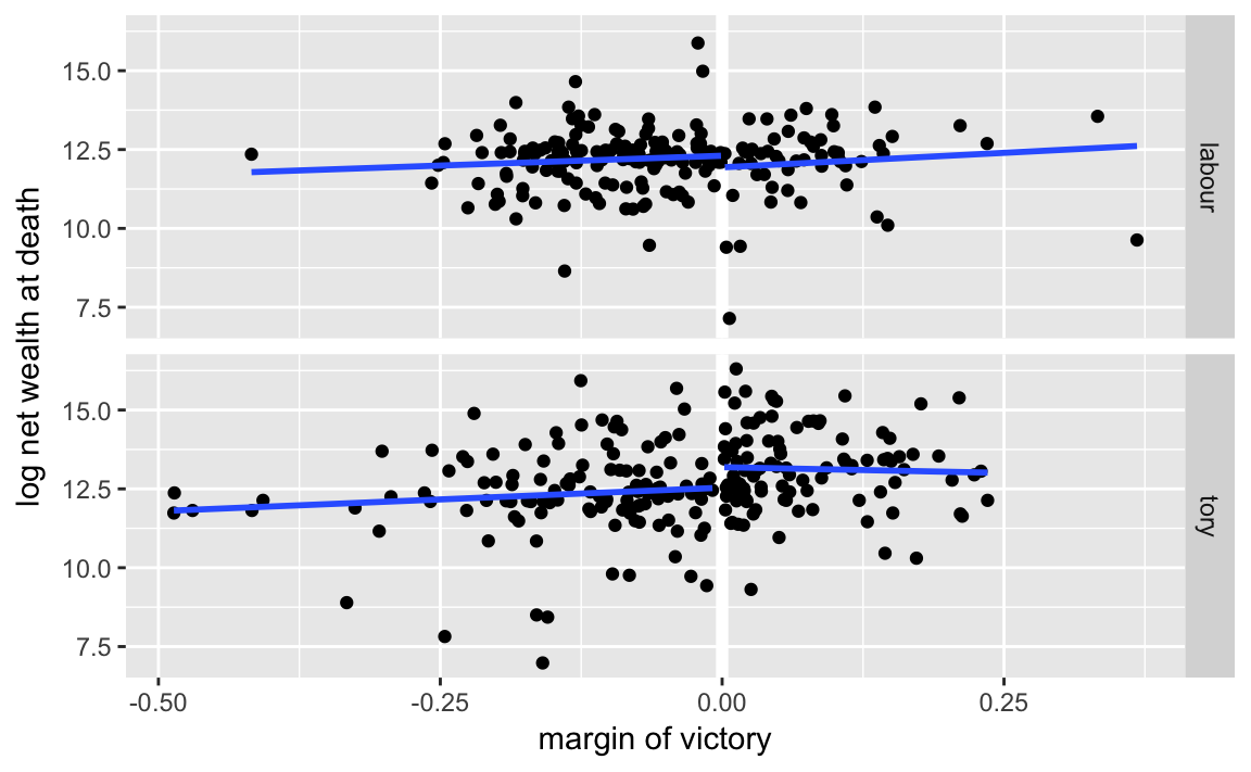
In the previous code, I didn’t directly compute the the average net wealth at 0, so I’ll need to do that here. I’ll use gather_predictions to add predictions for multiple models:
spread_predictions(data_frame(margin = 0),
                   tory_fit1, tory_fit2) %>%
  mutate(rd_est = tory_fit2 - tory_fit1)
#> # A tibble: 1 x 4
#>   margin tory_fit1 tory_fit2 rd_est
#>    <dbl>     <dbl>     <dbl>  <dbl>
#> 1      0      12.5      13.2  0.650
tory_fit3 <- lm(margin.pre ~ margin, data = filter(MPs_tory, margin < 0))
tory_fit4 <- lm(margin.pre ~ margin, data = filter(MPs_tory, margin > 0))
(filter(tidy(tory_fit4), term == "(Intercept)")[["estimate"]] -
filter(tidy(tory_fit3), term == "(Intercept)")[["estimate"]])
#> [1] -0.0173